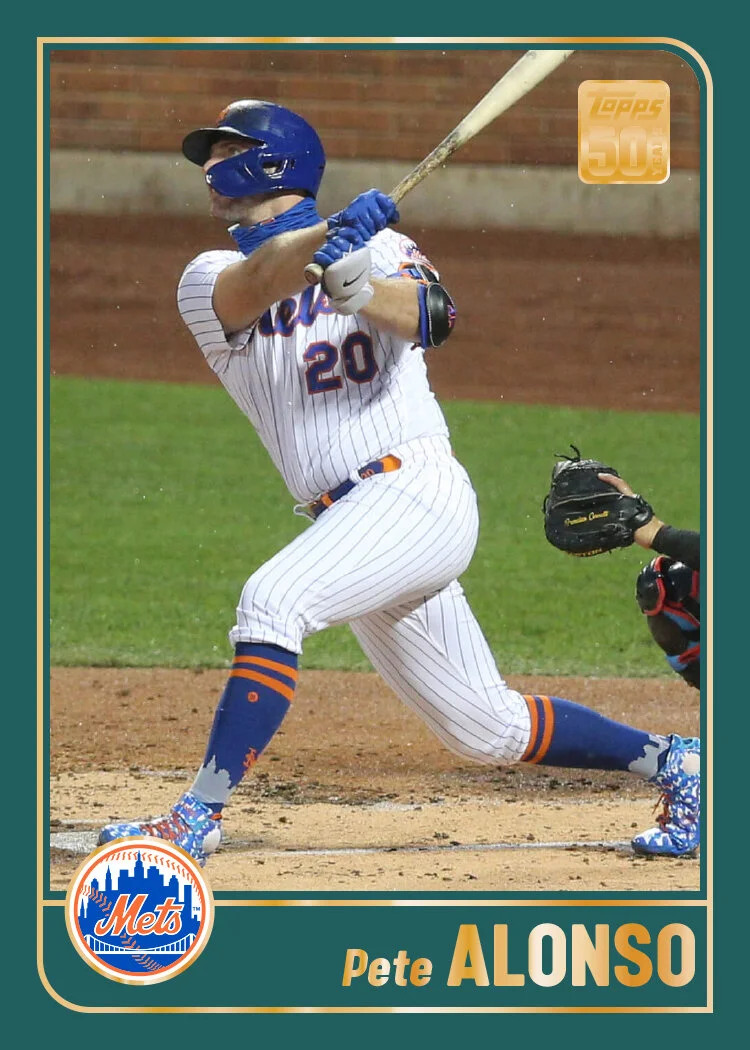
No long preamble this time. Just getting right to the cards.
2001 seems to have been a special year for Topps as they commemorated their 50th anniversary/set. So gold was required. This remix stays even closer to the original than my 2000 remix did. Obviously the spruce-y green borders are still here. They’re somehow neutral enough to not distract from anything. Plus it looks like a lot of the padding you see on the outfield walls. All this design really called for was a nice clean up. Gone are the extra thin lines just inside the left and bottom edges of the photo. I excised that little patch of “photo” above the last name on the original — partially because it’s unnecessary but also because it doesn’t allow for accents. The names stay in gold foil while I add an extra strip to connect the left and right border strips. That also lets me add a foil border to the team logo instead of all that bulky green stroke on the original. I also tweaked the Topps 50 Years logo a little to make it more compact, rotating YEARS 90 degrees counterclockwise and tucking it to the right of 50. It may be a little hard to make out on these mockups but it definitely helped get the whole shape closer to a square and not as rectangular.
This is probably the smallest degree of change you’ll see on these remixes. It’s a pretty simple design to begin with, so not a lot of room to go wrong and necessitate fixing.


