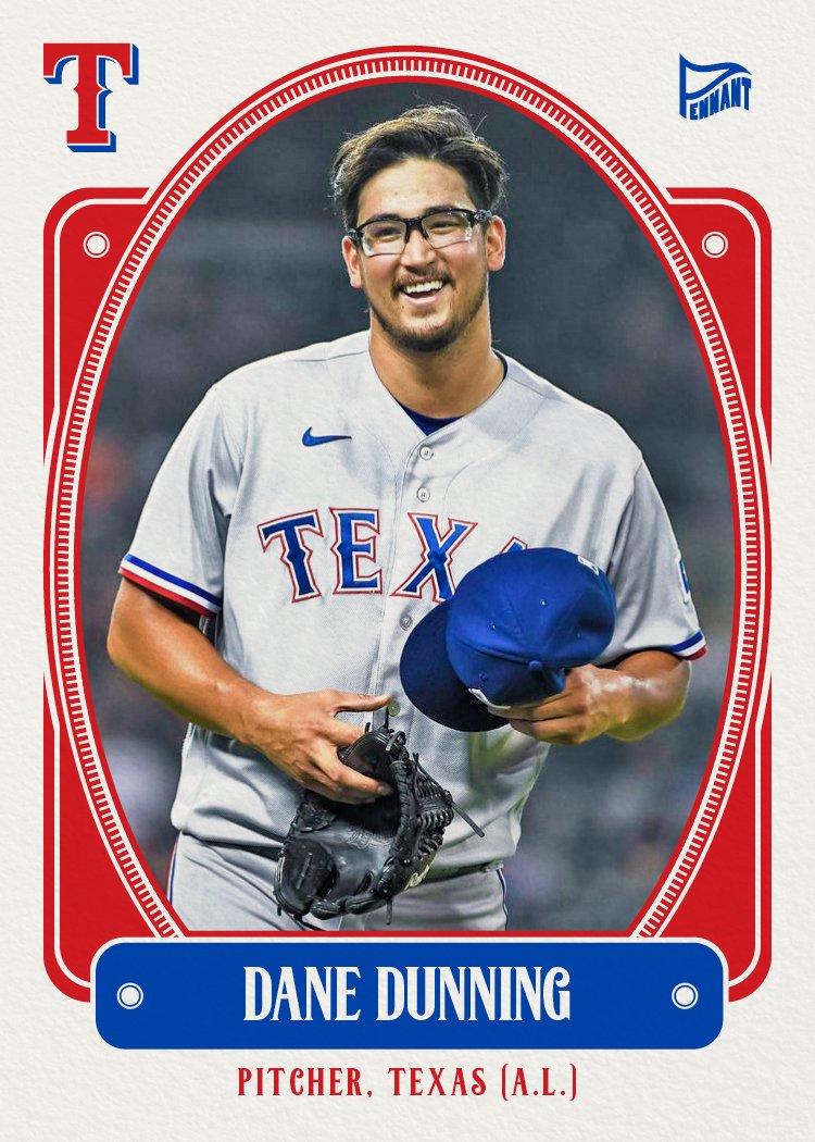
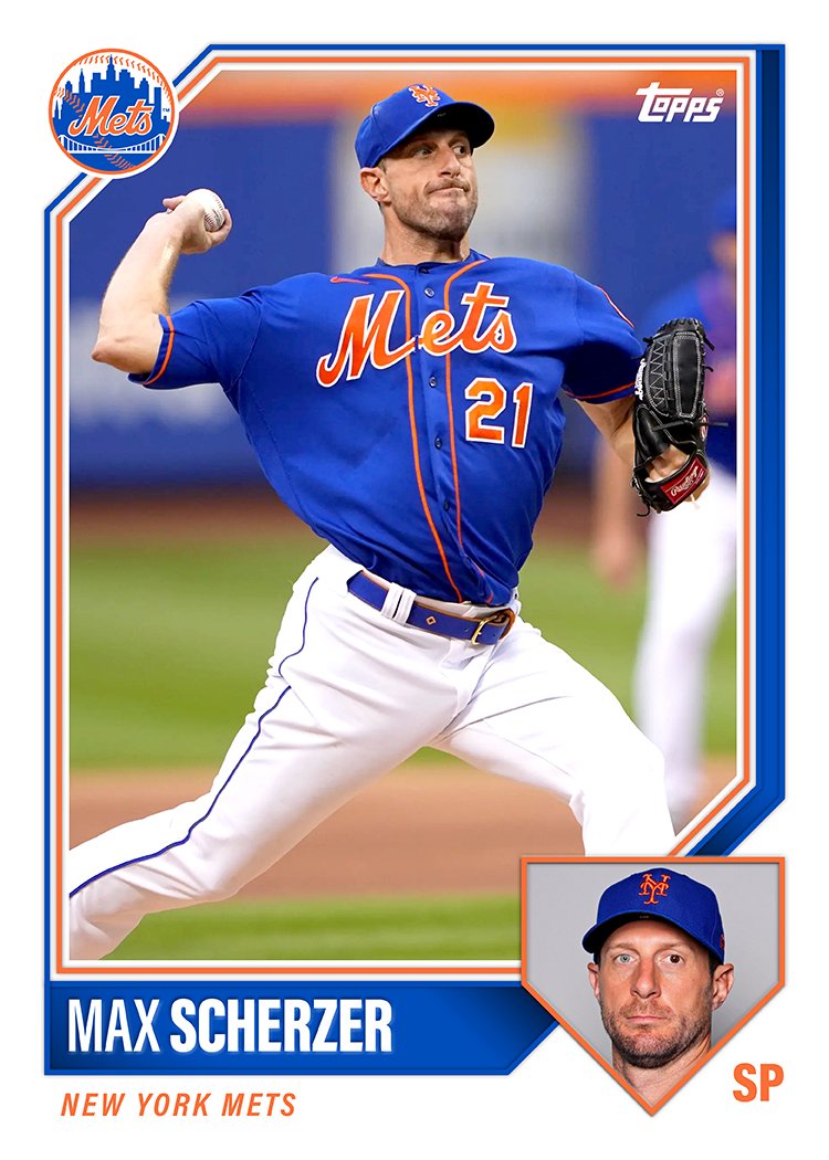
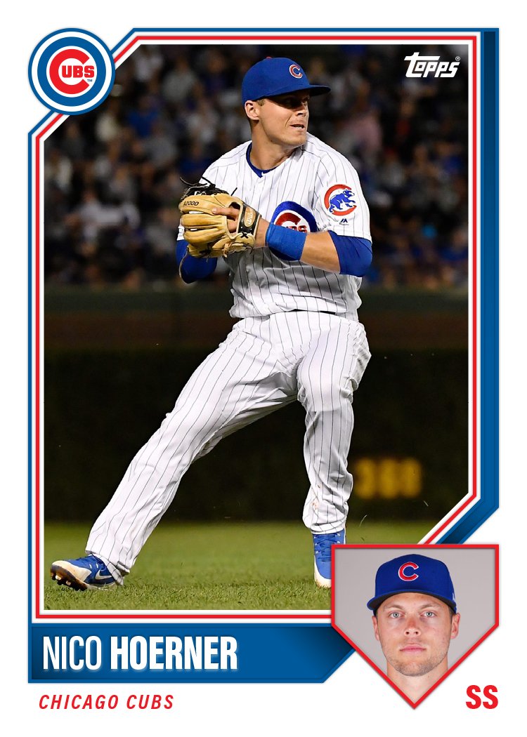
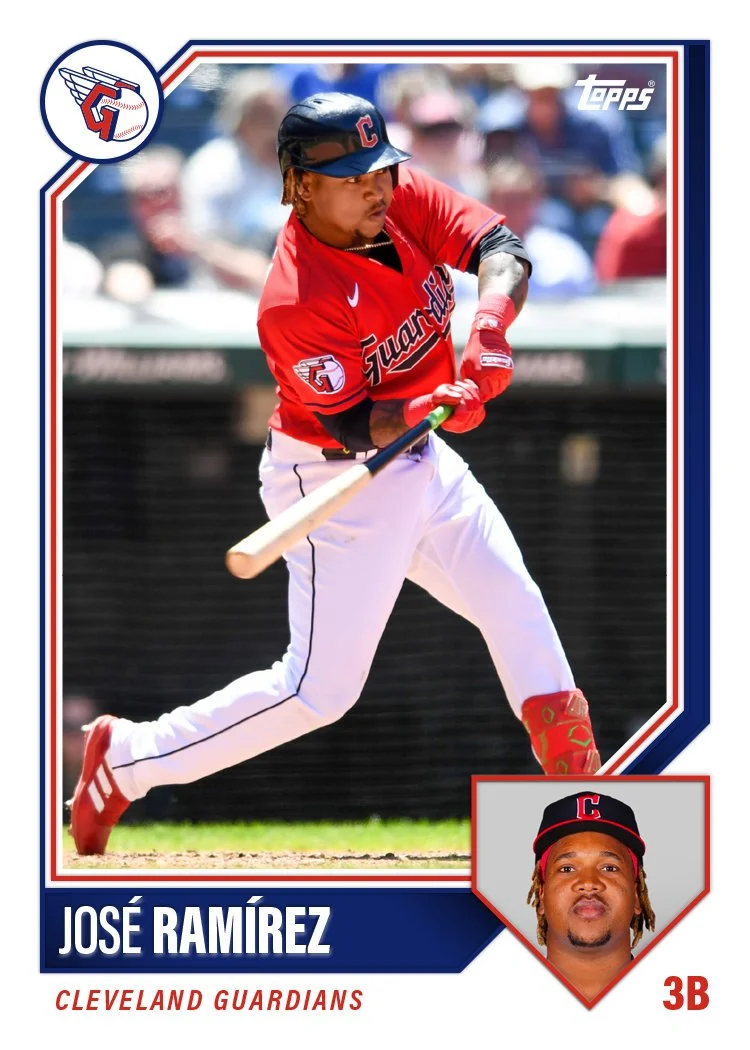
2024 Pennant Dream Team

Time for another Pennant insert.

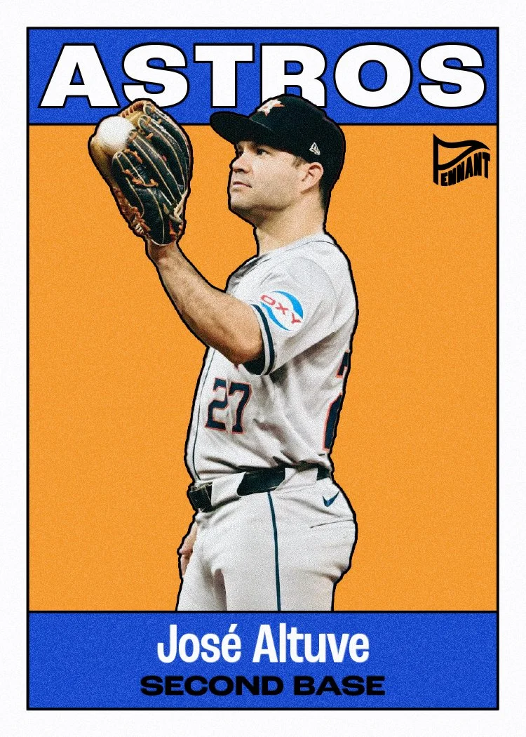
Keeping with the look of the 2024 Pennant base design, these feature black & white, high-contrast player cutouts over a gradient background. For these, I added a dreamy sky and baseball field overlay, so it’s not just a solid color block. Pairs well with the concept of the insert. I kept the text simple with “Dream Team” across the top and the last night along the bottom. No need to clutter with other info since these are the guys at each position. Here’s a look at the checklist I put together.

1B Bryce Harper
2B José Altuve
3B José Ramírez
SS Francisco Lindor
OF Mike Trout
OF Aaron Judge
OF Ronald Acuña, Jr.
C Adley Rutschman
DH Shohei Ohtani
UT Mookie Betts
SP Gerrit Cole
SP Corbin Burnes
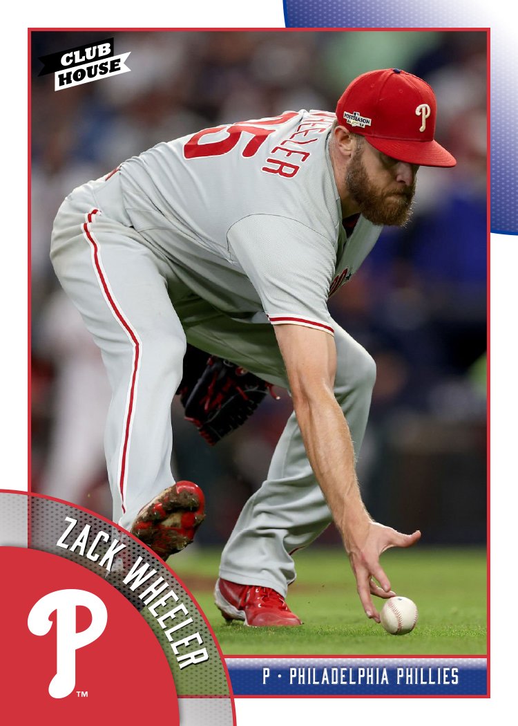
SP Zack Wheeler
SP Justin Verlander
SP Spencer Strider
RP Edwin Díaz
RP Emmanuel Clase

The starting pitcher rotation was honestly a bit of task, especially considering we’re in such an age of pitching. Verlander is there on account of this being timed to the beginning of the season before he was on the IL. Same with Strider. There just aren’t the lights-out names these days like there always seemed to be in years past.

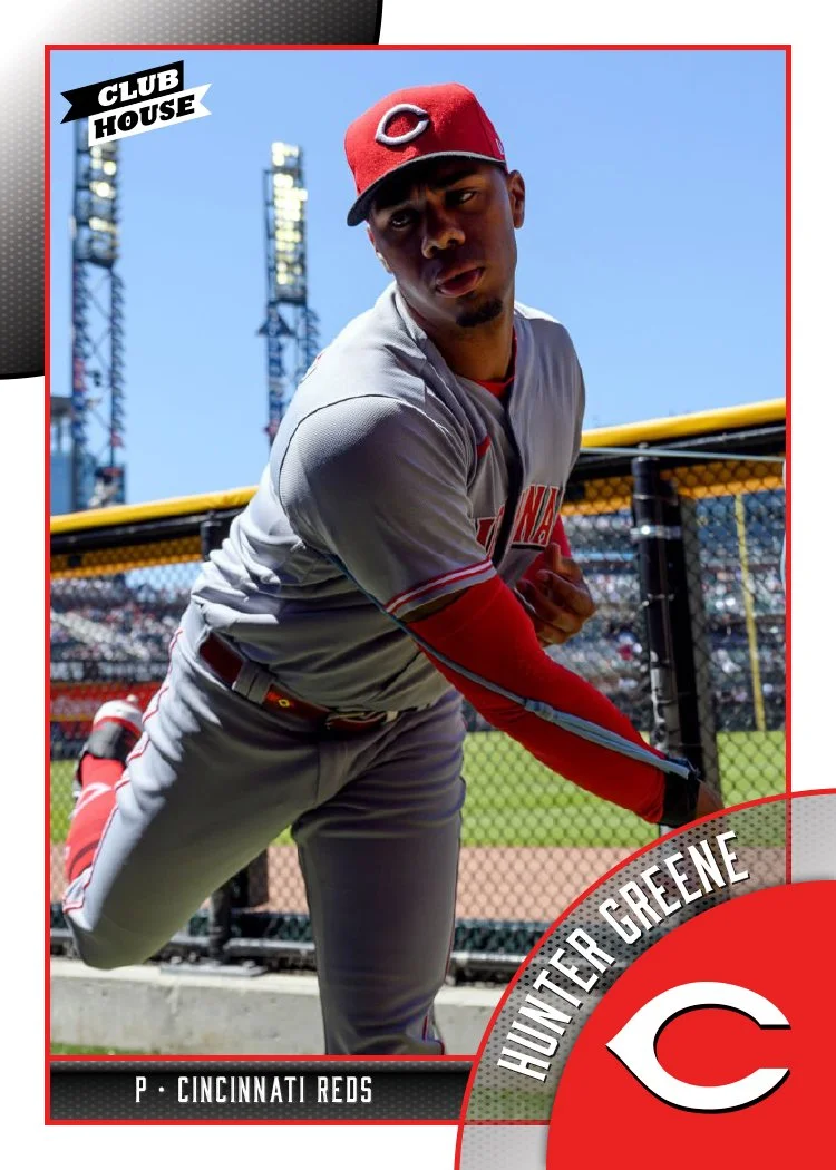
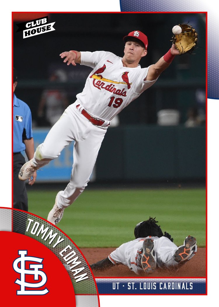
2024 Clubhouse All-MLB Team

Here’s a look at the All-MLB Team insert design for the Clubhouse set. I made them look a bit more chrome-like rather than foil-y like other stuff I’ve done in the past.

Looks like my third straight entry with some diagonal elements. Again, it works with the Clubhouse base design so I’m not too upset about that. The color scheme is red and blue to match the MLB logo, which makes an appearance in the bottom “wedge” here. The 1st and 2nd teams are differentiated by flipped colors and of course the big “1ST” and “2ND” elements along the right.

Gonna need to do something noticeably different for the next insert to break outta this groove. But overall I’m happy with what I’ve got going on here.

2024 Clubhouse League Leaders

Here comes another insert set for this year’s Clubhouse line. I’ve never done a league leaders set before so this is a first. I wanted to feature the top-10 finishers in double, triples and homers but with ties it ended up being a 38-card checklist rather than 30. Surprisingly, Mookie Betts and Shohei Ohtani would be the only repeats amongst the three categories. Here’s a look at the design.

Each category swaps out its shorthand in the bottom right corner, making it easy to differentiate the stats. The players’ tally is solid to the left of the big stat with some team color behind it to add some contrast. Above a white line slashing through the big stat is the player name over the other team color. And just behind the player is the “LEAGUE LEADERS” title at the top.

The diagonal elements work well with the rest of the Clubhouse designs for this year. And I always like to find a way to incorporate team colors into the proceedings. I tried to pick action shots that illustrate the category pretty well, hence the big follow throughs on the HR cards and running/sprinting on the 3B cards. It was also nice to do a card for guys like Will Benson or Ezequiel Tovar who don’t otherwise get a lot of love.

2024 Spirit All-Rookie Team

Let’s keep rolling with some inserts now while I have some momentum. Time for the Spirit All-Rookie Team set. This is a 15-card set with the top rookies at each position and 5 best rookie starting pitchers for the 2023 season. Here’s the checklist:

  1. Yainer Díaz - C

  2. Triston Casas - 1B

  3. Matt McLain - 2B

  4. Josh Jung - 3B

  5. Gunnar Henderson - SS

  6. Corbin Carroll - OF

  7. Nolan Jones - OF

  8. James Outman - OF

  9. Spencer Steer - DH

  10. Andrew Abbott - SP

  11. Tanner Bibee - SP

  12. Bobby Miller - SP

  13. Eury Pérez - SP

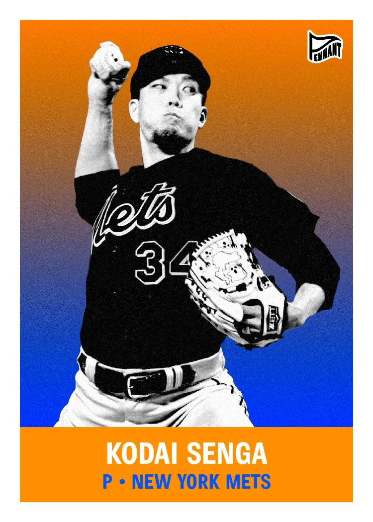
  14. Kodai Senga - SP

  15. Yennier Cano - RP

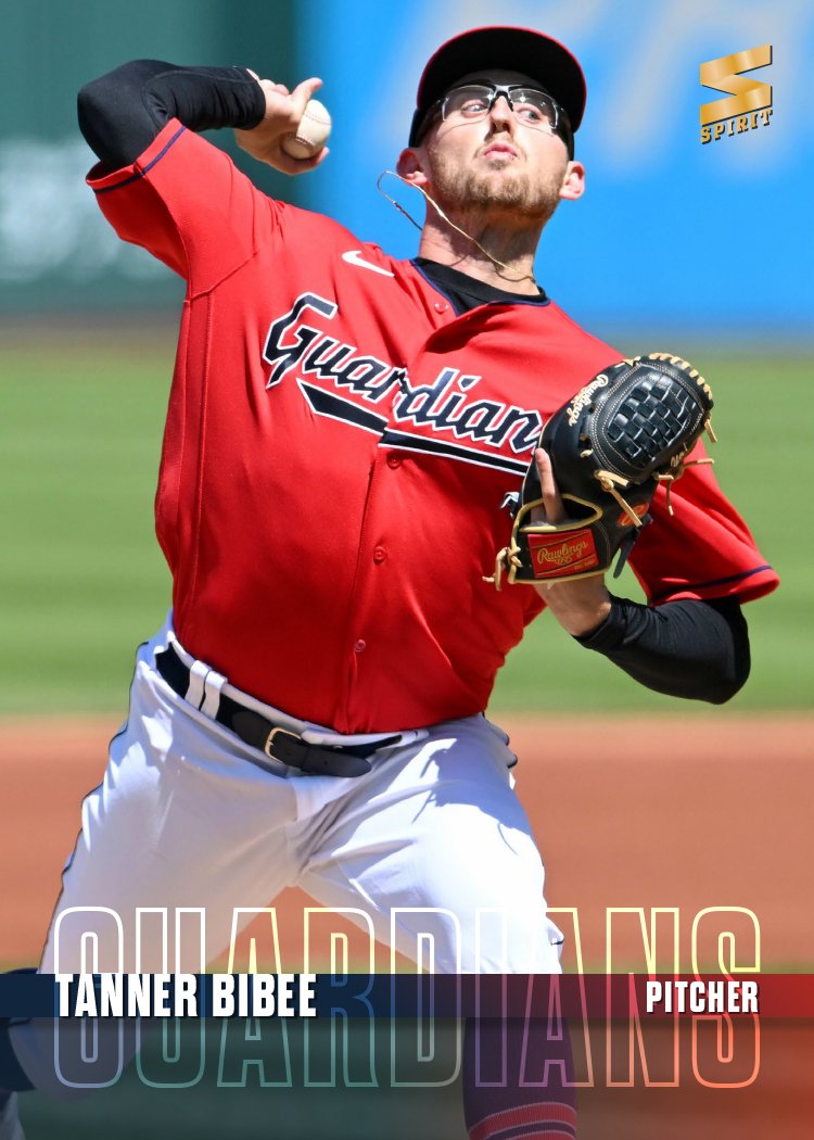
Design-wise, there’s a big diagonal bar running behind the player cutouts with the “2023 All-Rookie Team” text running over it. The “All-Rookie” portion overlaps the photo but with a little bit of transparency, the image shows through. The rest of the text is behind the cutout to show some depth. At the bottom of the card is another bar for the name and position running over the whole photo. The bottom right corner has a team color overlay and space for the team logo. The different planes and overlapping is meant to add depth and make things a bit more dynamic.

Here’s a look at the autograph parallels. Everything is the same but with a white autograph strip for the player signature. The original design really lended itself to an easy auto solution.

2024 Pennant Throwbacks

First insert for the Pennant set his year once again is the Throwbacks set, featuring players wearing, you guessed it, throwback uniforms. I had a hard time tracking down a lot of instances of teams wearing old-time uniforms in 2023. I blame the whole City Connect thing for that. The only ones I could track down were the Diamondbacks, Marlins and Rays. Expansion-palooza, minus the Rockies who have yet to really change their look since their conception.

The design has the same black-and-white cutout over gradient motif as the base set, though I tweaked the colors to match the team colors of the respective uniforms. The large ‘THROW BACKS’ type looks kinda like an old boxing flyer or something like that from the past.

There’s also a relic version with a swatch from the actual uniforms depicted in the photo. This one has a teal pinstripe, which looks pretty cool. The autograph version has the gradient and photo fading out to white at the bottom to leave room for a legible signature. I don’t think I had seen Arozarena’s sig before but it’s pretty cute, lol.

2024 Clubhouse All-Stars

Today is one of the most boring days of the year — the Thursday after the MLB All-Star Game, when there are zero games on the schedule and no games from the day before to discuss. It is, however, the perfect opportunity for me to post my 2024 Clubhouse All-Stars design, featuring members from last year’s midsummer classic.

Going off the vibe of the 2024 Clubhouse base design, these All-Star cards are clean but bright. Like I’ve done in the past, I used both blue and red in the design but swapped them on the AL and NL cards, respectively. (Mostly because I can never remember which color is “traditionally” associated with each league.) There’s a shiny, refractor-y star pattern along the top border to make these stand out in a pack. I think my favorite item here is the notation in the bottom right corner showing how many times each guy has been an all-star selection. Super satisfying.

2024 Pennant

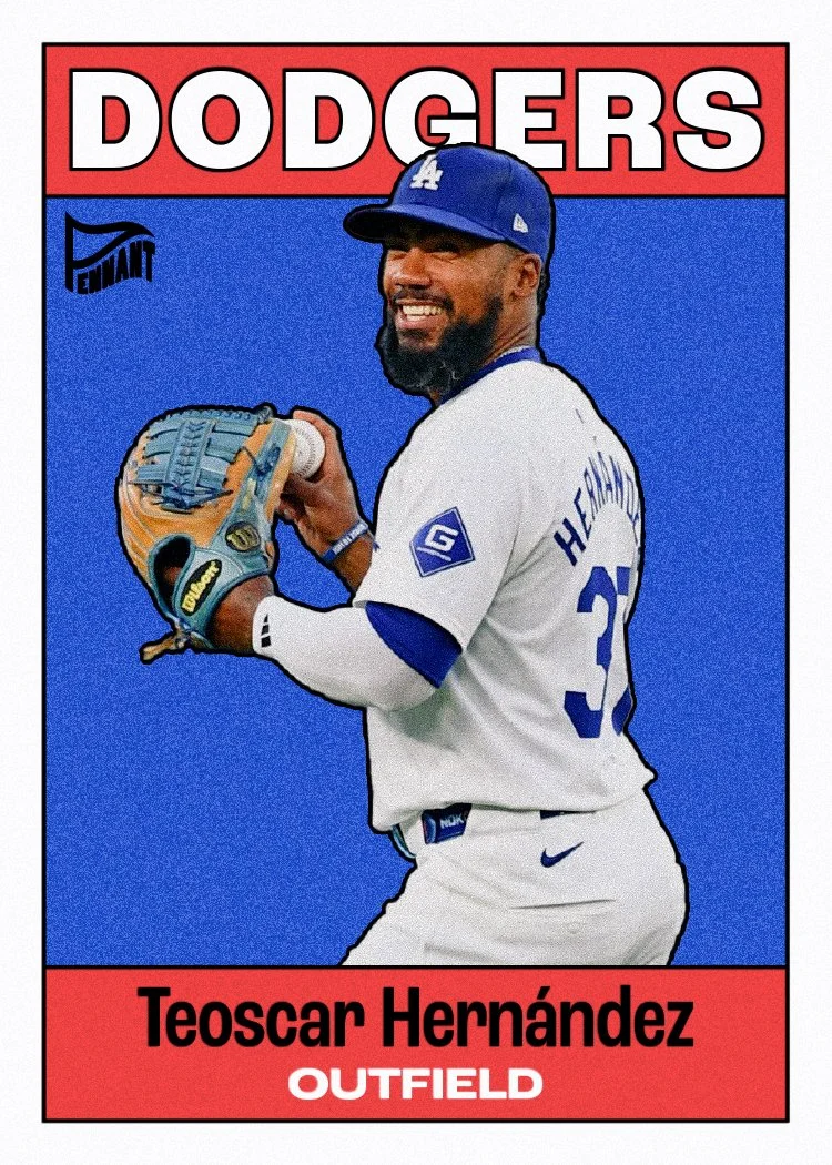
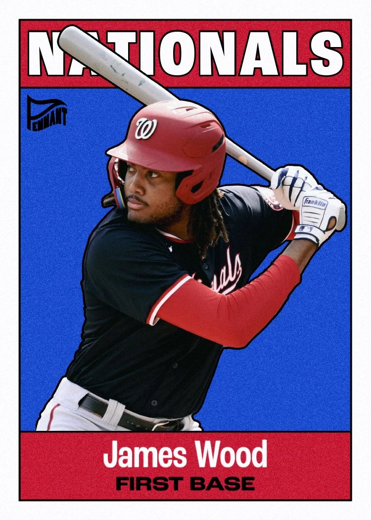
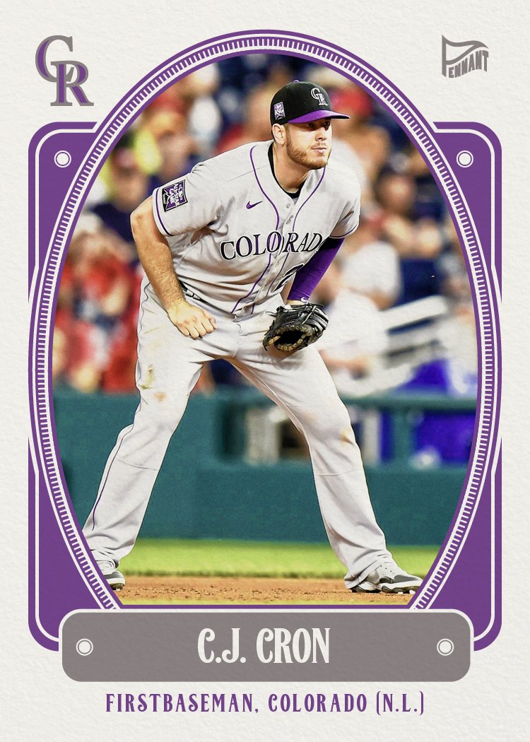
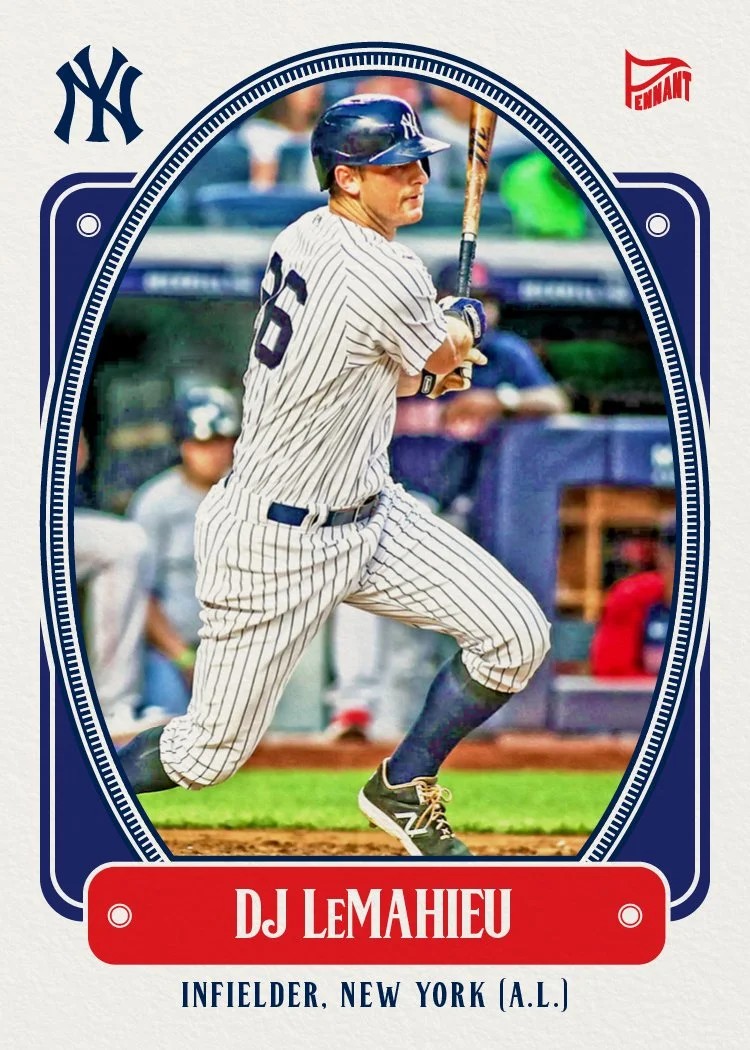
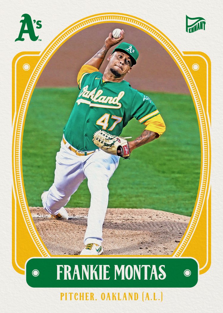
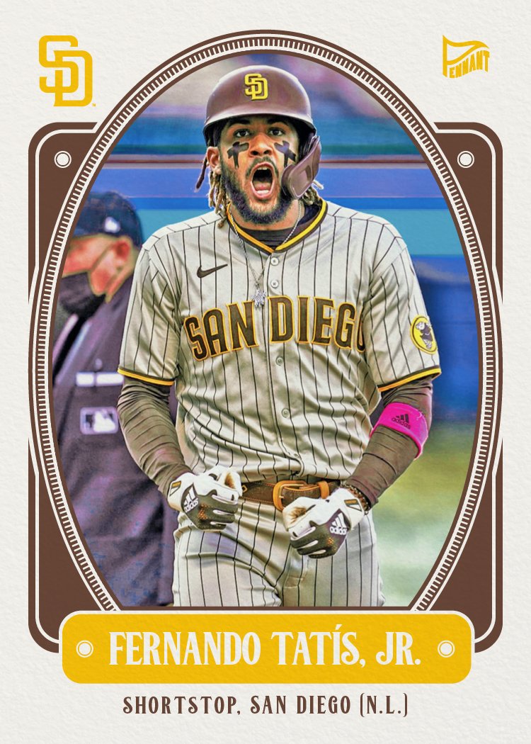
After accidentally deleting all the linked PSDs a month or two again, I just finished up redoing my 2024 Pennant set yesterday. Time to share.

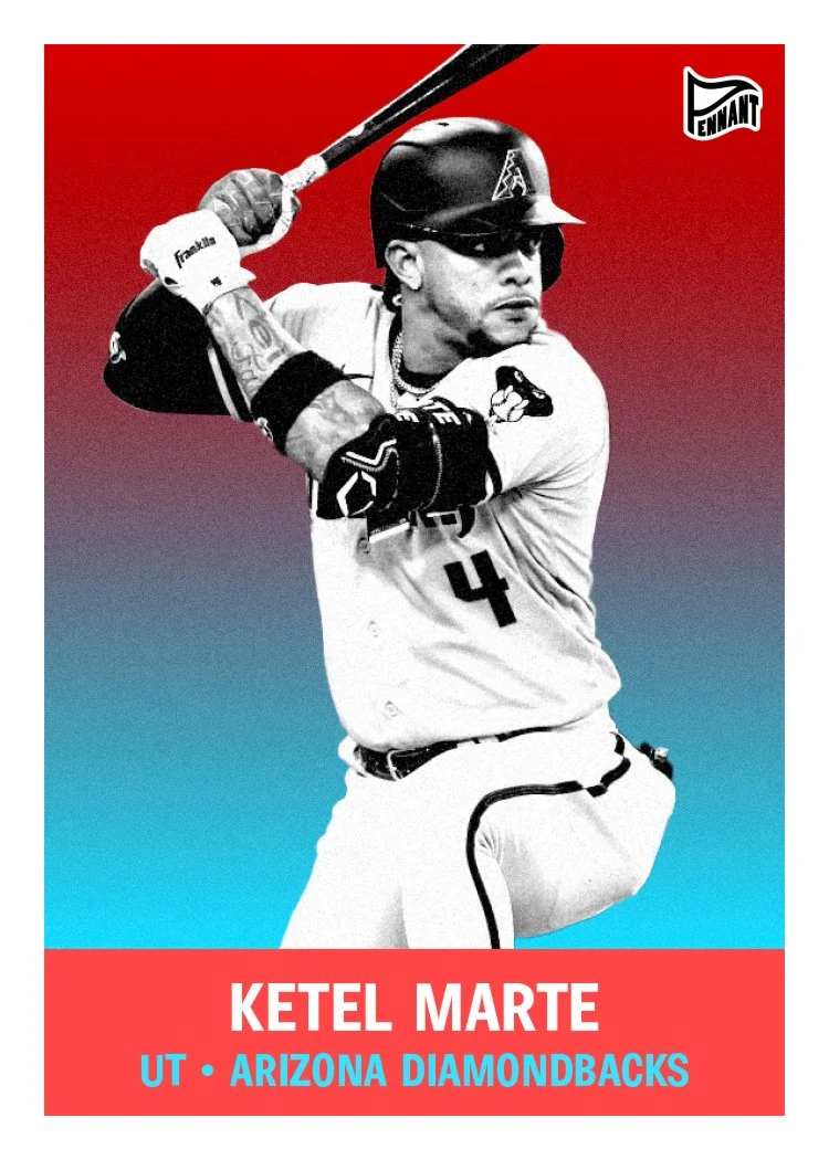
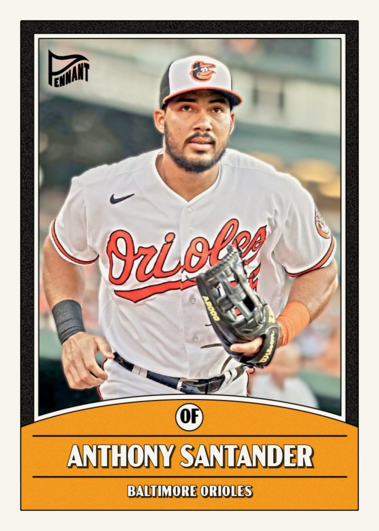
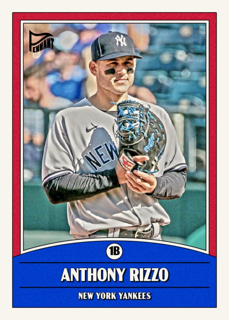
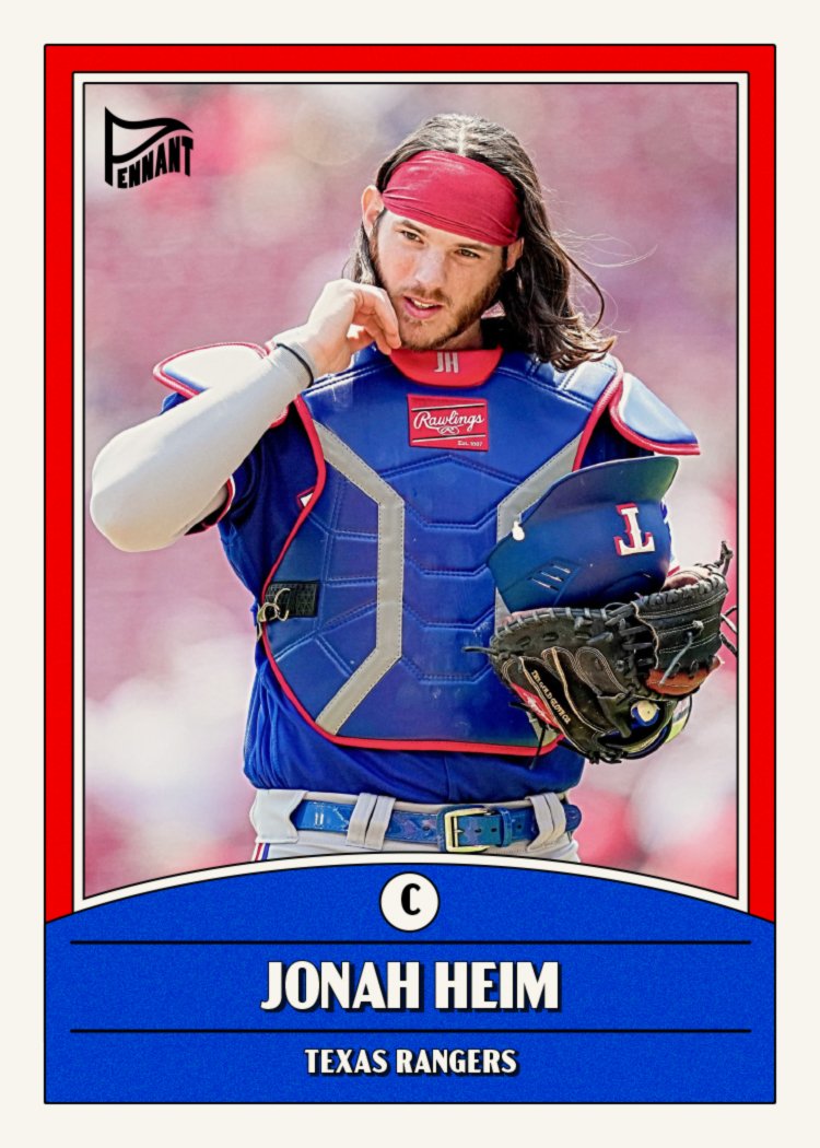
These are retro without calling back to a specific time period or design. Nuts and bolts of the design are basically a black-and-white high-contrast player photo on top of a color gradient and then a solid color block at the bottom for their name and team/position text. Rather than going with exact team colors, I decided to do what Topps did back in the day and assign each team its own combo of colors from a general color palette. It’s kinda of a hard task since there are so many red/blue teams in the league. To help that, I picked a couple different blues and a few different reds to mix things up a bit.

This was a fun set to do other than having to do the images two separate time. It did give me a chance to swap out Luis Arraez for the Marlins since he got traded to the Padres after my first go round. Hopefully nobody else featured here changes teams before I click “publish” on this bad boy.

2024 Clubhouse

We're a week into the 2024 MLB season and somehow I've yet to see a single inning of baseball. I guess this is the reality when you have a one-year-old to focus on. I've been keeping up with the league as best as I can through social media and the MLB app but it hasn't been easy. Luckily, I've been working ahead a bit on my 2024 designs and it's already time for the 2024 Clubhouse set.

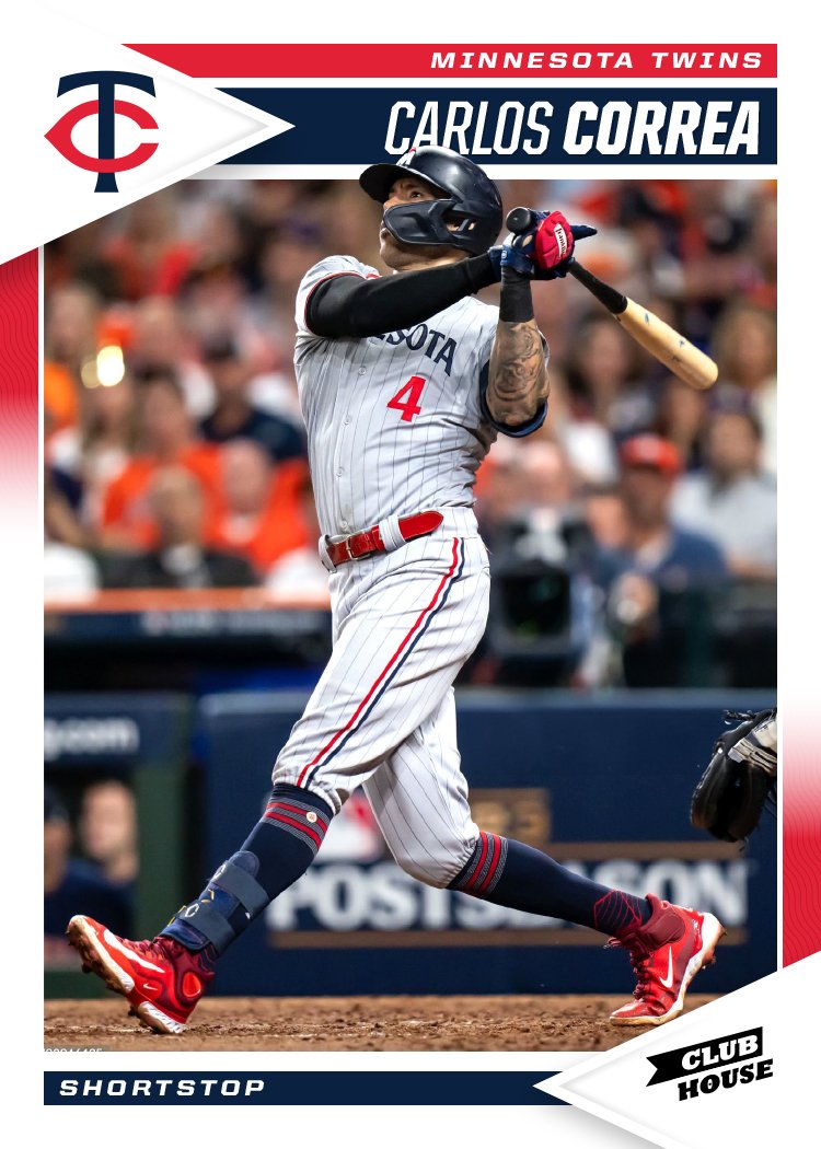
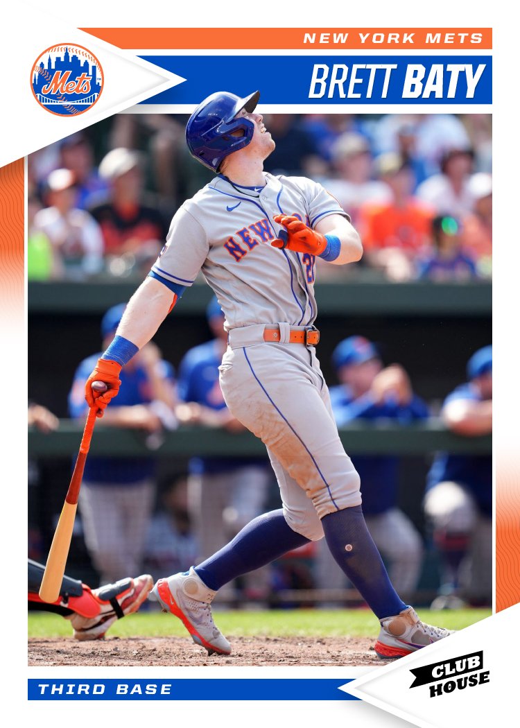
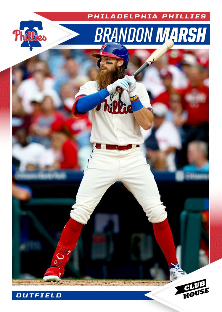
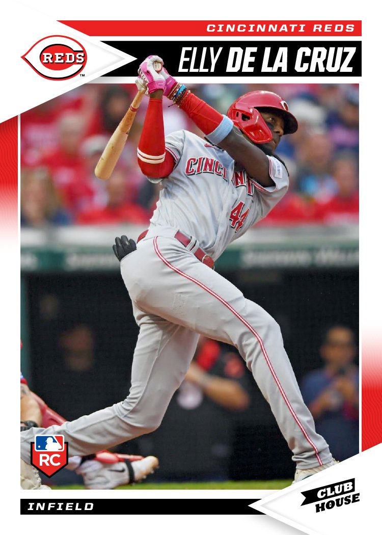
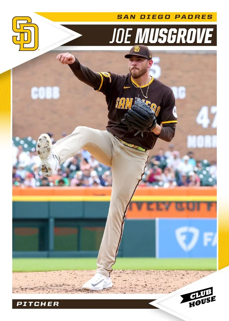
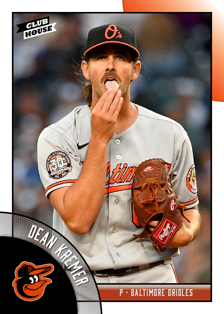
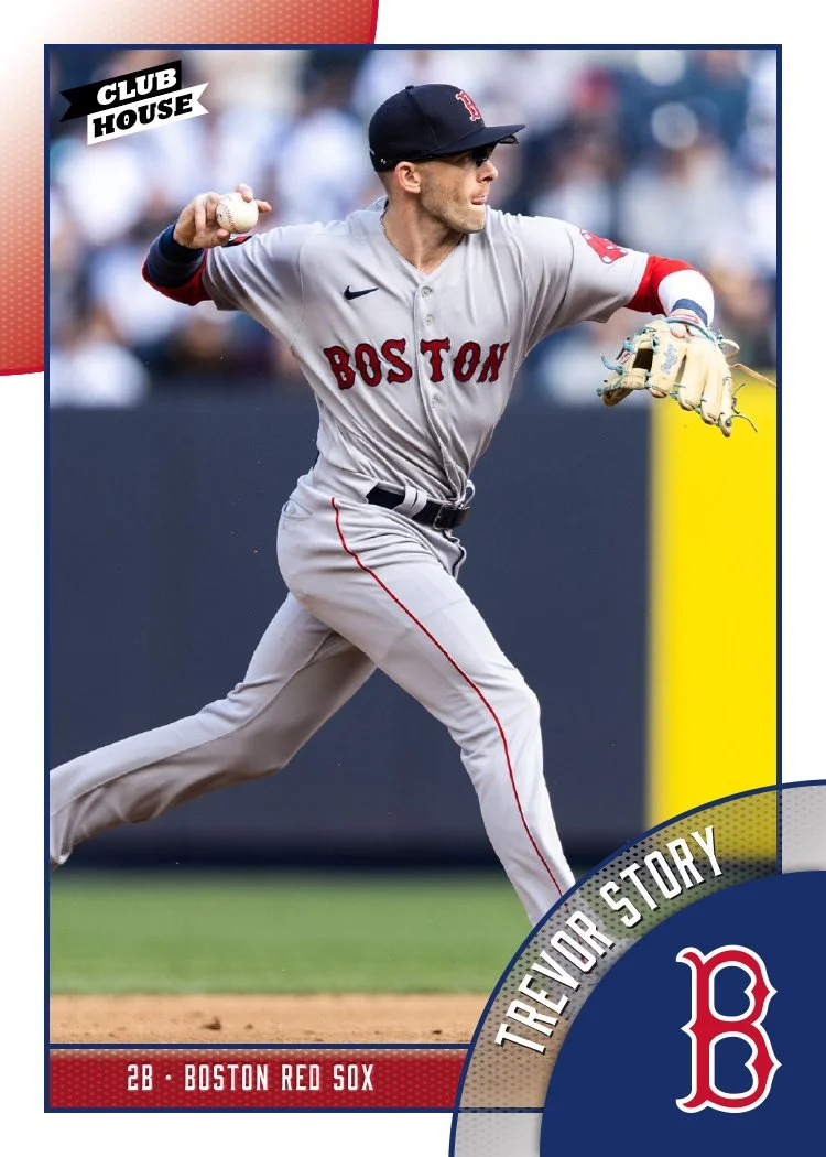
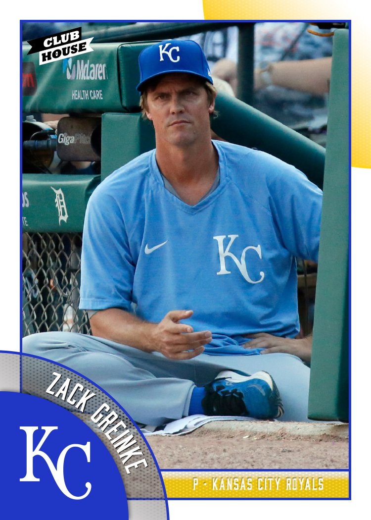
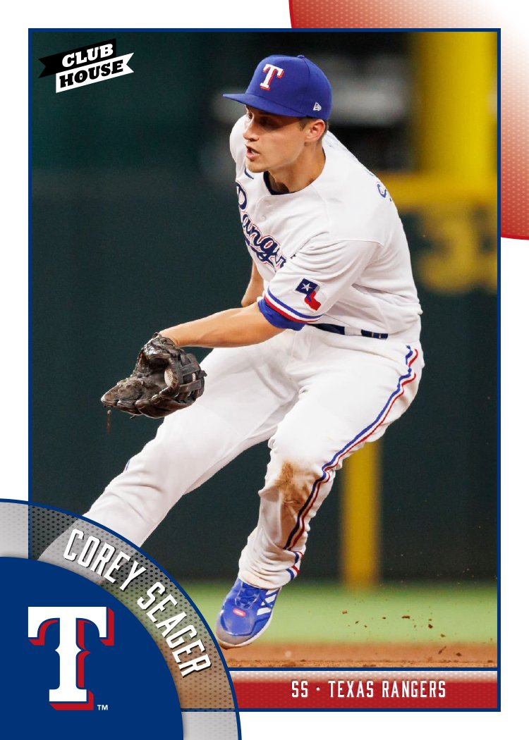
White border return with splashes of the team primary and secondary colors. There's a little bit of a pennant motif that pairs really well with the Clubhouse logo. Each photo finds space to break out of the frame a bit and overlap the name bar a least a little, though there are places like the Harold Ramírez card where it interacts with the name a bit more.

The vibe here is very "early 90's Score" which I've always been personally partial to. If Topps were to shoot for this with the Big League product, I think the response would be a lot more positive than what they've been getting.

2024 Spirit Base

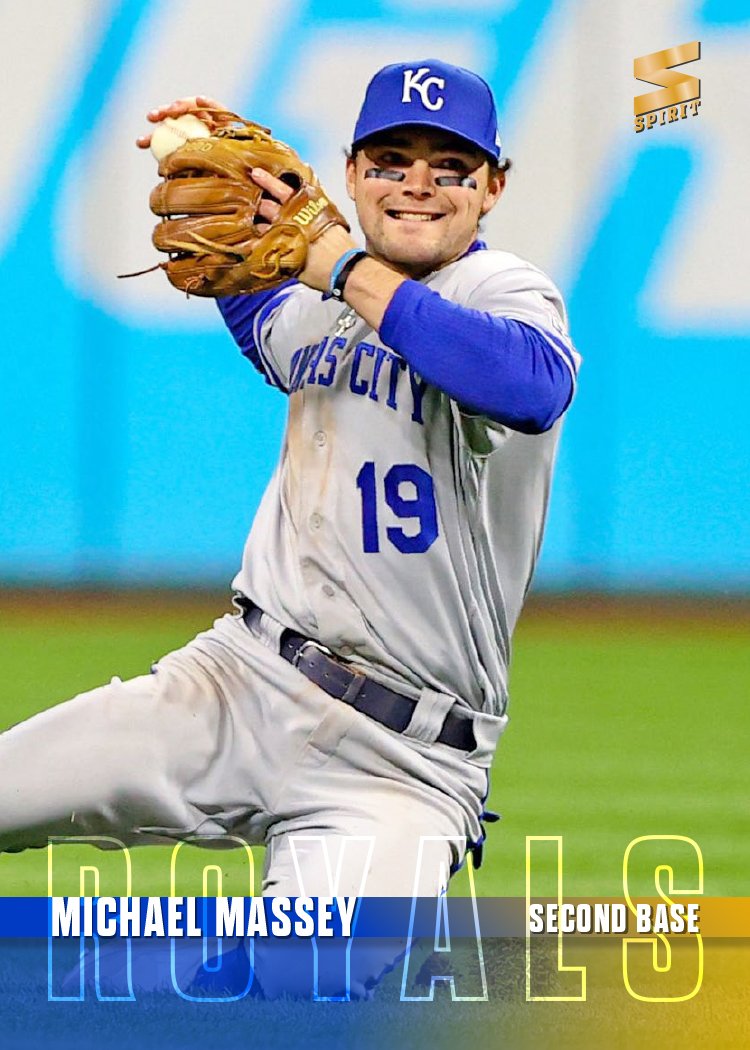
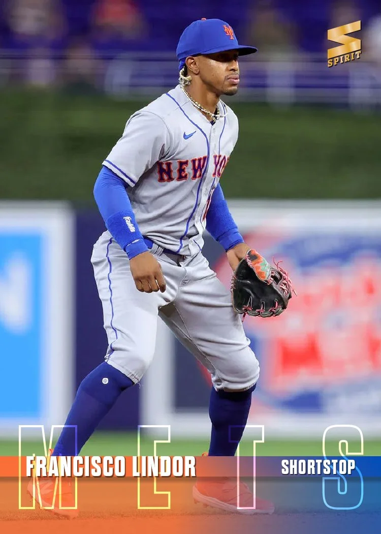
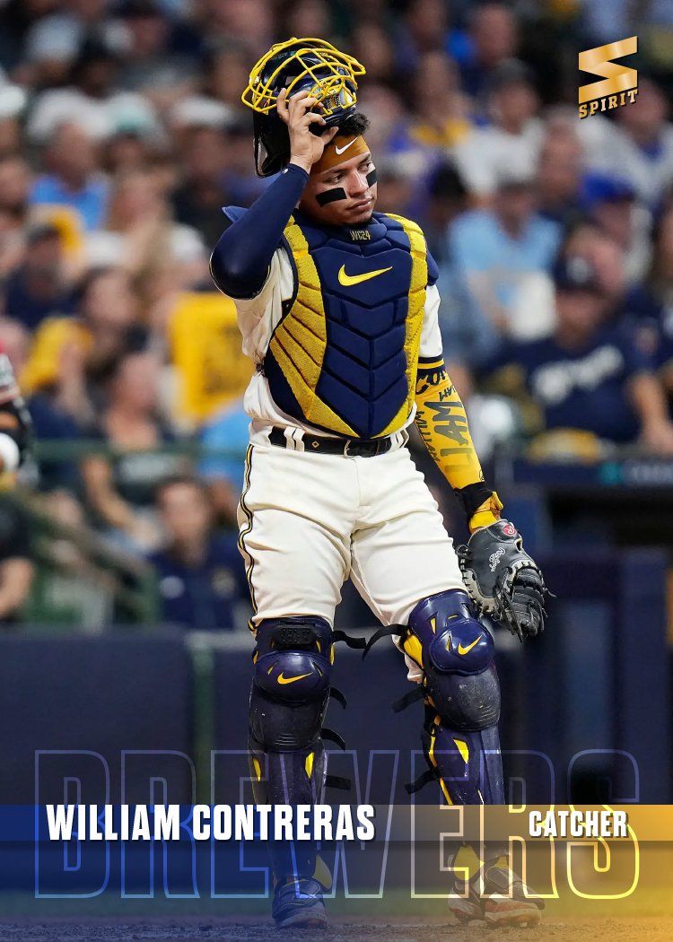
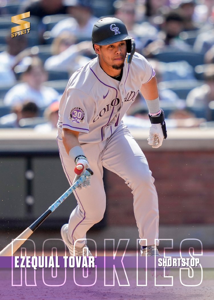
With Spring Training up and running, it’s time to share my 2024 Spirit base design.

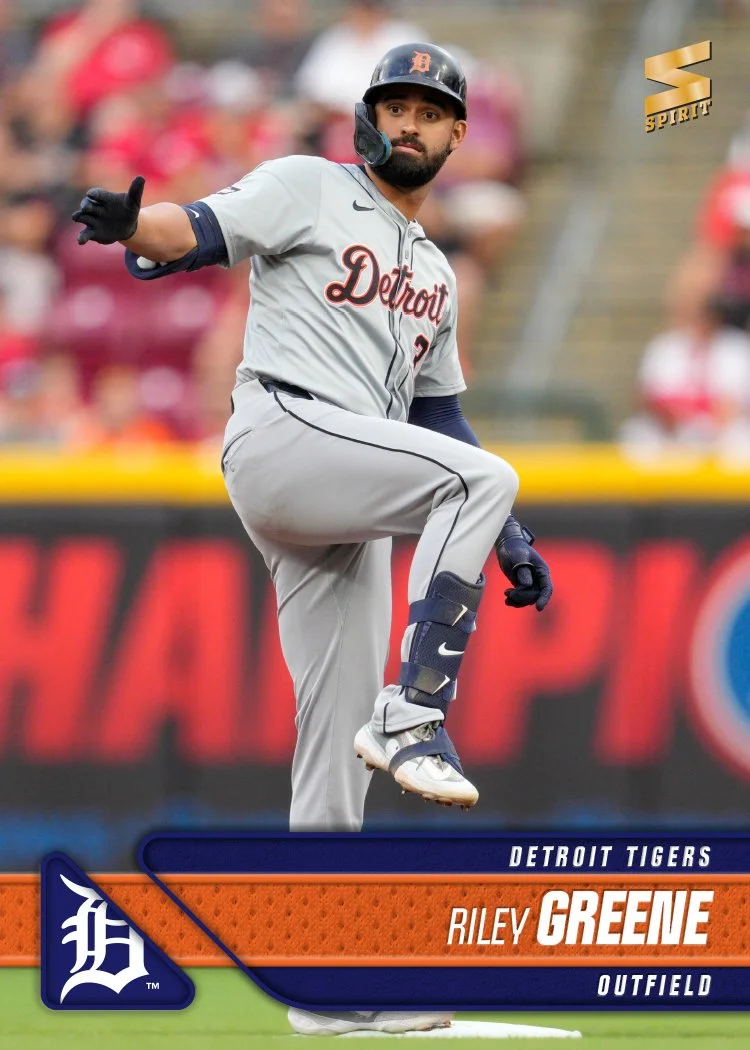
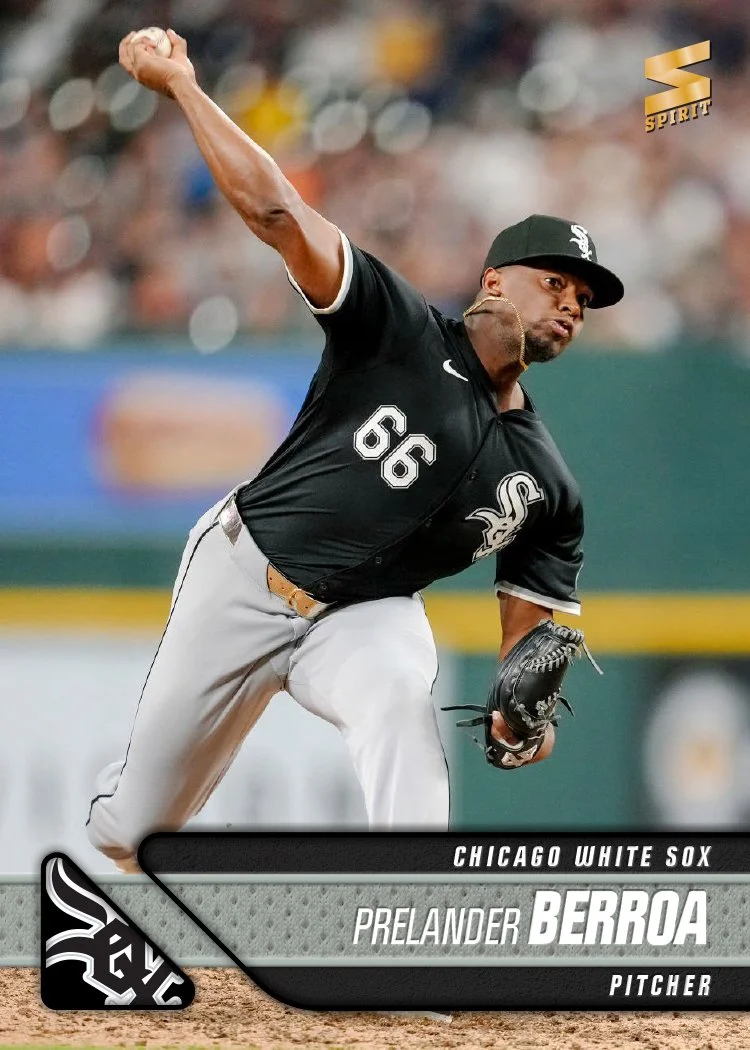
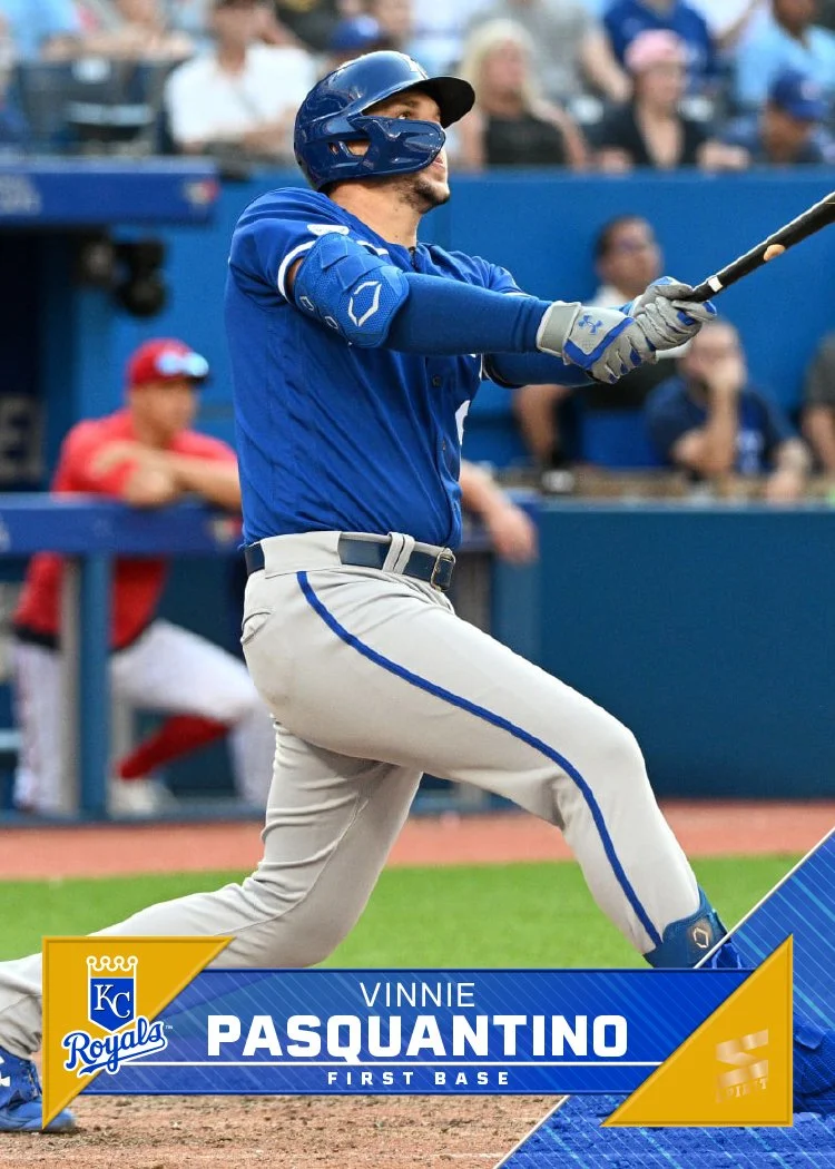
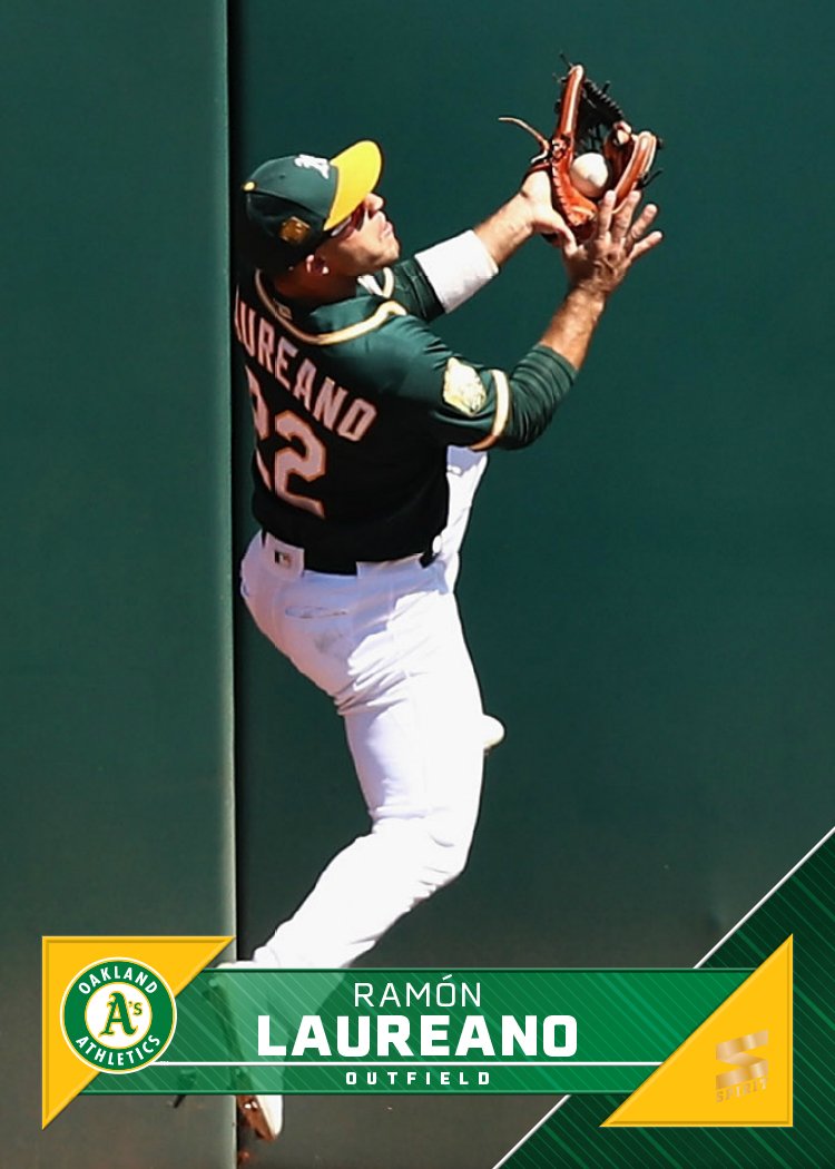
I believe this is the first time I’ve shied away from using some element of the team logo on a Spirit base design. The team names are big and stretched across the bottom of the card, overlapping a spectrum of the team colors. Tucked inside an opaque strip are the player names and positions. That leaves plenty of room for the photograph to be the main focus of the card. While simple, I find the design to be rather bold with the vibrant colors and the large team names.

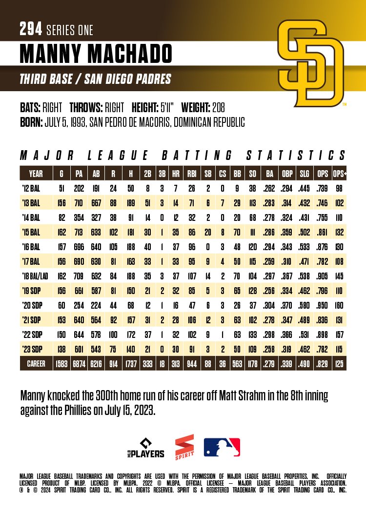
The backs are vertical as well with plenty room for full-career stats like Machado here. Team logos make an appearance on the back so they’re not completely absent from this year’s set. All in all, this is a pretty clean design for me as I’ve been using a lot of textures and effects in stuff the past few years. Not sure if this is an outlier or not but it was nice to do something a little different. Stay tuned to see what’s next.

2023 Pennant

Finishing up my 2023 designs is Pennant, the “retro” set in the Spirit family. I went with a 70s-ish look for this year’s design and for the first time kept the color palette limited to around 8 colors rather than doing team-specific colors like I usually do. While there is some overlap from team-to-team (I mean, there are so many red and blue MLB teams), I was able to keep teams in the same division from having a duplicate palette.

The photos also have undergone a treatment making them look less modern. It helps put the design in the right era and really drives home the “retro” feel in relation to the rest of the Spirit releases.

2023 Clubhouse

Before the 2024 designs start to drop, here’s a look at my 2023 Clubhouse set. This is meant to be the “fun” set for low-budget collectors. I tried to ramp up the fun here by featuring as many out-of-the-ordinary photos as I could.

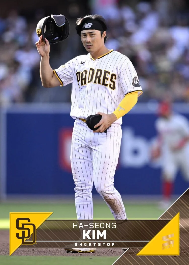
I think the Randy Arozarena one is probably my favorite, though the Ha-Seong Kim one is pretty great, too. Design-wise, these are meant to “connect” from card to card as you can see in the grid up there. The colored circles will line up at the edges, à la 1990 Topps. That means that not every, say, Mets card will have the logo on the right side. The next card in the checklist would have it on the left, then right, and so on. I just did the teams like this so you get the gist.

The player names arch along with the logo slice which is nice to have instead of on a straight line like usual. The position and team name do run next to it on the secondary color block to help balance the palette a little.

Overall, I think these strike the right balance between being fun but not too crazy, with a big assist from the photography. Bright and colorful without anything too over the top. I’d have been a big fan of something like this as a kid.

2023 Spirit Base

Sneaking this in before the ball drops on the year, here’s a look at my 2023 Spirit base design for every team.

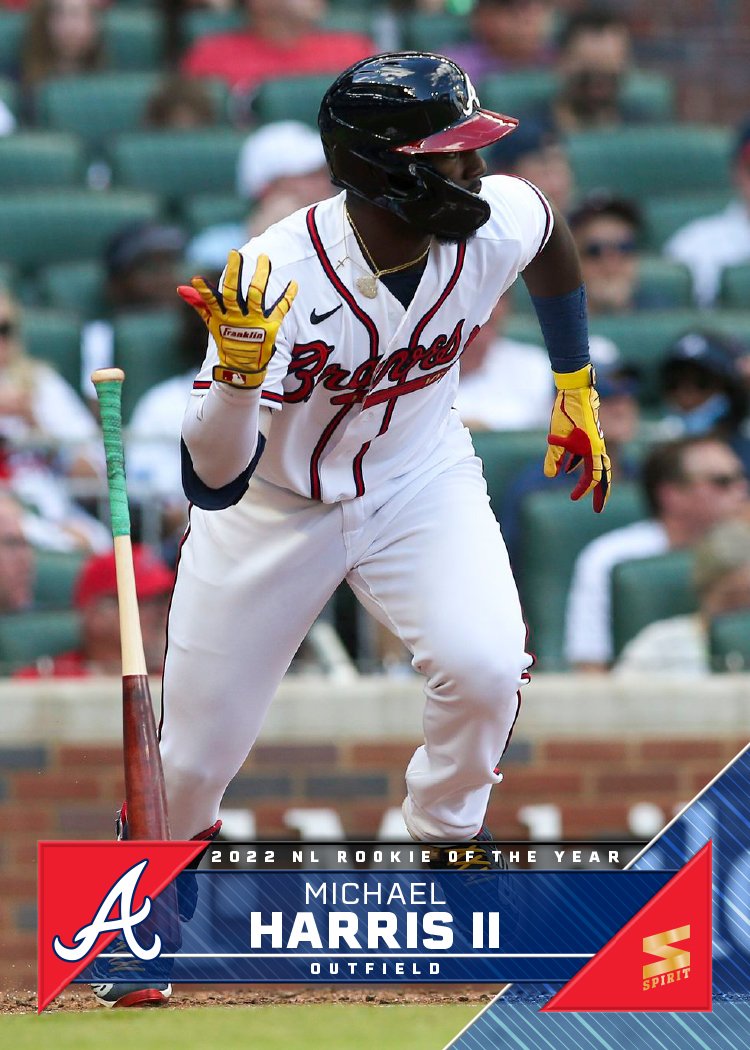
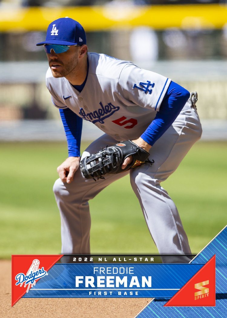
As it’s tradition by now, the design features a full-bleed photo the visual elements color-coded by team. The look on this year is sort of a triangular scroll with the player name position in the middle with the team logo on the left wedge and the Spirit logo on the right wedge. I added a bigger triangle to the bottom right corner to help balance the composition and also add even more team-identifying elements.

Like last year, I had a few different designs I tried out before arriving at this one. Here are the ones that didn’t make the cut.

The last two here were riffs off the same basic hook with the last one winning out. Ultimately, though, it couldn’t top the design I chose in the end.

I’ll try to do some more design dumps before the new year to show I haven’t been completely slacking. Hopefully 2024 will allow me more time to get back on the horse here.

Mocktober, Pt. 2

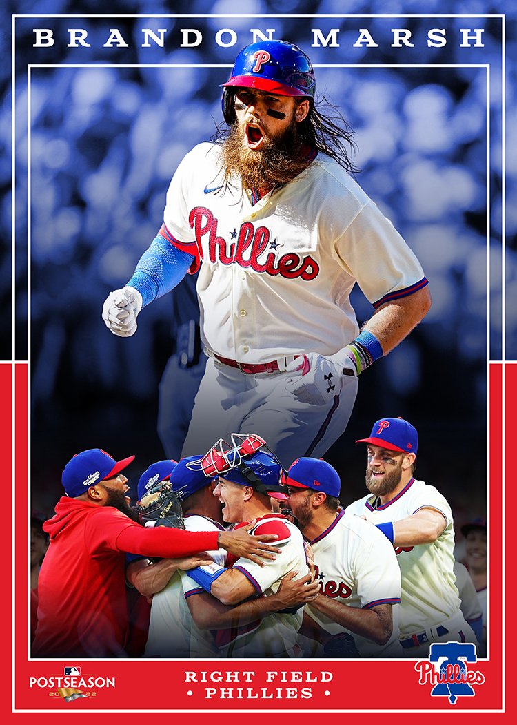
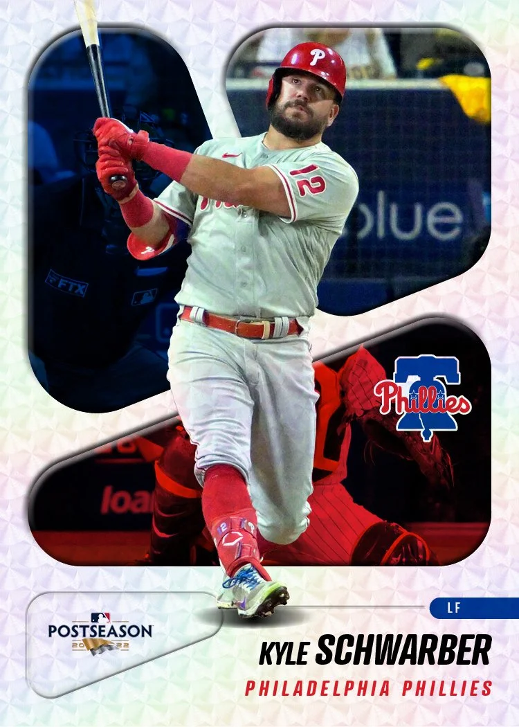
November is here, which means a chance to gather all of my Mocktober designs from this year’s MLB Postseason. Just like last year, I created a unique card design for every postseason game featuring the “player of the game” for each contest. With the expanded playoff format this year, I knew I’d be doing more cards than previous years. Luckily, the way each series played out there weren’t an overwhelming number of extra games. The final count was 40 cards this year compared to 37 last year.

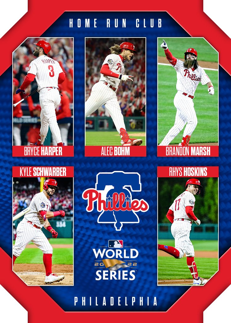
Jeremy Peña was the most featured with 4 individual cards. That makes sense since he was the ALCS and World Series MVP. Yordan made it onto 3 cards (with Peña getting a cameo on that final WS card). There were a couple of firsts for me this time around. Thanks to the Phillies’ historic homer-fest in Game 3 of the World Series, I did my first 5-player design. And then the following night, Cristian Javier and 3 other Astros pitchers combined for a no-hitter. In trying to figure out a way to feature them all without making another multi-player card, I focused on Javier while giving the rest of the crew the old hologram treatment. Thanks to some Photoshop tutorial vids on YouTube, I feel like I did a decent job with the hologram effect.

Looking at the whole lot now, it looks like I had better ideas as the postseason went on. I think that’s almost exclusively thanks to the number of games happening each day in the first round. That old adage “done is better than perfect” was definitely in play there. But this whole exercise is precisely about churning out ideas and trying out different things. All of them aren’t going to be great, but they’re all valuable.

2022 Pennant

There is no baseball until Friday. We have only 4-7 games of 2022 baseball left. Seems like a perfect time to get around to posting the rest of my 2022 Spirit stuff (though I’m sure I’ll be doing that well after the World Series, too). I’ve done the Spirit base set, the Clubhouse set, and a smattering of inserts for both. Next up is the Pennant design.

If you’ll recall, Pennant is the “retro” set. I use that as a vague direction to basically go for whatever non-modern vibe I feel like rather than trying to focus in on a specific era or set from the past. Anything that’s not objectively modern or contemporary will usually work for the brand.

There’s a look at the design spread across all 30 teams. White(ish) borders with team color cameo-style photo frames. I tried a few different looks for the frame details before sticking with this here. Some were too plain, some too gaudy. I think this hits the mark. I also did a “retro” treatment on the photos to make them look a bit old, though didn’t go the full Gypsy Queen route. I wanted to make sure the card were still bright and colorful.

Not sure if I’ll get around to doing inserts for this set, but I think the base design here is probably one of the most solid I’ve done. I have a couple of recurring insert themes I could easily revisit if the mood strikes. Stay tuned I guess.

2022 Spirit Award Winners

Other than when I’m remixing/tweaking previous designs, I try to do my best at being original when making new cards. Sure, there are a lot of intentional nods and references to other designs, but I usually shy away from blatantly lifting someone else’s work and calling it “my” design. But when I saw this tweet from MLB on Twitter, I couldn’t help but think what a good card design it would make.

It’s a nice presentation of two players on two different teams showing them on equal footing. Though I didn’t do it on last year’s set, I have utilized a 2-up design for the Award Winners insert in past years. This seemed like the perfect way to interpolate this graphic into a card.

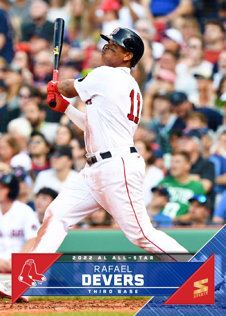
Putting the AL and NL Gold Glove and Silver Slugger winners at each position back-to-back fits perfectly. I designated the AL side as blue and the NL side as red, screening back the league logos in the big color boxes on the bottom. I really liked how the original graphic had the skyline/trees in there but I don’t think every MLB city lends itself to that conceit as well as NY and LA do. Other than adding the player names at the bottom and some gold/silver to the scheme, it follows the “inspiration” pretty closely. I did run into the issues of finding photos that fit together as well as the Cole/Trout combo. The Devers/Riley card works beautifully but when it came to finding fielding photos for the Gold Glove guys, it was a bit more challenging since great fielding isn’t always well-confined to a vertical frame. Minor quibbles.

Free Idea Here for the Taking, Topps

So even though the 2022 MLB season is still a long ways from wrapping up, I’ve been looking ahead to 2023 (and not just because the Giants have been a frustrating mess to watch and almost certainly won’t be participating in the expanded postseason this year). See, we’re already past the time when Topps usually reveals the design for the following season’s flagship set. It’s a nice way to break out of the slag of seeing the current year’s design through he numerous releases on which it will be featured (S1, Opening Day, S2, Chrome, Update).

But when Fanatics signed an exclusive deal with MLB to produce cards (among other stuff I believe), it basically meant the end of business-as-usual for Topps and their baseball card stranglehold. While Fanatics did end up acquiring Topps and allowing their legacy to continue, there haven’t been that many noticeable changes in the landscape after the deal was struck. I imagine that’s mostly due to the fact that Topps’ original deal was running through 2022 and the calendar hasn’t turned over yet. But like I mentioned before, “next year” usually starts in the middle of this year when it comes to baseball cards. As it stands here in mid-August, we still haven’t seen what’s in store for 2023.

One thing that’s been pointed out by a few people online is that Topps has followed a pattern of utilizing inset photos on their design every 20 years starting with the 1963 set.

Now, I don’t know if this was intentional on their part, and I’m sure the people around Topps weren’t there in 2003 or 1983, so there’s no guarantee this pattern will continue for the 2023 design. Something tells me that even if the people making design decisions for Topps are aware of the pattern, it’s not going to weigh too much (if any at all) in what they think a 2023 Topps card should look like. BUT, there’s an understanding amongst collectors that the 2023 flagship design should have an inset photo. As a designer, I like having parameters like that as it works as both a bit of a challenge and also some guardrails. So I figured I’d try my hand and making a “contemporary” card design that fit into the legacy.

I decided to try different shapes for each design just to explore the options. While 1963 and 1983 both had just circle inset photos, they went with a general baseball field shape for 2003 which I think works really nice as an obviously baseball identifier. On design 1, I used another common baseball shape (home plate) that works well with portraits. The rest of the design has elements of 1987 Topps (beveled top left border with team logo) as well as some double-stroke borders from various other years.

Design 2 has an inset shape that recalls Hall of Fame plaques though isn’t the exact same shape. I didn’t notice it until someone pointed it out to me on Twitter but this design is very reminiscent of the 1992-93 NBA Hoops set. I was a little embarrassed but then I remembered how awesome that design is and got over it.

I tried a diamond/base shape for design 3 but it doesn’t lend itself to mugshots too well. Perhaps if it were bigger it wouldn’t cut off as much of the photo, but then it would end up throwing everything else off balance. The little bowtie shape to the left and right of the portrait also led to some challenges. I filled one side with the team logo but the position side doesn’t work as well.

And on design 4, I went with a plain old circle because sometimes the obvious choice is the best choice. The rest of the design is pretty basic with a diagonal space for the name/position adding a little dynamism and keep it from retreading 1983’s ground. After I had the basic compositions down, I added some “effects” since Topps can’t not do that. Nothing too obnoxious, just enough to add some depth.

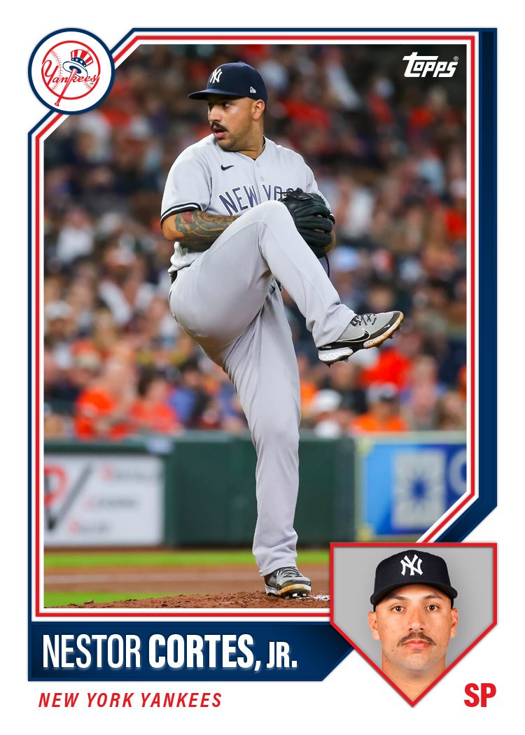
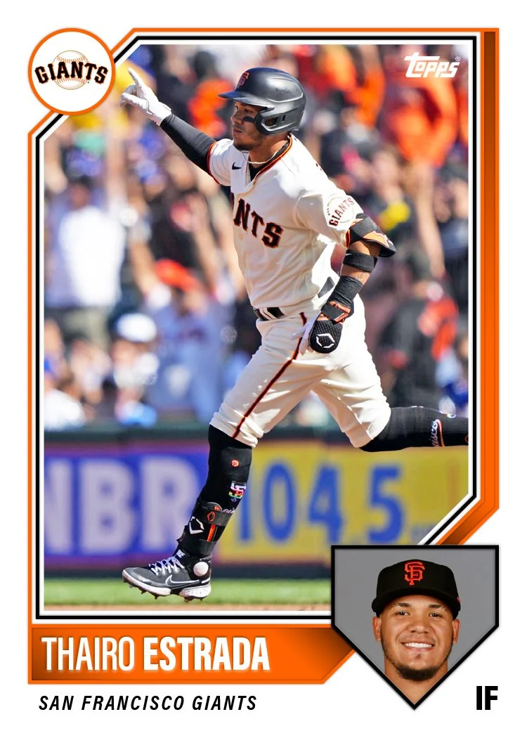
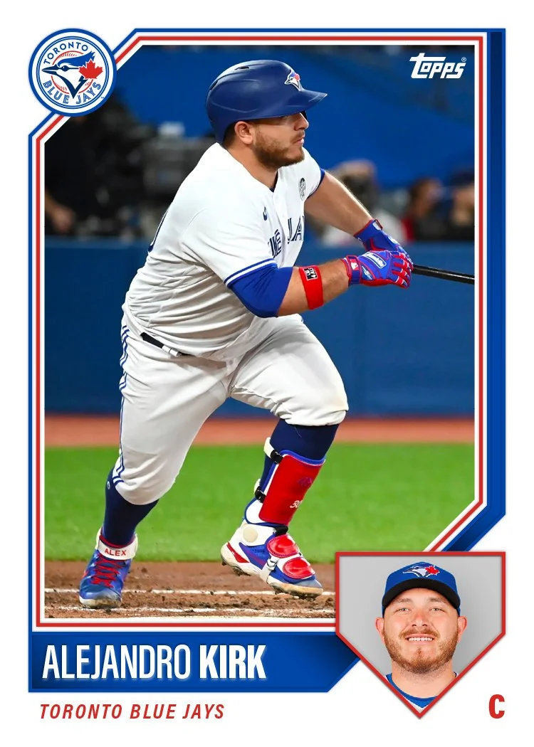
After sharing these with fellow card designers to get some feedback, design 1 emerged as the best of the batch. With some minor tweaks, I built a card for each team to see how the different logos/colors work with the design.

I know these would look more legit if I did some major cropping and HDR-ing of the photos but these don’t look too far off from a possible Topps release. Definitely something closer to what I wish their releases looked like. I’m curious to see how these stack up to what we do end up seeing from the first Topps/Fanatics flagship set.

2022 Spirit All-Rookie Team

Next insert up for the 2022 Spirit set features the All-Rookie Team from the 2021 season. This is basically the Spirit version of the Topps Rookie Cup cards except they’re inserts instead of just the base card with an extra graphic to crowd the design. (This wasn’t always the case with the Rookie Cup cards but as Topps’ flagship designs have gotten busier recently, adding another little element can really be overkill).
The design here is pretty sparse with just a horizontal player photo with the background cut out and screened back in the team colors. And of course the bit All-Rookie Team text separating the two planes. I original had the “ALL-ROOKIE” fill just the regular full-color portion of the photo but it looked a little frazzled with contrasts and stuff, making the actual words hard to read. Instead, I decided to go with a partially-colored photo fill you see here.

As for the full checklist, it may look a bit familiar:

  • C - Tyler Stephenson

  • 1B - Bobby Dalbec

  • 2B - Jonathan India

  • 3B - Patrick Wisdom

  • SS - Wander Franco

  • OF - Randy Arozarena

  • OF - Adolis García

  • OF - Dylan Carlson

  • DH - Ryan Mountcastle

  • SP - Alek Manoah

  • SP - Shane McClanahan

  • SP - Trevor Rogers

  • SP - Luis García

  • SP - Ian Anderson

  • RP - Emmanuel Clase

  • RP - Garrett Whitlock

All of the guys from the Topps Rookie Cup squad make an appearance here. I decided to pad it out a bit more with more starters and relievers since there was a strong crop last year.

There are also autograph variations of these inserts. The open space between the ART text and the player name/position on the bottom is a perfect spot for an autograph

2022 Clubhouse All-Stars

With the 2022 MLB All-Star starters being announced last Friday and the All-Star Break coming up next week, it seems like a perfect time to share my design for the 2022 Clubhouse All-Star insert.

These of course feature the dudes that made the 2021 All-Star squads (in case the post name was a bit confusing). I went for something different than the usual “star” motif that I’ve used in All-Star designs in the past. And instead of having the leagues designated by strictly either red OR blue, this design features both colors equally for both leagues, just changing up their placement in the design to help distinguish between the two teams. The diagonal boxes add some movement to the design while the foil board/chrome space behind the player cutout makes things shiny as nod to these players being stars. Add in the player overlap and these end up being dynamic considering they’re basically just made up of geometric shapes.

2022 Clubhouse

Time for the next release on the 2022 Spirit calendar. Clubhouse is the “fun” set geared towards younger collectors or those not so smitten by modern hobby pillars like autographs, parallels, etc.

These may look a bit familiar as they’re a re-worked version of one of the Spirit base designs I was tinkering with back in January. They received some positive feedback but I felt they didn’t fit the vibe of the Spirit base design I had established in the past 10 years. Luckily, they fit the Clubhouse vibe pretty well with bright colors, some bubbly text and an almost cartoon-ish twisting wave, though some adjustments were made. The obvious change is adding a white border to the cards which instantly places them alongside what a lot of folks consider a baseball card to be. (There’s a reason Topps has added borders back to their flagship design the past two years). Adding borders allowed me to make the team logos a bit bigger. The other change was including the accolades text in the bottom right below the position banner.

Back side of 2022 Clubhouse card for Yordan Álvarez featuring his biological info and MLB career stats.

The backs have the color ribbons at the top with the primary color bleeding off the top edge. Yordan only has 3 seasons under his belt so there’s plenty of room for his full career stats, but for longer-tenured players, they’ll probably have just 10 seasons and full career line.

I don’t have any done right now but there will be some Clubhouse inserts to follow, including the traditional Clubhouse All-Stars. Hopefully some other “fun” ideas come to mind.

2022 Spirit Team MVP

Time for the first insert design to make an appearance. I’ve been doing the Team MVP cards since the very first Spirit set back in 2012. I’m sure I’ve missed a year or two along the way but it’s been the closest thing to a stalwart for the past decade.

Once again, these are relic cards with a jersey or bat swatch comprising the M-V-P text. The design elements mirror the 2022 Spirit base set with team color tabs filled with a brushed metal texture and the same typeface. The only thing new is I set it all at a an angle to add a little verve since these are (presumably) the best players on each team.