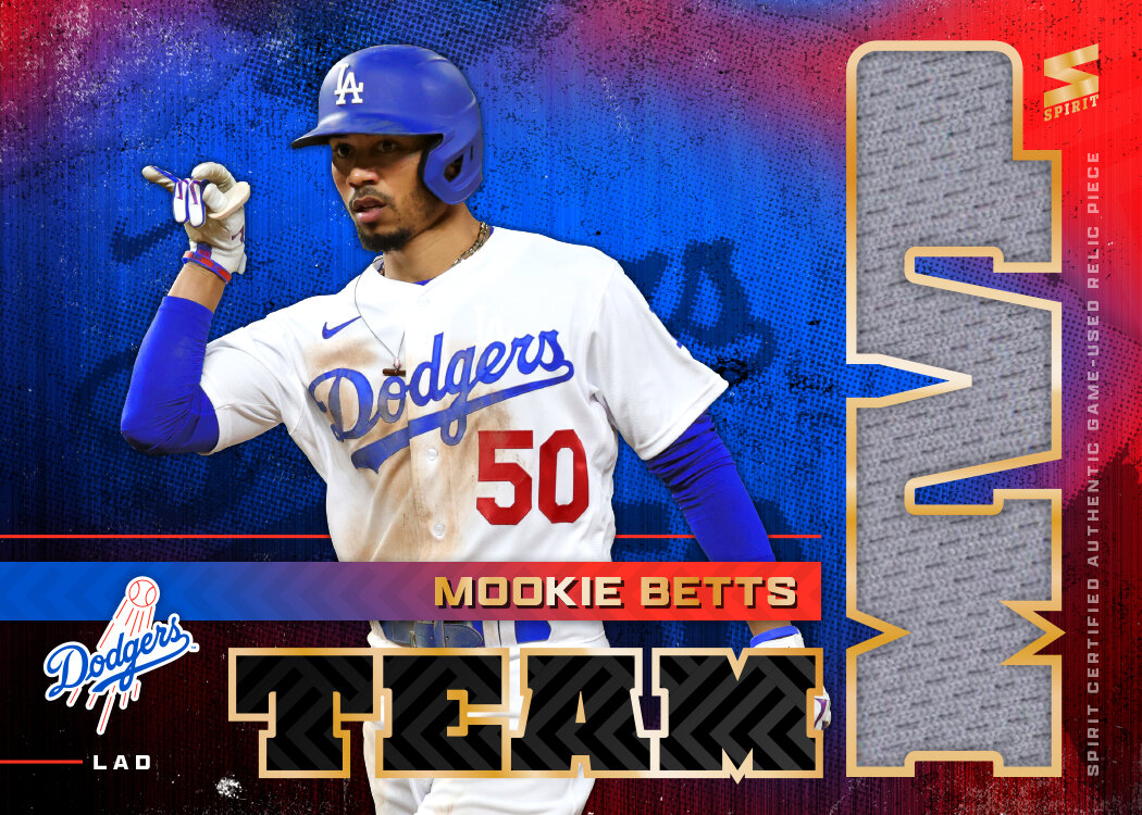
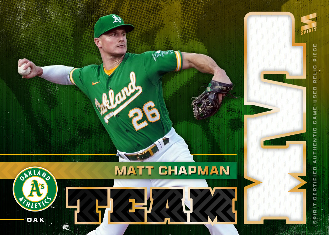
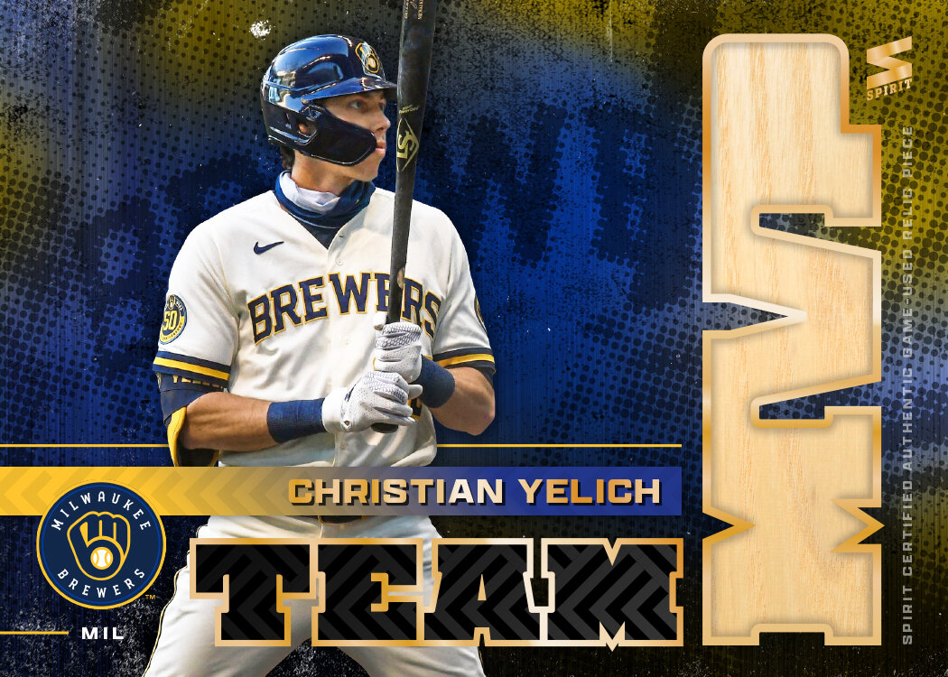
Time for the first insert of the 2021 Spirit set. This has been a longtime inclusion in my Spirit designing endeavor, with this being my 6th entry into the logs.


Like every other year, I’ve made this an all-relic set with the MVP letters housing the relic. That means using a big, bulky typeface for the MVP as well as somewhere else in the design. This year, I carried over some design elements from the 2021 Spirit base design, namely the herringbone-esque texture and the name font. Behind the player cutout is a colorful, textured background image with a zoomed-in look at the jersey script from the photo. It’s a nice contrast to the clean lines on the rest of the design. Also included is the team logo along with the 3-letter shorthand for each club I’ve found myself using a bit.
I’m pretty pleased with the composition here and just the overall vibe. Combining clean and textured into the same design might be a good summation for my personal aesthetic.