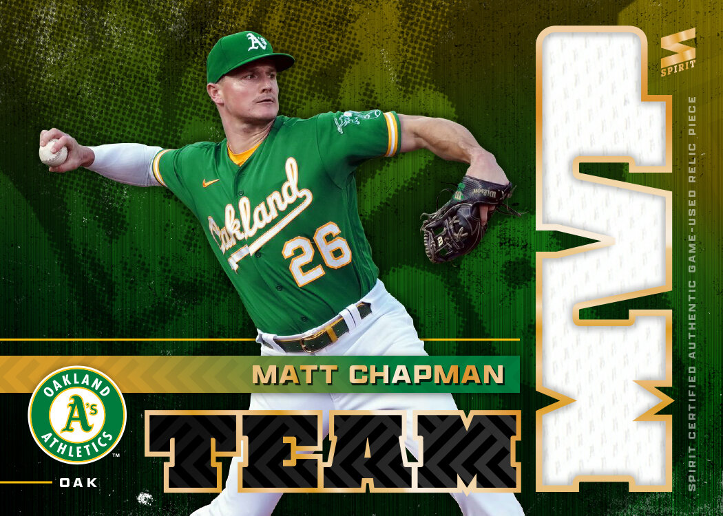
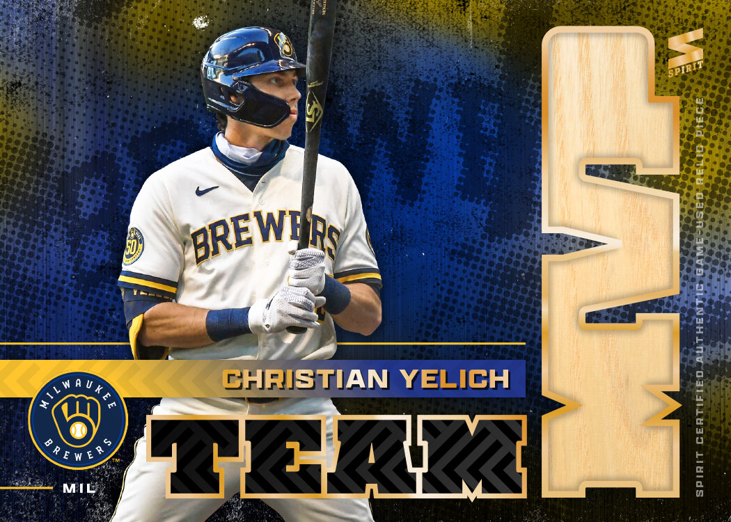
2024 Spirit Team MVP

Rolling through the customary inserts I do each year, it’s time for the Spirit flagship’s entry, Team MVPs — a 30-card set sporting each team’s best player.

Each year, I try to figure out a way to incorporate a jersey swatch into the letters for MVP. I think this is the first time I’ve had the swatch run behind the letters rather than fill them. I think it helps for readability not having to drop the hole for the middle of the P.

The other design features include a team-color background with some grain added for contrast to the full-color player image. The “TEAM MVP” text is a team-color-ish shiny foil spot for some extra pizzazz. The team primary logo rest next to TEAM. Simple name and team text at the bottom finish things out.

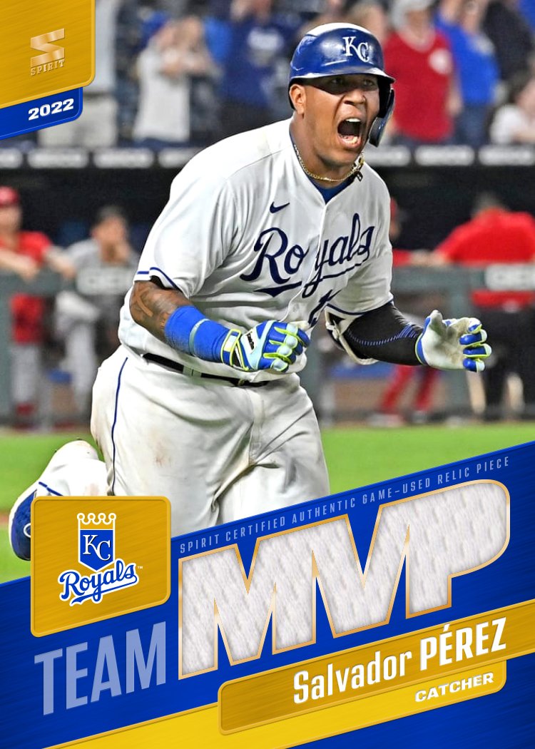
2022 Spirit Team MVP

Time for the first insert design to make an appearance. I’ve been doing the Team MVP cards since the very first Spirit set back in 2012. I’m sure I’ve missed a year or two along the way but it’s been the closest thing to a stalwart for the past decade.

Once again, these are relic cards with a jersey or bat swatch comprising the M-V-P text. The design elements mirror the 2022 Spirit base set with team color tabs filled with a brushed metal texture and the same typeface. The only thing new is I set it all at a an angle to add a little verve since these are (presumably) the best players on each team.

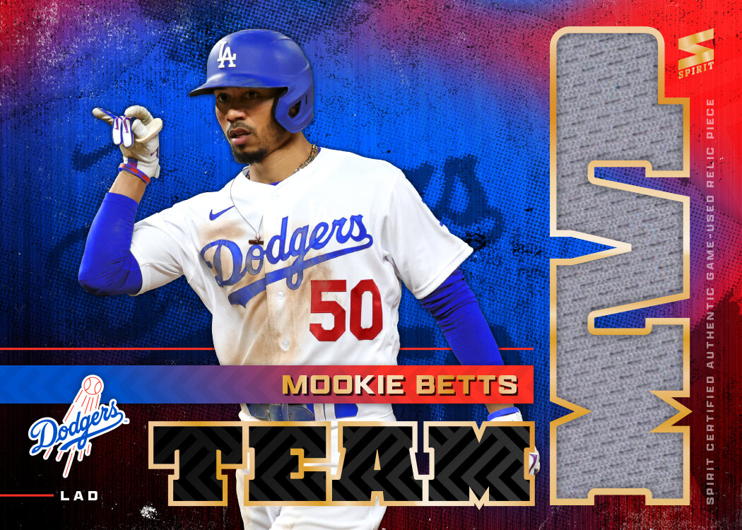
2021 Spirit Team MVP

Time for the first insert of the 2021 Spirit set. This has been a longtime inclusion in my Spirit designing endeavor, with this being my 6th entry into the logs.

Like every other year, I’ve made this an all-relic set with the MVP letters housing the relic. That means using a big, bulky typeface for the MVP as well as somewhere else in the design. This year, I carried over some design elements from the 2021 Spirit base design, namely the herringbone-esque texture and the name font. Behind the player cutout is a colorful, textured background image with a zoomed-in look at the jersey script from the photo. It’s a nice contrast to the clean lines on the rest of the design. Also included is the team logo along with the 3-letter shorthand for each club I’ve found myself using a bit.

I’m pretty pleased with the composition here and just the overall vibe. Combining clean and textured into the same design might be a good summation for my personal aesthetic.