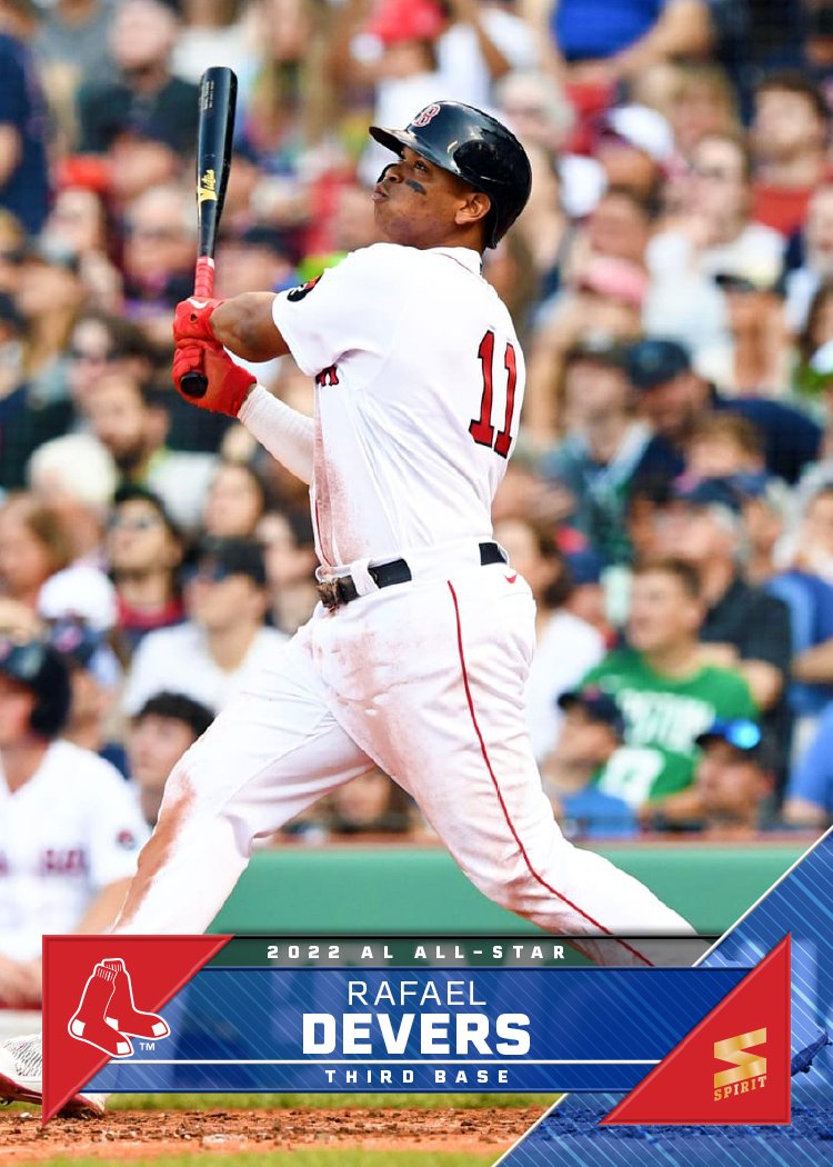
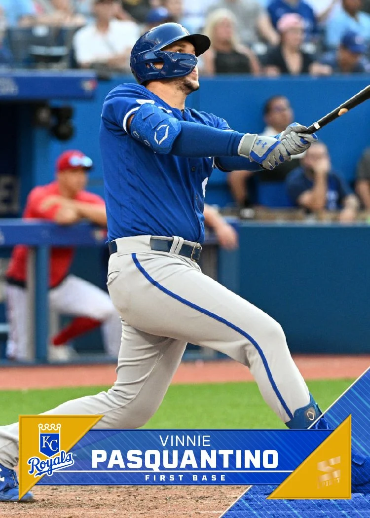
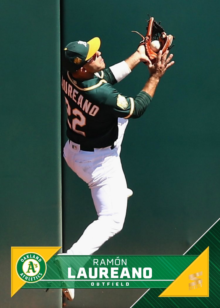
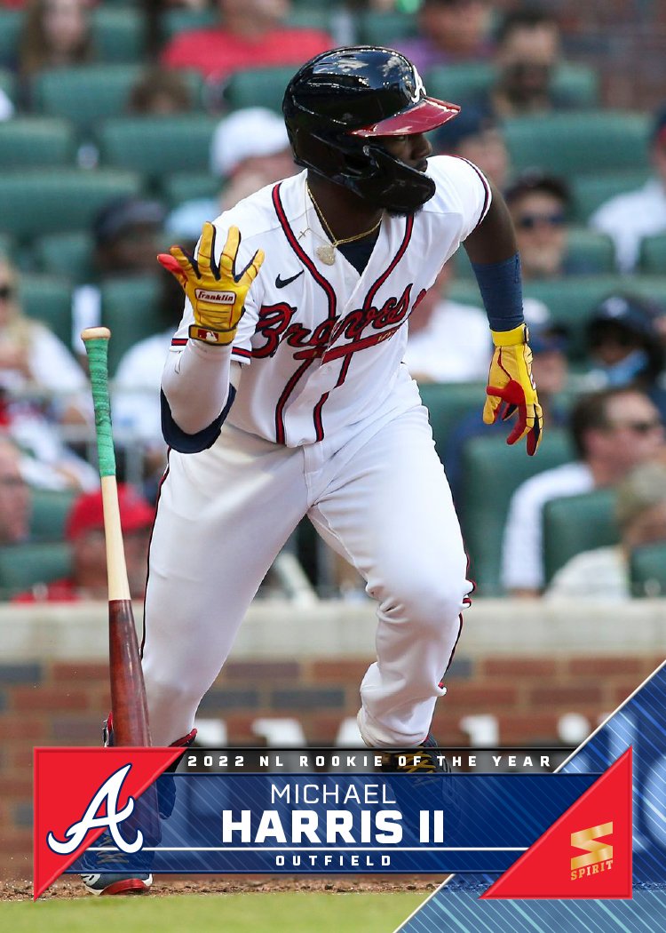
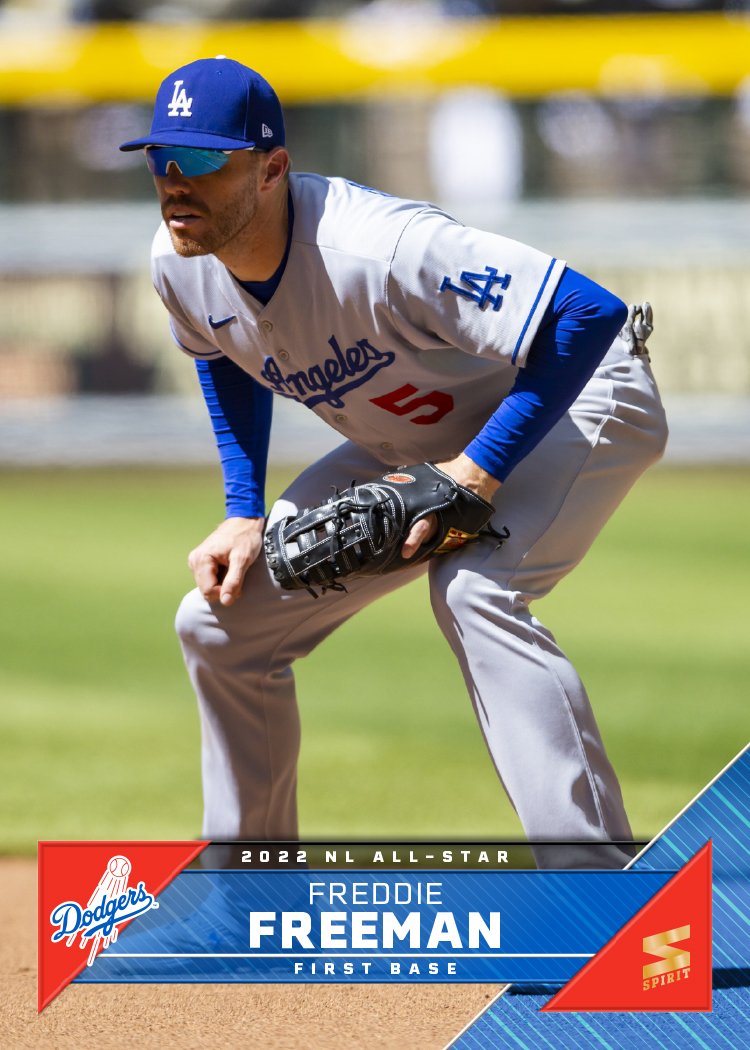
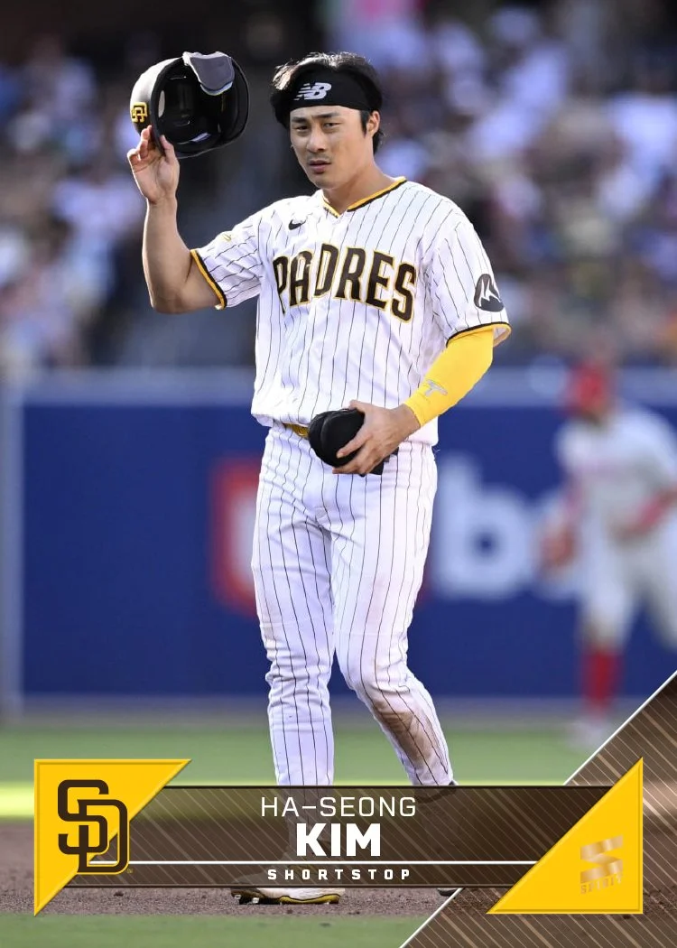
Sneaking this in before the ball drops on the year, here’s a look at my 2023 Spirit base design for every team.
As it’s tradition by now, the design features a full-bleed photo the visual elements color-coded by team. The look on this year is sort of a triangular scroll with the player name position in the middle with the team logo on the left wedge and the Spirit logo on the right wedge. I added a bigger triangle to the bottom right corner to help balance the composition and also add even more team-identifying elements.
Like last year, I had a few different designs I tried out before arriving at this one. Here are the ones that didn’t make the cut.
The last two here were riffs off the same basic hook with the last one winning out. Ultimately, though, it couldn’t top the design I chose in the end.
I’ll try to do some more design dumps before the new year to show I haven’t been completely slacking. Hopefully 2024 will allow me more time to get back on the horse here.

