2025 Spirit Base

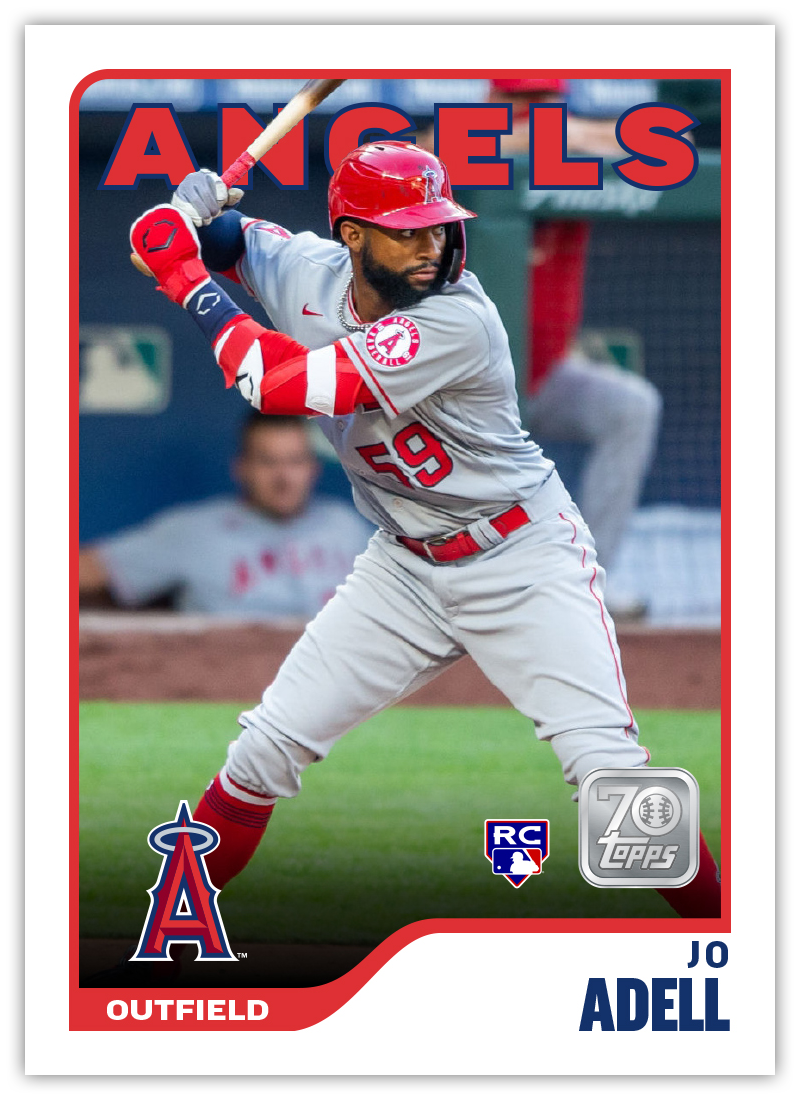
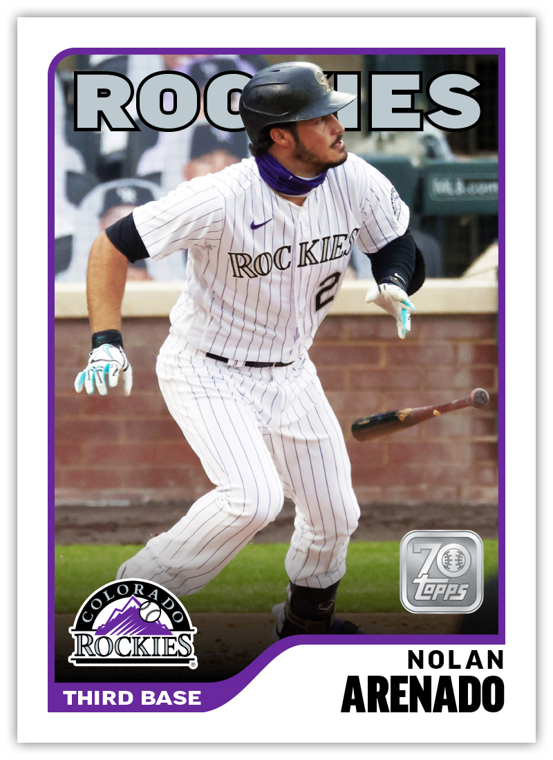
Now that Topps Series 1 has hit the shelves and Spring Training is up and running, it’s time to take a look at what 2025 has in store for my fake Spirit brand.

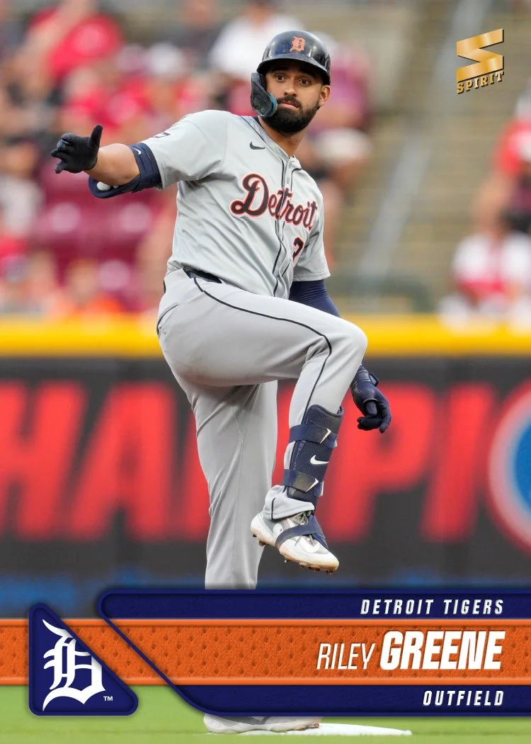
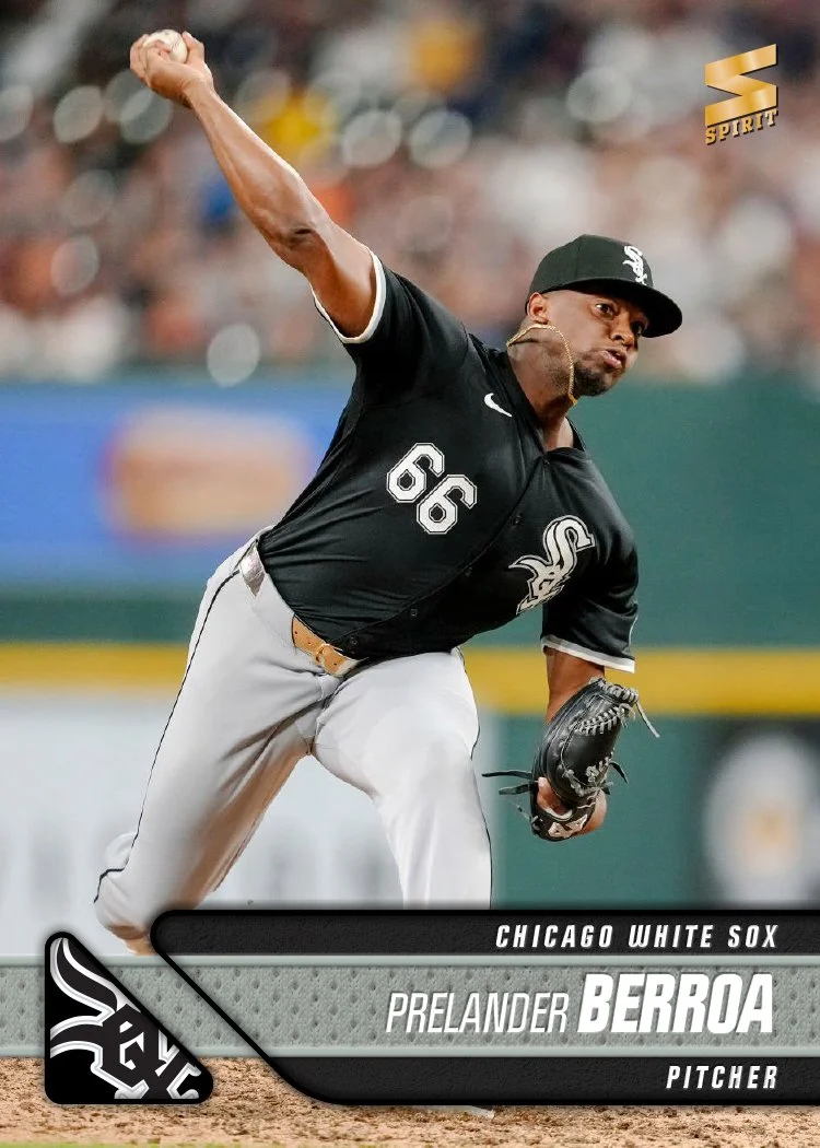
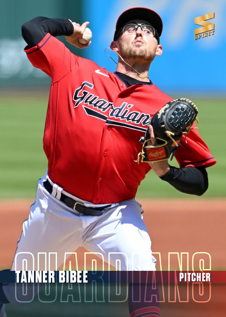
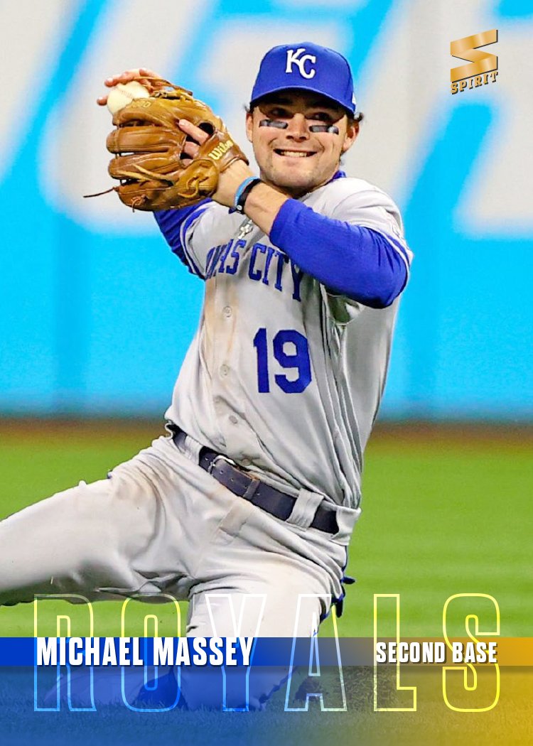
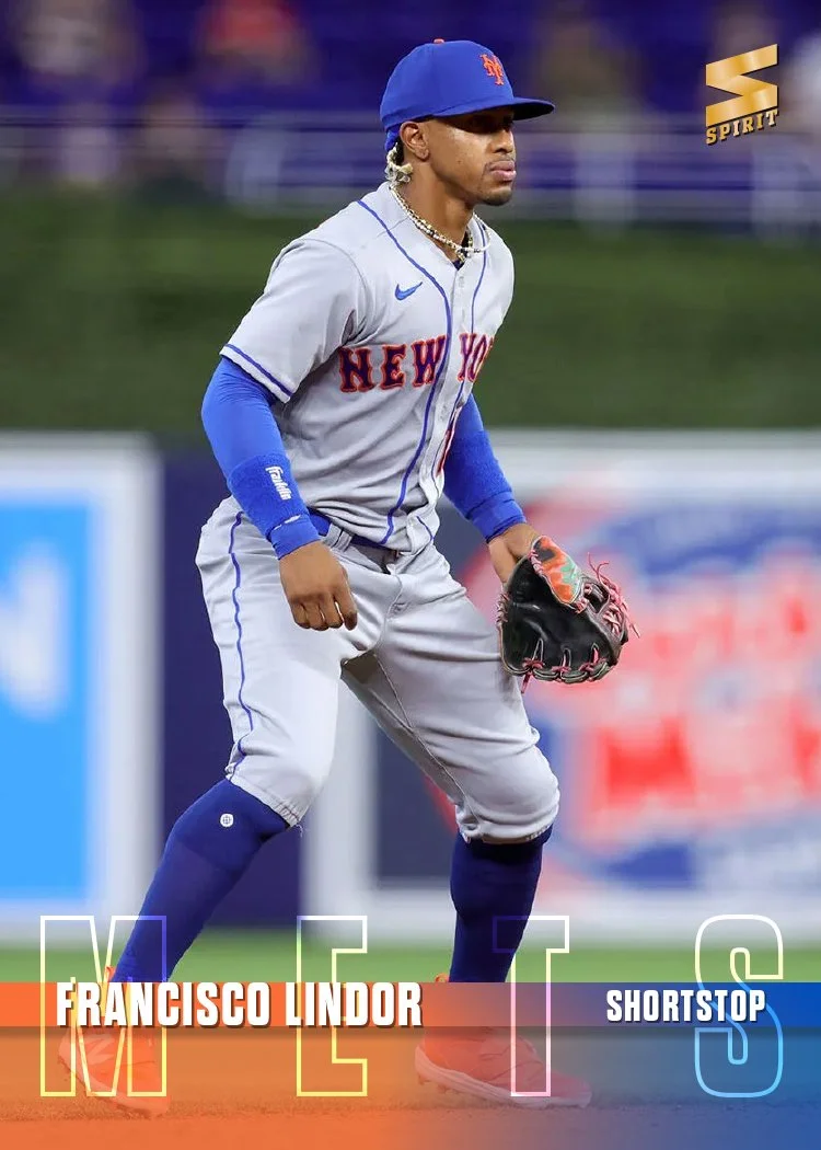
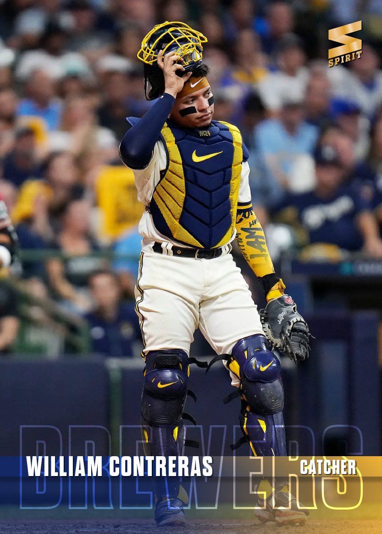
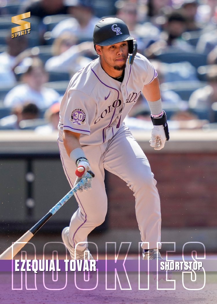
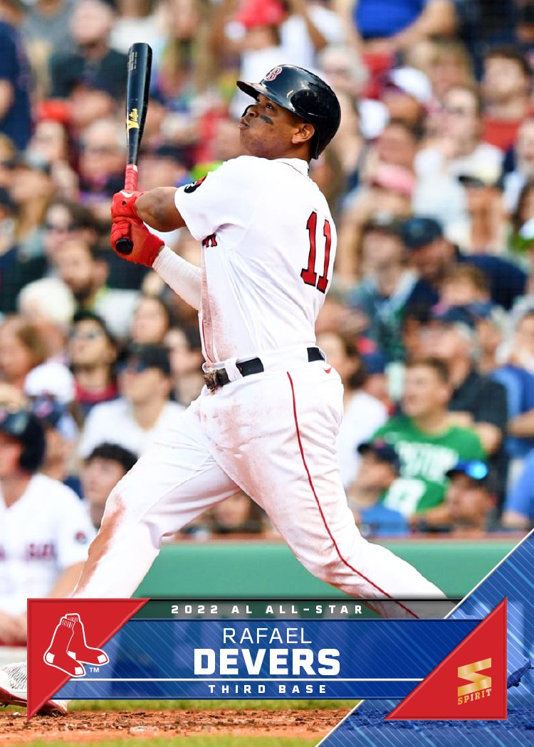
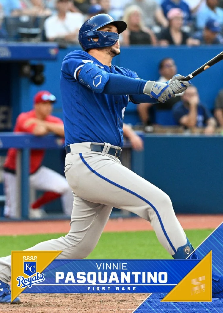
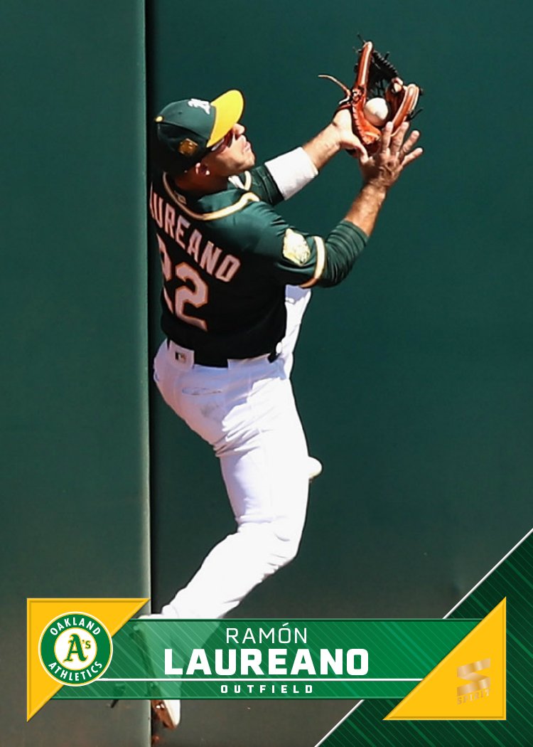
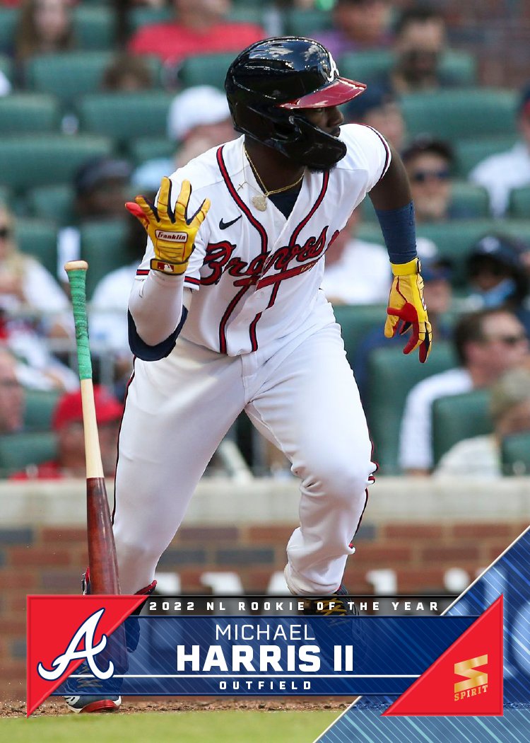
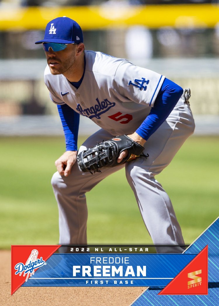
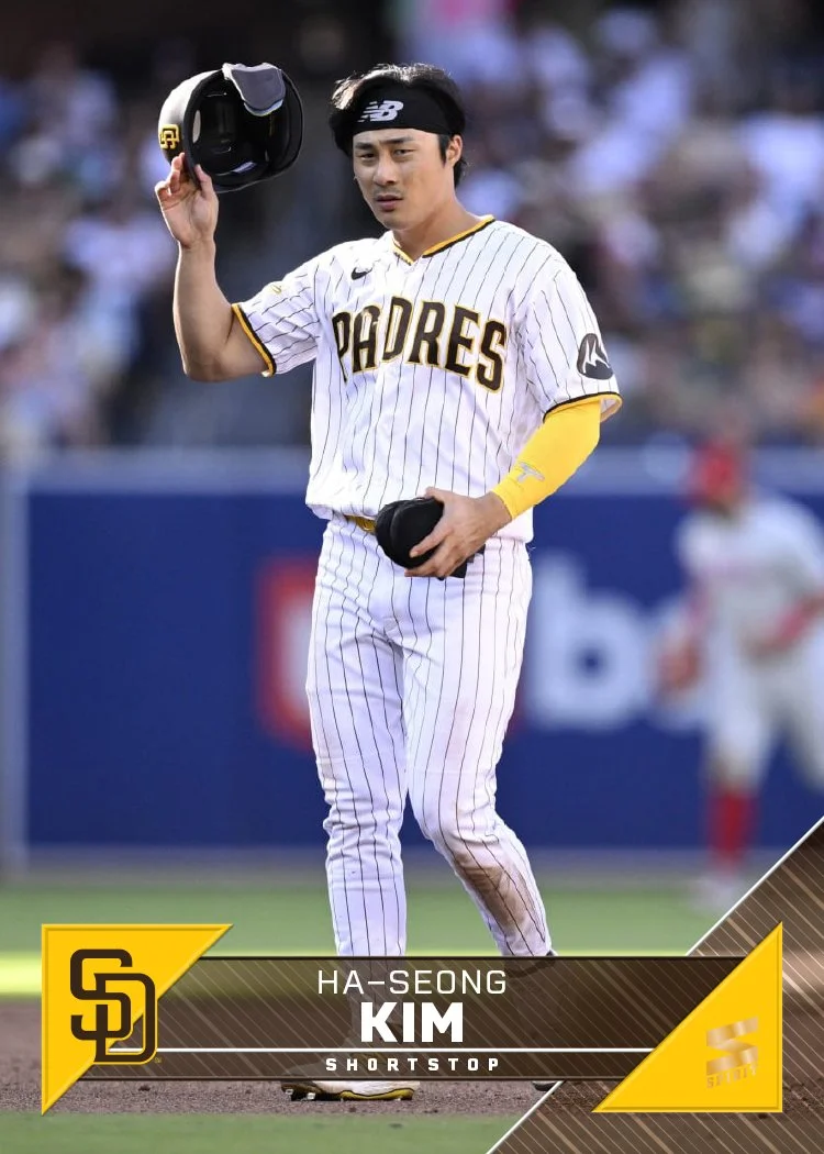
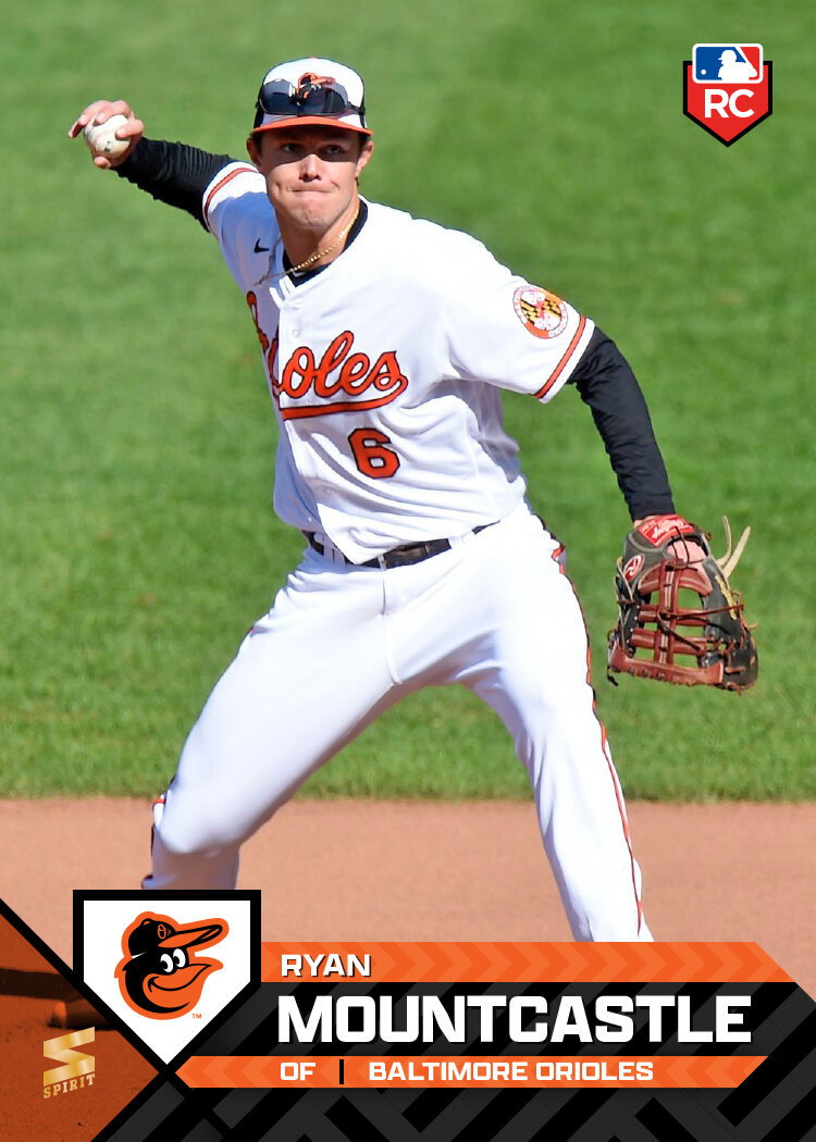
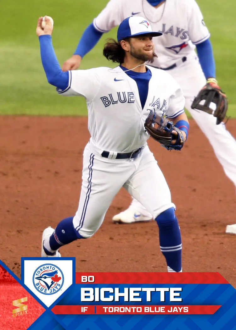
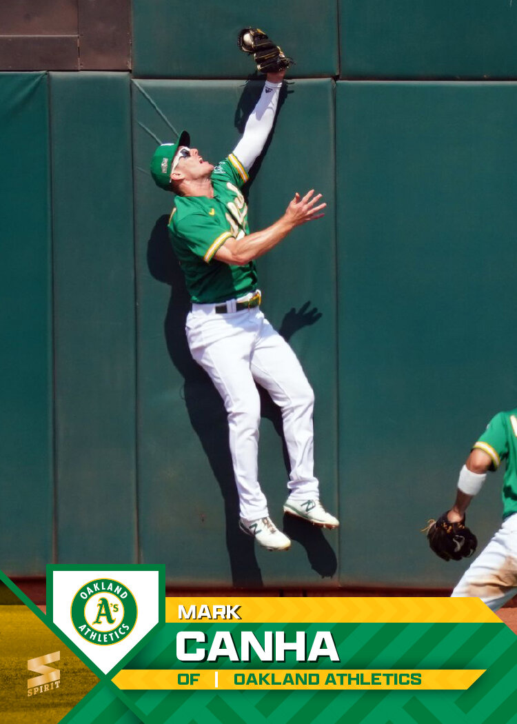
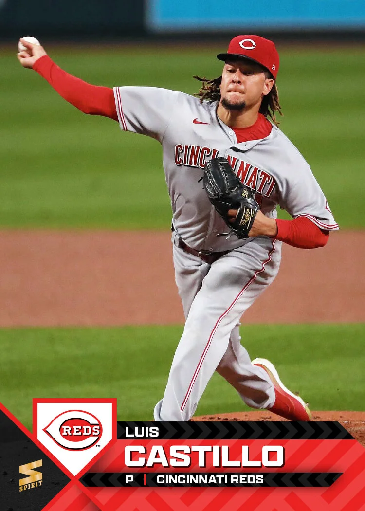
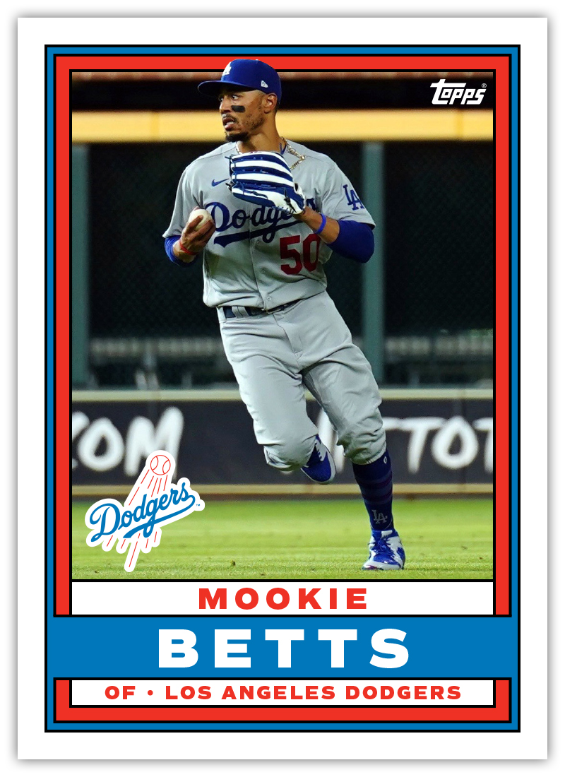
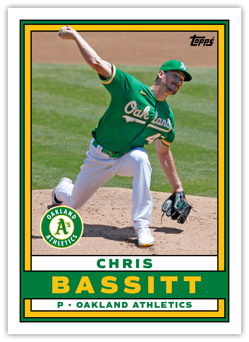
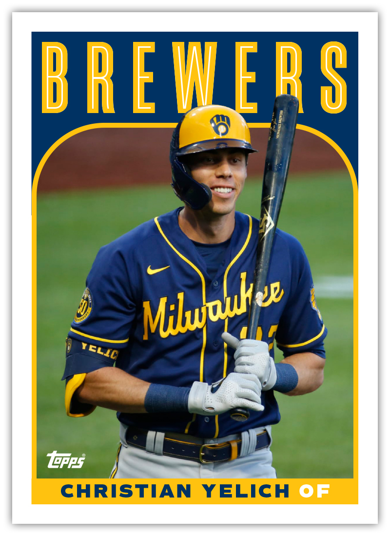
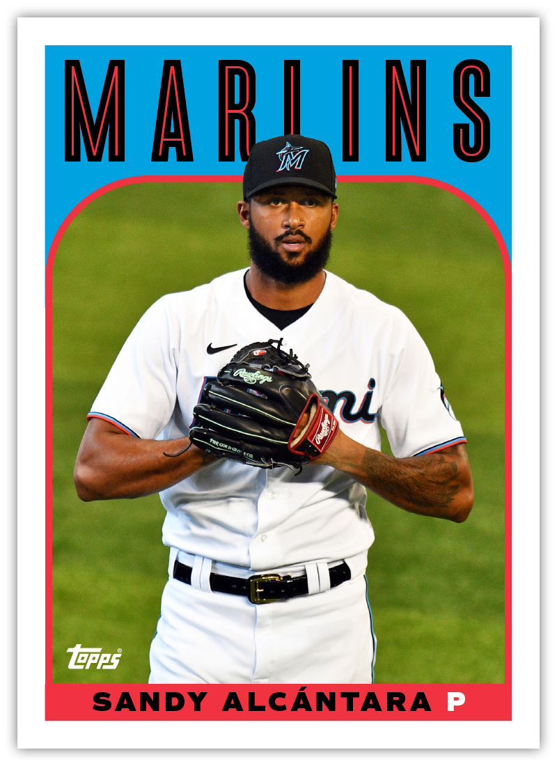
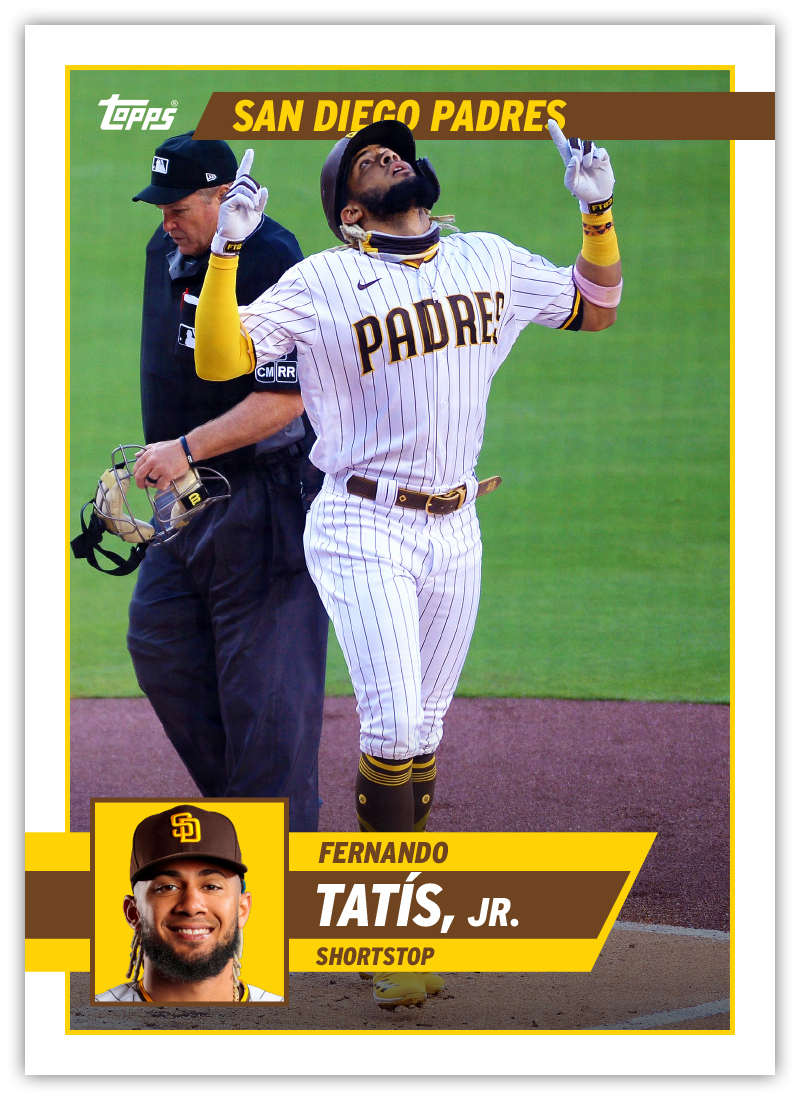
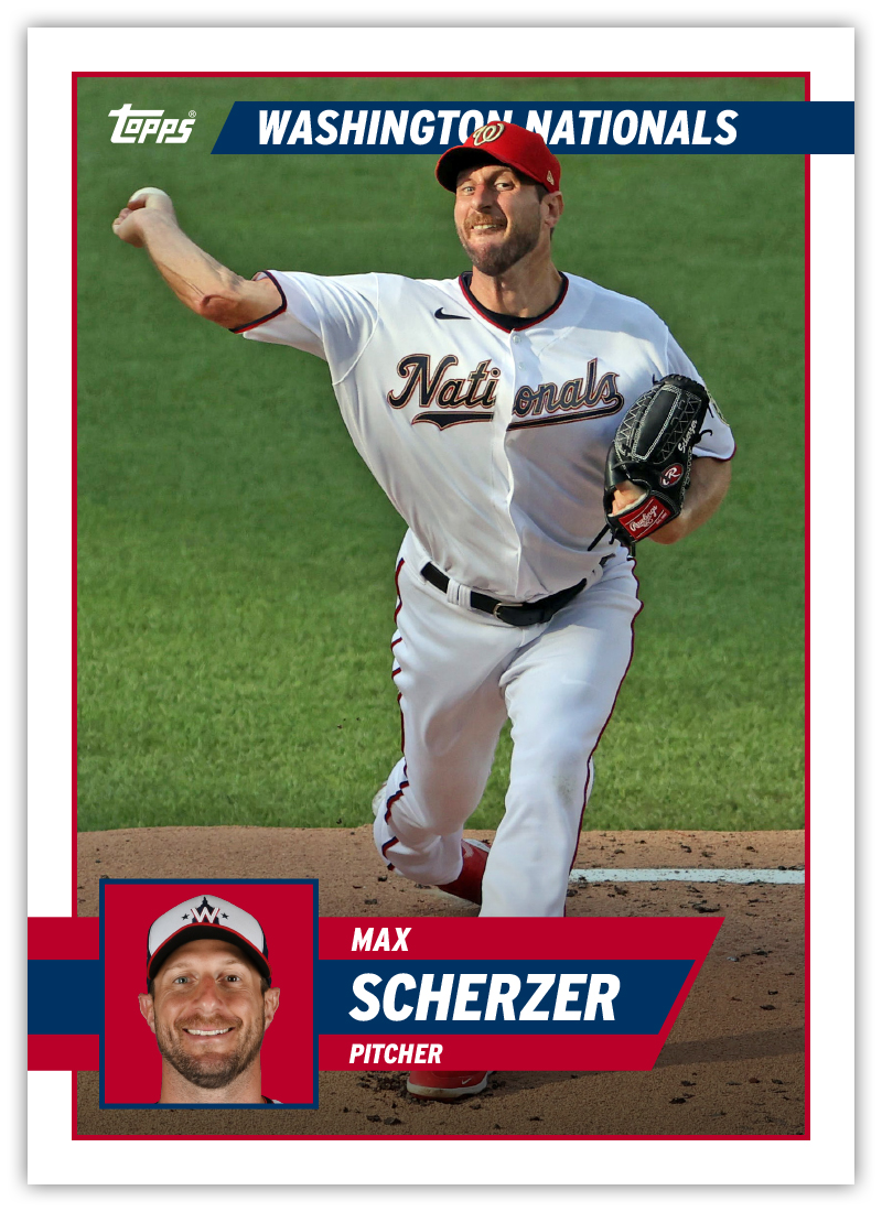
I went borderless once again like I’ve done for the past 14 years now (omg). Photographically, I tried to get a good variety of photos here, sprinkling in some actions shots along with stuff from the sidelines or dugout. Even with the action shots, I tried to pick some with interesting angles or a unique element. The Toglia one in particular is good example of a run-of-the-mill action that’s a little different than what you might typically see on cardboard. Of course the stuff like the Gatorade bath, tv interview, etc., might stand out a bit more.

As for the design, there are basically three elements all reflecting each team’s identity — the ribbon running from edge-to-edge with the player name, the secondary bar below holding the team name and player position, and then the wedge with the team logo in the bottom left corner. The 45-degree angle adds a little drama along with the stroke of the underneath bar overlapping the ribbon. There’s a little texture and depth in there but overall it’s a rather clean design.

I already have my designs for the Clubhouse, Pennant and Deluxe sets squared away. Just need to finish putting together all the cards and I’ll be posting those in the near-ish future. Maybe even before Opening Day!

Baseball Season (ish)

After the Eagles finished dismantling the Chiefs in the Super Bowl Sunday night, my Bluesky feed was full of posts declaring it “officially baseball season.” Pitchers and catchers are trickling into Spring Training facilities in Arizona and Florida. And with Topps Series 1 hitting the shelves on Wednesday, it’s fair to say it is indeed baseball season.

Fanatics released images of the 2025 flagship design last month and from what I’ve seen, the response has been pretty middling, at least compared to the near-universal praise the 2024 design received. I haven’t really seen anybody say they absolutely love the design but I also don’t really remember any intense hate for it either. That’s pretty much where I sit as well. But like past years, I do have a few tweaks I think would help the design overall.

On the left is the original Topps design and on the right my “remix.” The first thing I addressed was the big team name text on the left side. The outline on the original is just too plain hard to read. I don’t know if the physical cards will change a bit with the printing process (like the metallic shine on 2024’s neon elements) but on-screen, it’s a bit of a mess. I decided to place the text “inside” the colored bars but have them be a bit transparent so there’s a little depth there. Speaking of the colored bars, I tweaked the curves of the corners just a bit so they look “truer.” And I swapped the Yankees’ color palette to blue and red rather than the blue and gray Topps chose. Not sure why they want to make the cards less colorful, especially since the Yankees primary logo has more red than anything else in it.

The next area of adjustment is the bottom bar where the player name is. I’m just really not a fan of the treatment they gave it. The first name outlined with the drop shadow is a bad solution to a problem of their own doing. And the last name is a bit too thin weight-wise for my taste. They also seem to have made the gray bar fade out towards the bottom, adding the possibility of some legibility issues for some photos. My fix was to make it a solid bar as part of the border and then switch the typeface from Eurostile Wide to Eurostile Condensed Bold. And to keep with their motif, the first name is outline-only. The last name should be more prominent than the first in my opinion. Their original design has the opposite.

The one element that I have seen a lot of people praise the position indicator field icon in the bottom right corner. I kept that the same except updated the colors and then shaved the little tab off the bottom so the color border is straight across. After moving the Topps logo to the upper right corner, I called this one done. Nothing too drastic but enough little improvements I think makes a big difference overall.

2024 Spirit Base

With Spring Training up and running, it’s time to share my 2024 Spirit base design.

I believe this is the first time I’ve shied away from using some element of the team logo on a Spirit base design. The team names are big and stretched across the bottom of the card, overlapping a spectrum of the team colors. Tucked inside an opaque strip are the player names and positions. That leaves plenty of room for the photograph to be the main focus of the card. While simple, I find the design to be rather bold with the vibrant colors and the large team names.

The backs are vertical as well with plenty room for full-career stats like Machado here. Team logos make an appearance on the back so they’re not completely absent from this year’s set. All in all, this is a pretty clean design for me as I’ve been using a lot of textures and effects in stuff the past few years. Not sure if this is an outlier or not but it was nice to do something a little different. Stay tuned to see what’s next.

2023 Spirit Base

Sneaking this in before the ball drops on the year, here’s a look at my 2023 Spirit base design for every team.

As it’s tradition by now, the design features a full-bleed photo the visual elements color-coded by team. The look on this year is sort of a triangular scroll with the player name position in the middle with the team logo on the left wedge and the Spirit logo on the right wedge. I added a bigger triangle to the bottom right corner to help balance the composition and also add even more team-identifying elements.

Like last year, I had a few different designs I tried out before arriving at this one. Here are the ones that didn’t make the cut.

The last two here were riffs off the same basic hook with the last one winning out. Ultimately, though, it couldn’t top the design I chose in the end.

I’ll try to do some more design dumps before the new year to show I haven’t been completely slacking. Hopefully 2024 will allow me more time to get back on the horse here.

Welcome to 2021

In honor of the first Spring Training games of the (pre)season, I figured today would be a good day to share the Spirit 2021 designs. I’ve decided to scale back from last year and just make a card for each team here instead of making one for every single card on the checklist. This means I’ll have more time to tackle other designs like inserts for this set as well as some of the other releases I’ve done in the past (Clubhouse, Pennant, Deluxe). I also tackled just a couple of the backs — one pitcher, one batter — since those may get a little boring looking at 30 in a row.

As I try to do with the Spirit line, the base design features full-bleed photos with team colors and team logos as well as the player name prominently featured (and easy to read). The home plate shape for the logo took me in the direction of these diagonal elements for the team colors and name plates. The idea is for the design to add some visually interest and give the info room to live without getting in the way or overpowering the photo. Ryan Mountcastle and Dylan Carlson have the standard RC logo I’ve been using on Spirit cards for years, tucked into the top corners to balance the design as a whole and not crowding the bottoms.

The backs are full-color with the same colorful diagonals from the front. I pared down the bio information so it could fit in the secondary bar and leave room for a fuller career stat record. I also reintroduced a feature from previous years where a player’s accomplishment from the previous season can be easily highlighted (Maeda’s All-MLB 2nd Team honor, Solano’s Silver Slugger award). Obviously every player won’t have such a notation but the space will still work if empty.

As 2020 taught us, plans are futile and we’re all living in a nonsensical simulation, but my intention is to have a good number of card design posts in this space throughout the upcoming season. Even as the hobby and world have made some huge shifts in the very recent past, making and sharing these cards is something that brings me joy, so hopefully there’s plenty more to come.

Every Day Is a Holiday

Today is National Baseball Card Day, according to Topps anyway. As I’m sure you’re aware if you’ve made your way to this blog, I’m a big fan of baseball cards — even as an adult. The main call for NBCD is to get collectors into hobby shops and buy cards. Topps facilitates this by providing shop owners “free” packs to distribute to customers for coming in and/or buy cards. Well, since there’s a pandemic going on, the idea of going to a card shop today seems particularly dubious. Still, I try to not be a scrooge for any holiday, let alone one that caters to my interest in particular. So here’s how I celebrated today.

Earlier this week, Topps unveiled the design for their 2021 flagship release. In addition to disappointing many “collectors” by revealing Jo Adell rookie cards won’t be in any 2020 product, the reception was overwhelmingly sour. I found a lot of issues with the design and tried my hand at rectifying them a bit to meet in the middle of what Topps decided on and what I consider to be “good”. The finished product still has a few flaws but I’d call it a definite upgrade.

Well, since that day, I’ve been in a card designing mood, leading me to spend my Saturday putting together a few more design ideas for what some might consider a more traditional baseball card look. So here are 4 new designs (2 cards of each) that I think bring to mind some of the rich history of baseball card design without ripping anything off entirely. Hopefully these bridge the gap between traditional and modern.