2024 Clubhouse All-MLB Team

Here’s a look at the All-MLB Team insert design for the Clubhouse set. I made them look a bit more chrome-like rather than foil-y like other stuff I’ve done in the past.

Looks like my third straight entry with some diagonal elements. Again, it works with the Clubhouse base design so I’m not too upset about that. The color scheme is red and blue to match the MLB logo, which makes an appearance in the bottom “wedge” here. The 1st and 2nd teams are differentiated by flipped colors and of course the big “1ST” and “2ND” elements along the right.

Gonna need to do something noticeably different for the next insert to break outta this groove. But overall I’m happy with what I’ve got going on here.

2024 Clubhouse League Leaders

Here comes another insert set for this year’s Clubhouse line. I’ve never done a league leaders set before so this is a first. I wanted to feature the top-10 finishers in double, triples and homers but with ties it ended up being a 38-card checklist rather than 30. Surprisingly, Mookie Betts and Shohei Ohtani would be the only repeats amongst the three categories. Here’s a look at the design.

Each category swaps out its shorthand in the bottom right corner, making it easy to differentiate the stats. The players’ tally is solid to the left of the big stat with some team color behind it to add some contrast. Above a white line slashing through the big stat is the player name over the other team color. And just behind the player is the “LEAGUE LEADERS” title at the top.

The diagonal elements work well with the rest of the Clubhouse designs for this year. And I always like to find a way to incorporate team colors into the proceedings. I tried to pick action shots that illustrate the category pretty well, hence the big follow throughs on the HR cards and running/sprinting on the 3B cards. It was also nice to do a card for guys like Will Benson or Ezequiel Tovar who don’t otherwise get a lot of love.

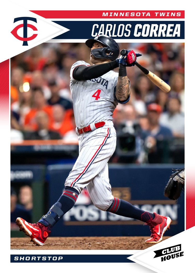
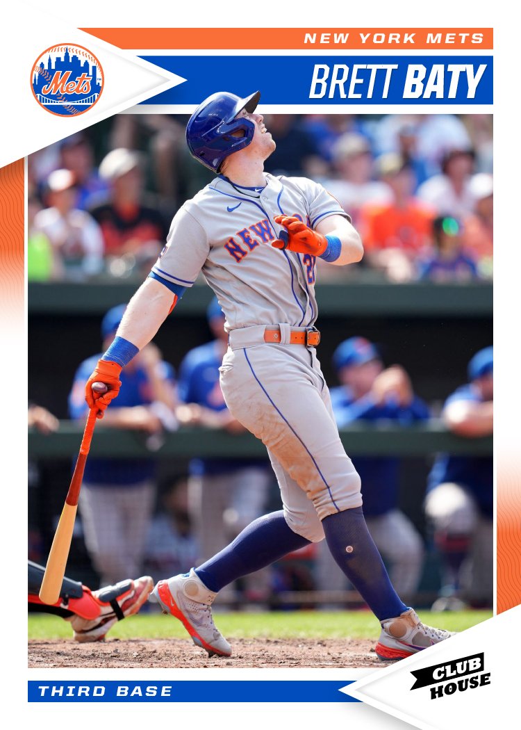
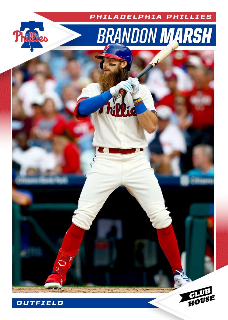
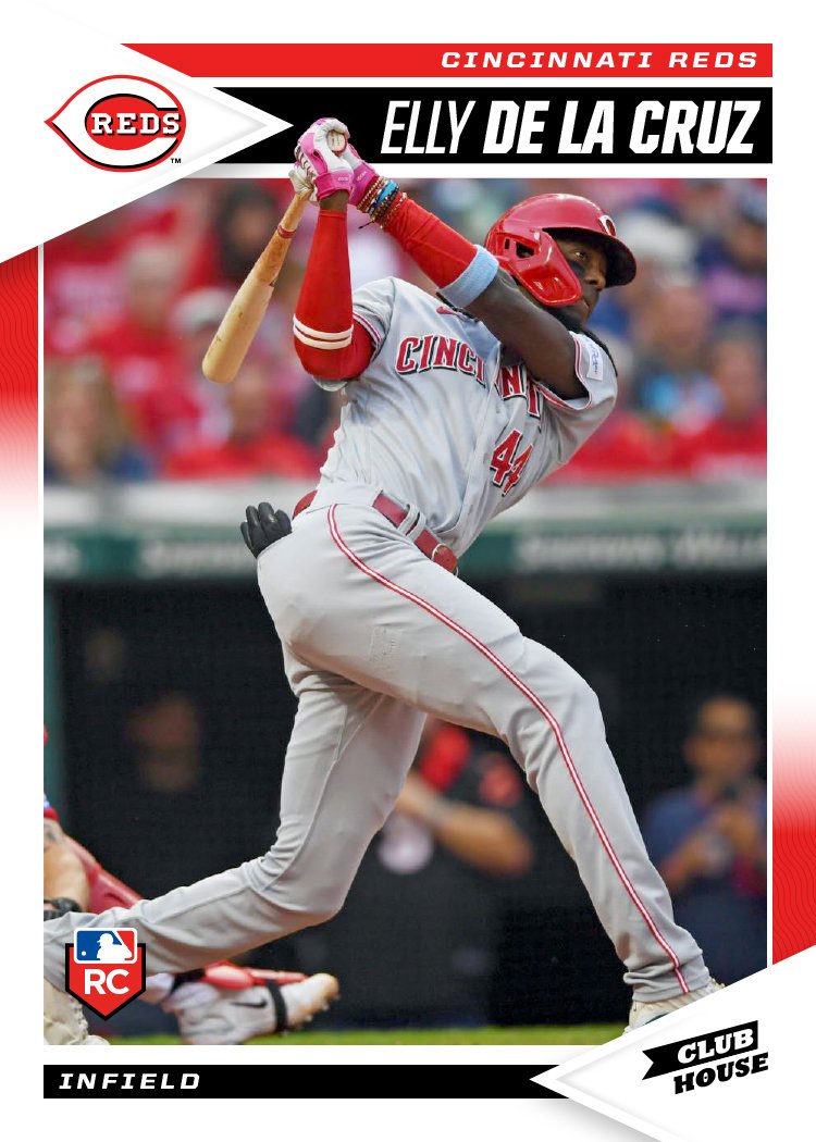
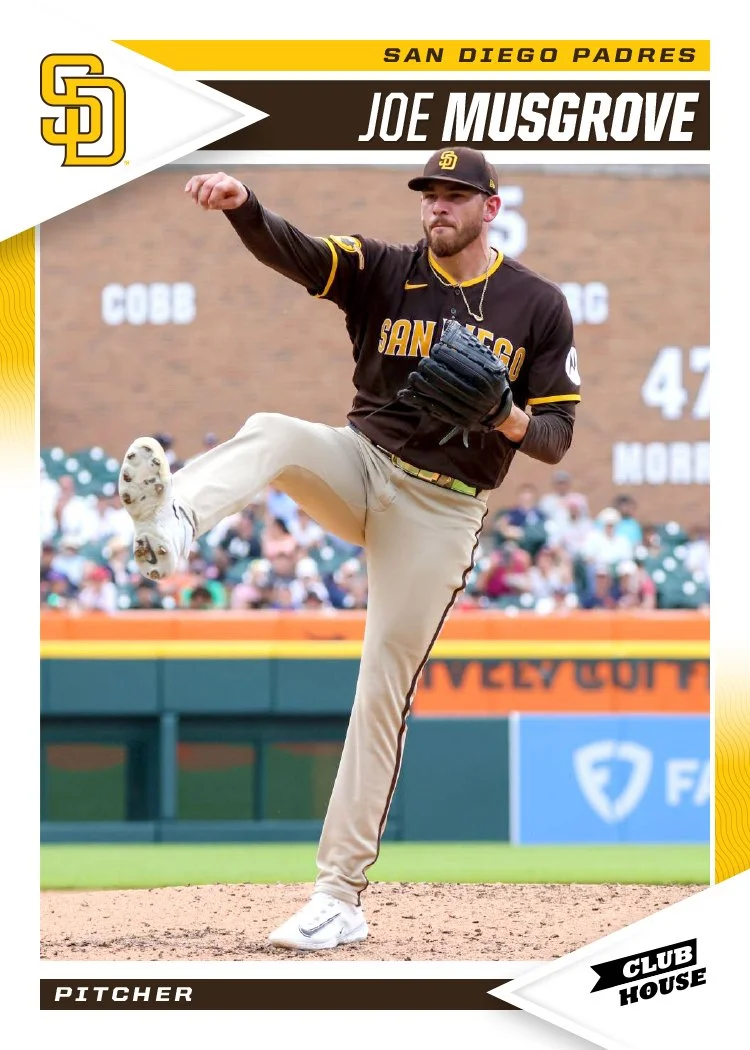
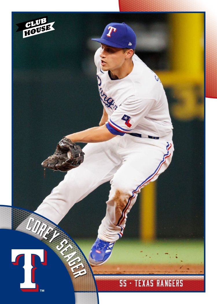
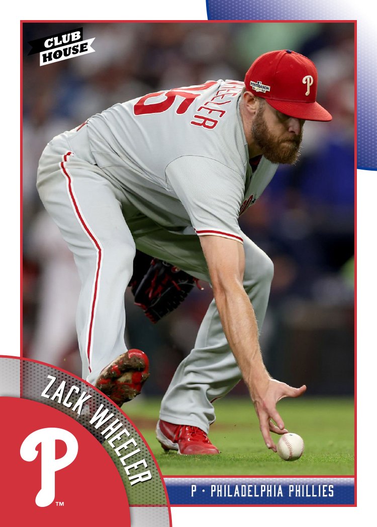
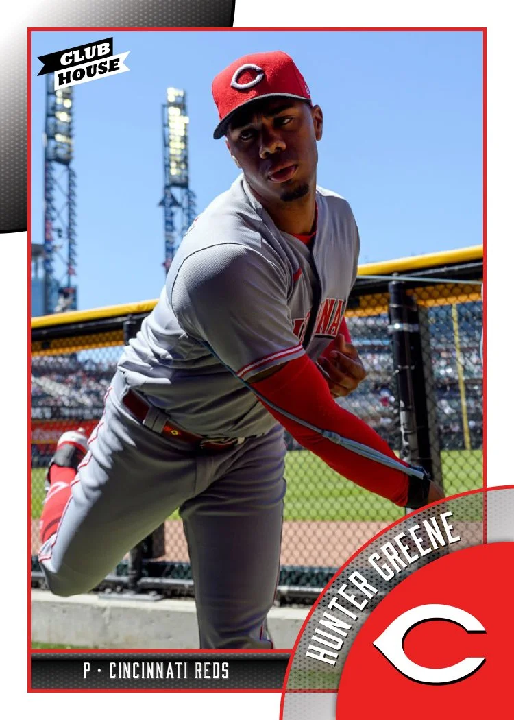
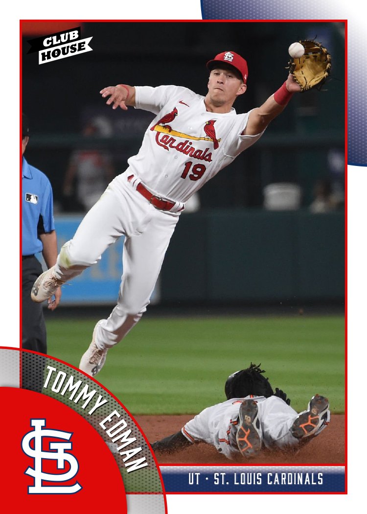
2024 Clubhouse

We're a week into the 2024 MLB season and somehow I've yet to see a single inning of baseball. I guess this is the reality when you have a one-year-old to focus on. I've been keeping up with the league as best as I can through social media and the MLB app but it hasn't been easy. Luckily, I've been working ahead a bit on my 2024 designs and it's already time for the 2024 Clubhouse set.

White border return with splashes of the team primary and secondary colors. There's a little bit of a pennant motif that pairs really well with the Clubhouse logo. Each photo finds space to break out of the frame a bit and overlap the name bar a least a little, though there are places like the Harold Ramírez card where it interacts with the name a bit more.

The vibe here is very "early 90's Score" which I've always been personally partial to. If Topps were to shoot for this with the Big League product, I think the response would be a lot more positive than what they've been getting.

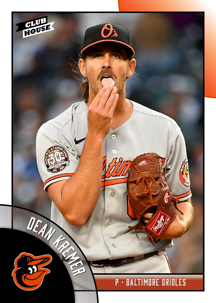
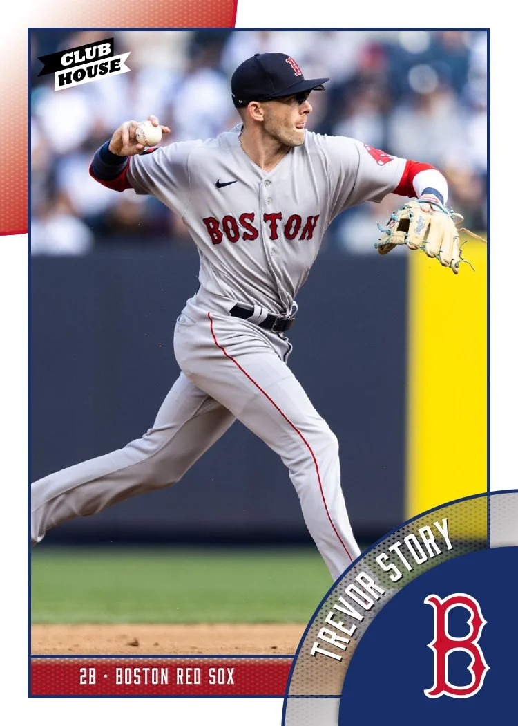
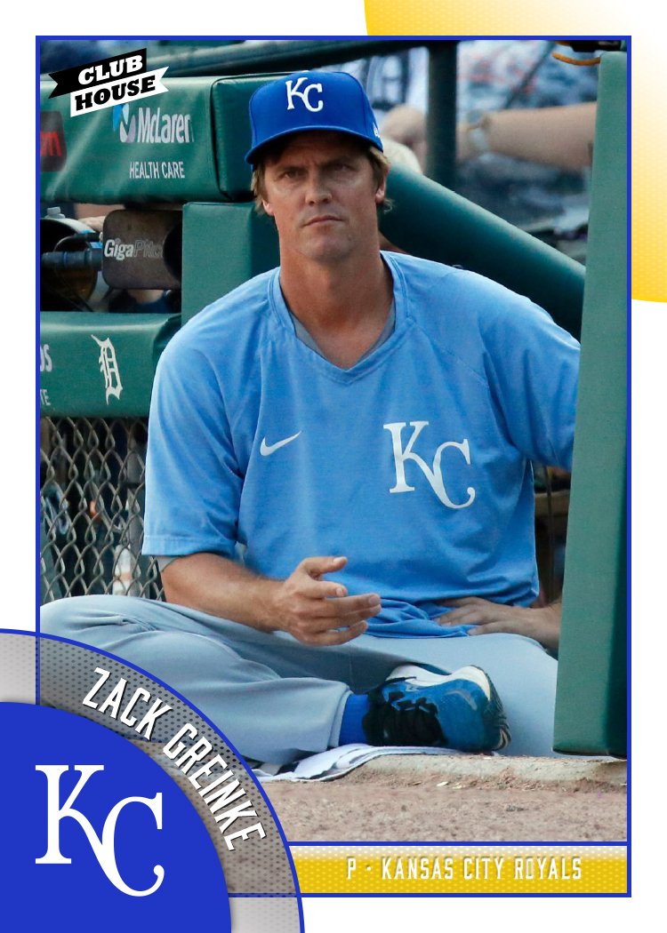
2023 Clubhouse

Before the 2024 designs start to drop, here’s a look at my 2023 Clubhouse set. This is meant to be the “fun” set for low-budget collectors. I tried to ramp up the fun here by featuring as many out-of-the-ordinary photos as I could.

I think the Randy Arozarena one is probably my favorite, though the Ha-Seong Kim one is pretty great, too. Design-wise, these are meant to “connect” from card to card as you can see in the grid up there. The colored circles will line up at the edges, à la 1990 Topps. That means that not every, say, Mets card will have the logo on the right side. The next card in the checklist would have it on the left, then right, and so on. I just did the teams like this so you get the gist.

The player names arch along with the logo slice which is nice to have instead of on a straight line like usual. The position and team name do run next to it on the secondary color block to help balance the palette a little.

Overall, I think these strike the right balance between being fun but not too crazy, with a big assist from the photography. Bright and colorful without anything too over the top. I’d have been a big fan of something like this as a kid.

2022 Clubhouse All-Stars

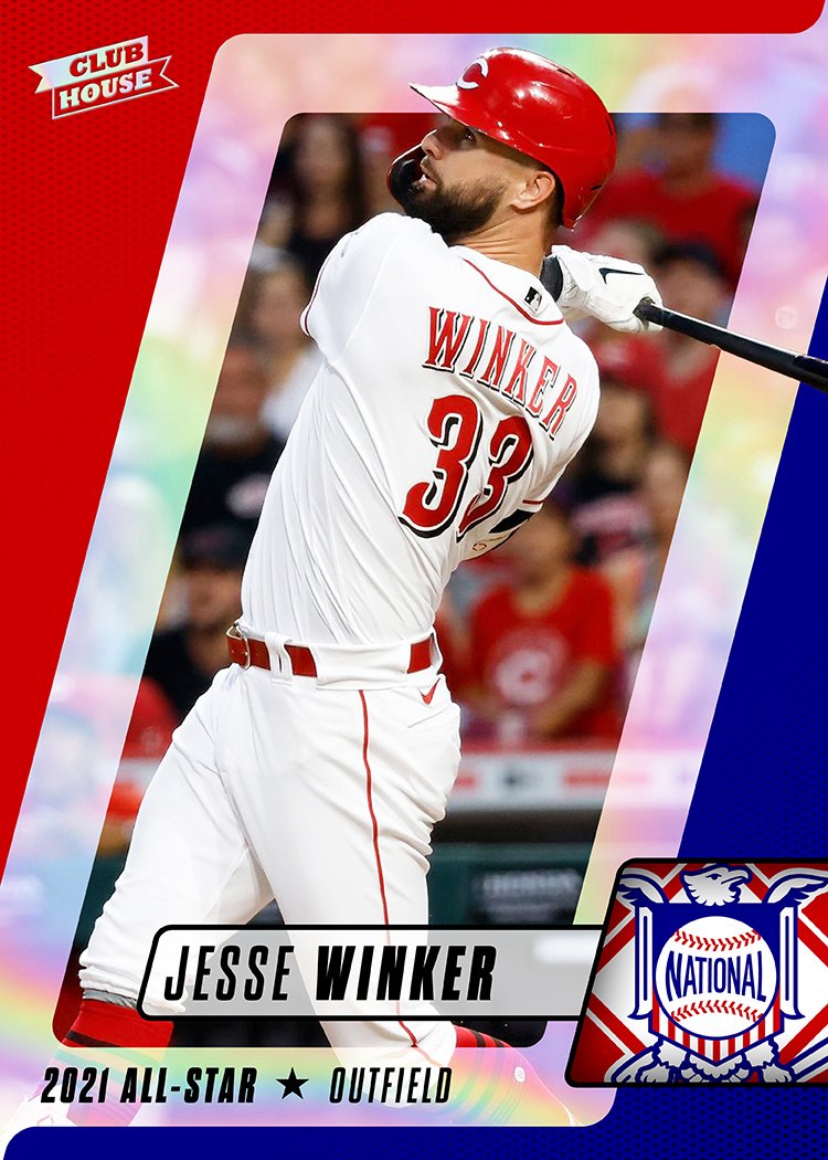
With the 2022 MLB All-Star starters being announced last Friday and the All-Star Break coming up next week, it seems like a perfect time to share my design for the 2022 Clubhouse All-Star insert.

These of course feature the dudes that made the 2021 All-Star squads (in case the post name was a bit confusing). I went for something different than the usual “star” motif that I’ve used in All-Star designs in the past. And instead of having the leagues designated by strictly either red OR blue, this design features both colors equally for both leagues, just changing up their placement in the design to help distinguish between the two teams. The diagonal boxes add some movement to the design while the foil board/chrome space behind the player cutout makes things shiny as nod to these players being stars. Add in the player overlap and these end up being dynamic considering they’re basically just made up of geometric shapes.

2022 Clubhouse

Time for the next release on the 2022 Spirit calendar. Clubhouse is the “fun” set geared towards younger collectors or those not so smitten by modern hobby pillars like autographs, parallels, etc.

These may look a bit familiar as they’re a re-worked version of one of the Spirit base designs I was tinkering with back in January. They received some positive feedback but I felt they didn’t fit the vibe of the Spirit base design I had established in the past 10 years. Luckily, they fit the Clubhouse vibe pretty well with bright colors, some bubbly text and an almost cartoon-ish twisting wave, though some adjustments were made. The obvious change is adding a white border to the cards which instantly places them alongside what a lot of folks consider a baseball card to be. (There’s a reason Topps has added borders back to their flagship design the past two years). Adding borders allowed me to make the team logos a bit bigger. The other change was including the accolades text in the bottom right below the position banner.

Back side of 2022 Clubhouse card for Yordan Álvarez featuring his biological info and MLB career stats.

The backs have the color ribbons at the top with the primary color bleeding off the top edge. Yordan only has 3 seasons under his belt so there’s plenty of room for his full career stats, but for longer-tenured players, they’ll probably have just 10 seasons and full career line.

I don’t have any done right now but there will be some Clubhouse inserts to follow, including the traditional Clubhouse All-Stars. Hopefully some other “fun” ideas come to mind.

2021 Clubhouse

I’ve had these designs in the can for a while but figured I should probably get this posted before the trade deadline. In case you haven’t been following my projects or need a refresher, Clubhouse is the “value” or “budget” line of Spirit cards. Think Topps’ Big League of today or Upper Deck’s Collector’s Choice of yore. These are meant to be fun, colorful and appealing to all ages, not just dudes in their 40s or older.

The design here is pretty simple with rounded rectangles showing off the team colors. Each color gets a pair of tabs going off the edge of the card, breaking the white borders but still keeping everything crisp and clean. I found space for the name at the top, which is something I’ve noticed goes a bit against the grain lately. Even with my own designs, I find myself placing the names towards the bottom of the card. Can somebody pinpoint the birth of that trend?

At the bottom in the center is the team logo, which should be safe to overlap the edge of the photo there and not cover up too much of the action. Flanking the logo is the team abbreviation on the left and player position on the right. The 3-letter abbreviation is a thing I’ve tinkered with on a few designs but it’s definitely a placeholder here. Honestly, I just needed something on the opposite side of the position to keep the symmetry going. I love the rest of the design so much, I wasn’t going to let a little detail like that derail things.

2021 Clubhouse_COLE_BACK.jpg

The back mirrors the front pretty closely with the tabs lining up the same on both sides. There’s more of the primary color here to make room for the player bio next to his mug shot. I trimmed the career stats down to just the most recent 5 seasons. My reasoning here is this isn’t the flagship set and I’d have to sacrifice a lot of other design options just to accommodate more columns of numbers. And really, I don’t need more obstacles standing between me and a finished design.

Overall, there’s something very pleasing to me about this design. Something about the basic-ness speaks to me in a “well duh, why isn’t this already a thing?” kind of way. Big solid colors are throwback to cards of the past, but somehow this isn’t all that hokey (to my eyes at least).