2024 Pennant Dream Team

Time for another Pennant insert.

Keeping with the look of the 2024 Pennant base design, these feature black & white, high-contrast player cutouts over a gradient background. For these, I added a dreamy sky and baseball field overlay, so it’s not just a solid color block. Pairs well with the concept of the insert. I kept the text simple with “Dream Team” across the top and the last night along the bottom. No need to clutter with other info since these are the guys at each position. Here’s a look at the checklist I put together.

1B Bryce Harper
2B José Altuve
3B José Ramírez
SS Francisco Lindor
OF Mike Trout
OF Aaron Judge
OF Ronald Acuña, Jr.
C Adley Rutschman
DH Shohei Ohtani
UT Mookie Betts
SP Gerrit Cole
SP Corbin Burnes
SP Zack Wheeler
SP Justin Verlander
SP Spencer Strider
RP Edwin Díaz
RP Emmanuel Clase

The starting pitcher rotation was honestly a bit of task, especially considering we’re in such an age of pitching. Verlander is there on account of this being timed to the beginning of the season before he was on the IL. Same with Strider. There just aren’t the lights-out names these days like there always seemed to be in years past.

2024 Clubhouse All-MLB Team

Here’s a look at the All-MLB Team insert design for the Clubhouse set. I made them look a bit more chrome-like rather than foil-y like other stuff I’ve done in the past.

Looks like my third straight entry with some diagonal elements. Again, it works with the Clubhouse base design so I’m not too upset about that. The color scheme is red and blue to match the MLB logo, which makes an appearance in the bottom “wedge” here. The 1st and 2nd teams are differentiated by flipped colors and of course the big “1ST” and “2ND” elements along the right.

Gonna need to do something noticeably different for the next insert to break outta this groove. But overall I’m happy with what I’ve got going on here.

2024 Clubhouse League Leaders

Here comes another insert set for this year’s Clubhouse line. I’ve never done a league leaders set before so this is a first. I wanted to feature the top-10 finishers in double, triples and homers but with ties it ended up being a 38-card checklist rather than 30. Surprisingly, Mookie Betts and Shohei Ohtani would be the only repeats amongst the three categories. Here’s a look at the design.

Each category swaps out its shorthand in the bottom right corner, making it easy to differentiate the stats. The players’ tally is solid to the left of the big stat with some team color behind it to add some contrast. Above a white line slashing through the big stat is the player name over the other team color. And just behind the player is the “LEAGUE LEADERS” title at the top.

The diagonal elements work well with the rest of the Clubhouse designs for this year. And I always like to find a way to incorporate team colors into the proceedings. I tried to pick action shots that illustrate the category pretty well, hence the big follow throughs on the HR cards and running/sprinting on the 3B cards. It was also nice to do a card for guys like Will Benson or Ezequiel Tovar who don’t otherwise get a lot of love.

2024 Spirit All-Rookie Team

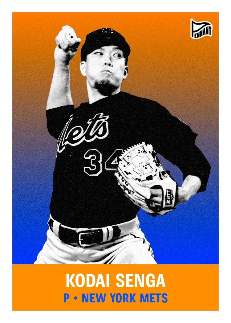
Let’s keep rolling with some inserts now while I have some momentum. Time for the Spirit All-Rookie Team set. This is a 15-card set with the top rookies at each position and 5 best rookie starting pitchers for the 2023 season. Here’s the checklist:

  1. Yainer Díaz - C

  2. Triston Casas - 1B

  3. Matt McLain - 2B

  4. Josh Jung - 3B

  5. Gunnar Henderson - SS

  6. Corbin Carroll - OF

  7. Nolan Jones - OF

  8. James Outman - OF

  9. Spencer Steer - DH

  10. Andrew Abbott - SP

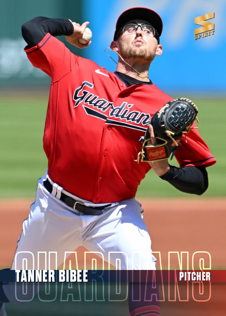
  11. Tanner Bibee - SP

  12. Bobby Miller - SP

  13. Eury Pérez - SP

  14. Kodai Senga - SP

  15. Yennier Cano - RP

Design-wise, there’s a big diagonal bar running behind the player cutouts with the “2023 All-Rookie Team” text running over it. The “All-Rookie” portion overlaps the photo but with a little bit of transparency, the image shows through. The rest of the text is behind the cutout to show some depth. At the bottom of the card is another bar for the name and position running over the whole photo. The bottom right corner has a team color overlay and space for the team logo. The different planes and overlapping is meant to add depth and make things a bit more dynamic.

Here’s a look at the autograph parallels. Everything is the same but with a white autograph strip for the player signature. The original design really lended itself to an easy auto solution.

2024 Spirit Team MVP

Rolling through the customary inserts I do each year, it’s time for the Spirit flagship’s entry, Team MVPs — a 30-card set sporting each team’s best player.

Each year, I try to figure out a way to incorporate a jersey swatch into the letters for MVP. I think this is the first time I’ve had the swatch run behind the letters rather than fill them. I think it helps for readability not having to drop the hole for the middle of the P.

The other design features include a team-color background with some grain added for contrast to the full-color player image. The “TEAM MVP” text is a team-color-ish shiny foil spot for some extra pizzazz. The team primary logo rest next to TEAM. Simple name and team text at the bottom finish things out.

2024 Pennant Throwbacks

First insert for the Pennant set his year once again is the Throwbacks set, featuring players wearing, you guessed it, throwback uniforms. I had a hard time tracking down a lot of instances of teams wearing old-time uniforms in 2023. I blame the whole City Connect thing for that. The only ones I could track down were the Diamondbacks, Marlins and Rays. Expansion-palooza, minus the Rockies who have yet to really change their look since their conception.

The design has the same black-and-white cutout over gradient motif as the base set, though I tweaked the colors to match the team colors of the respective uniforms. The large ‘THROW BACKS’ type looks kinda like an old boxing flyer or something like that from the past.

There’s also a relic version with a swatch from the actual uniforms depicted in the photo. This one has a teal pinstripe, which looks pretty cool. The autograph version has the gradient and photo fading out to white at the bottom to leave room for a legible signature. I don’t think I had seen Arozarena’s sig before but it’s pretty cute, lol.

2024 Clubhouse All-Stars

Today is one of the most boring days of the year — the Thursday after the MLB All-Star Game, when there are zero games on the schedule and no games from the day before to discuss. It is, however, the perfect opportunity for me to post my 2024 Clubhouse All-Stars design, featuring members from last year’s midsummer classic.

Going off the vibe of the 2024 Clubhouse base design, these All-Star cards are clean but bright. Like I’ve done in the past, I used both blue and red in the design but swapped them on the AL and NL cards, respectively. (Mostly because I can never remember which color is “traditionally” associated with each league.) There’s a shiny, refractor-y star pattern along the top border to make these stand out in a pack. I think my favorite item here is the notation in the bottom right corner showing how many times each guy has been an all-star selection. Super satisfying.

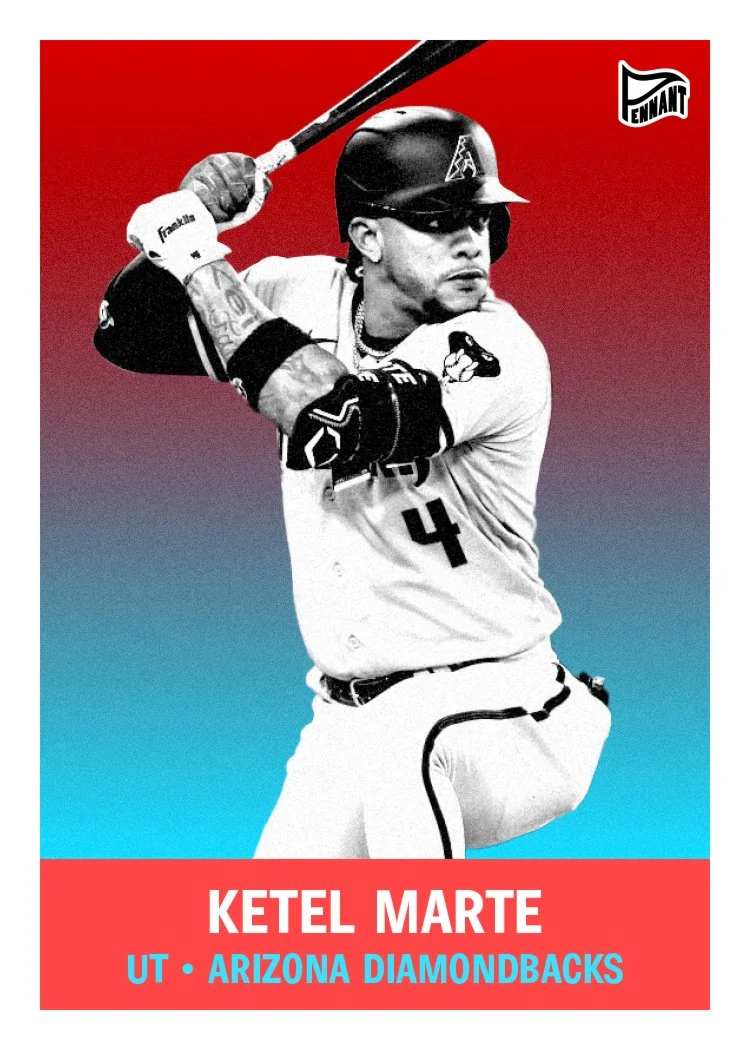
2024 Pennant

After accidentally deleting all the linked PSDs a month or two again, I just finished up redoing my 2024 Pennant set yesterday. Time to share.

These are retro without calling back to a specific time period or design. Nuts and bolts of the design are basically a black-and-white high-contrast player photo on top of a color gradient and then a solid color block at the bottom for their name and team/position text. Rather than going with exact team colors, I decided to do what Topps did back in the day and assign each team its own combo of colors from a general color palette. It’s kinda of a hard task since there are so many red/blue teams in the league. To help that, I picked a couple different blues and a few different reds to mix things up a bit.

This was a fun set to do other than having to do the images two separate time. It did give me a chance to swap out Luis Arraez for the Marlins since he got traded to the Padres after my first go round. Hopefully nobody else featured here changes teams before I click “publish” on this bad boy.

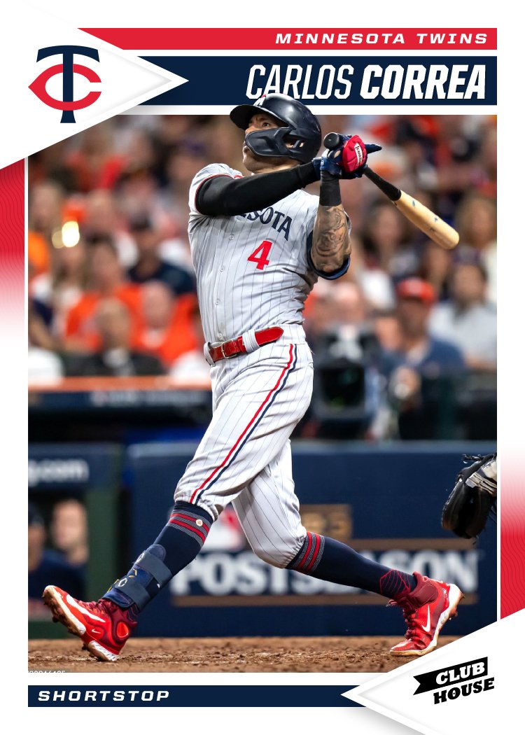
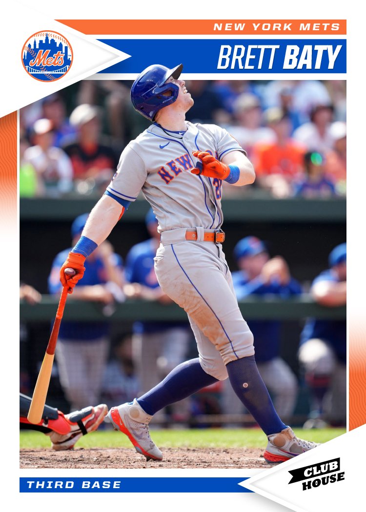
2024 Clubhouse

We're a week into the 2024 MLB season and somehow I've yet to see a single inning of baseball. I guess this is the reality when you have a one-year-old to focus on. I've been keeping up with the league as best as I can through social media and the MLB app but it hasn't been easy. Luckily, I've been working ahead a bit on my 2024 designs and it's already time for the 2024 Clubhouse set.

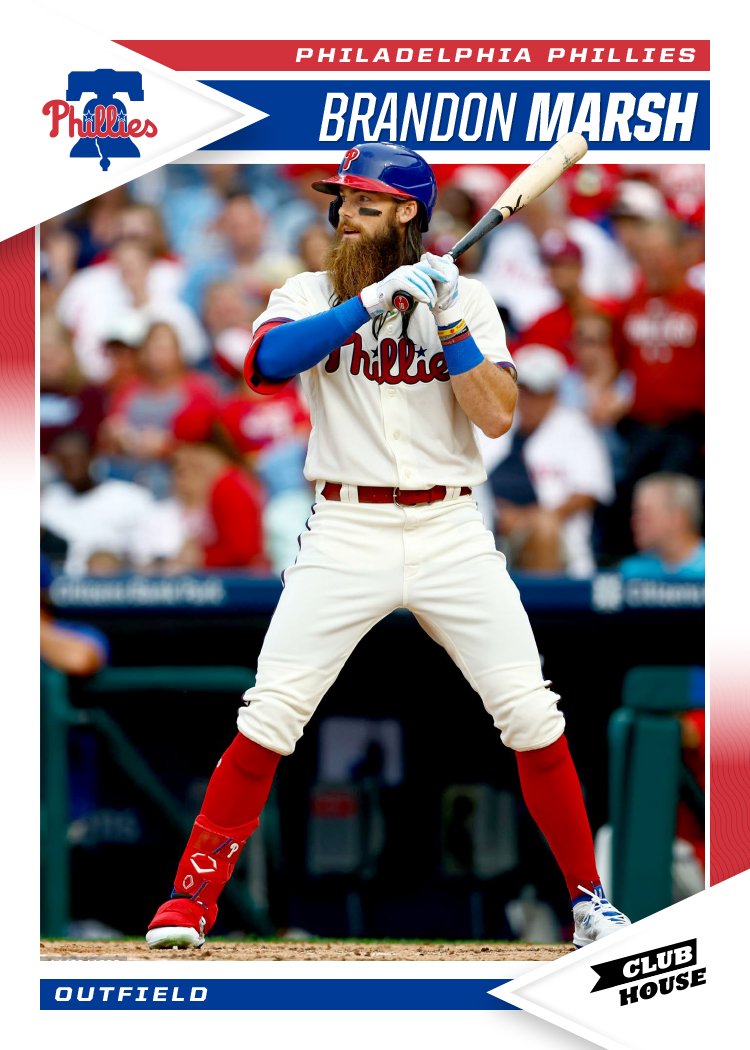
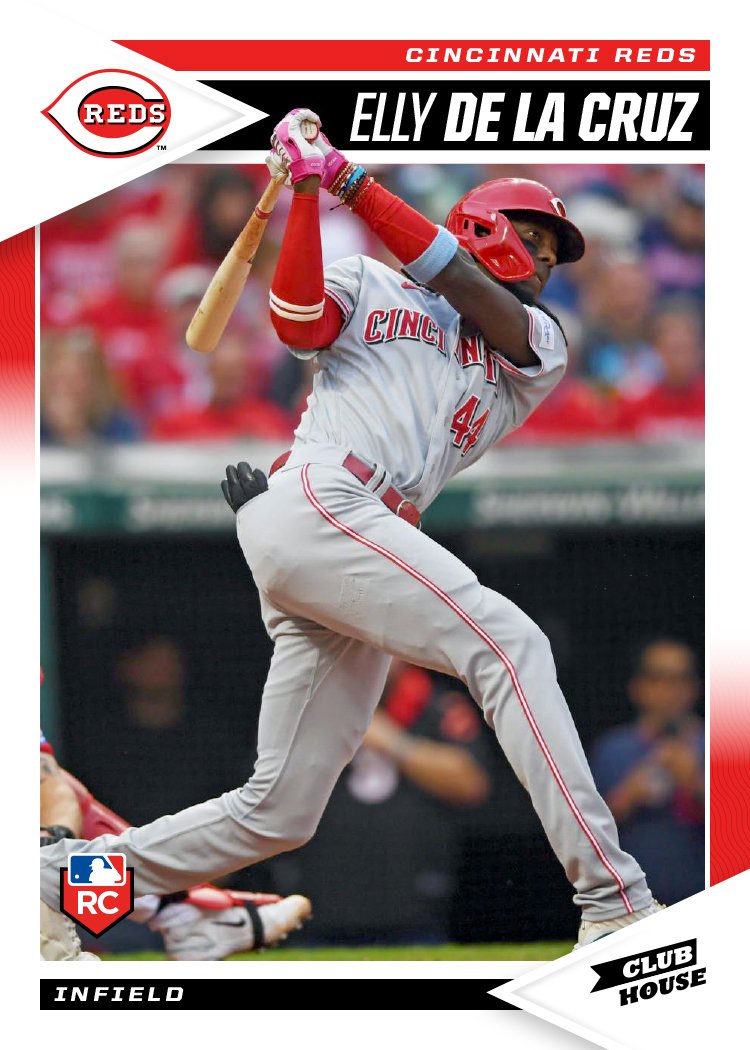
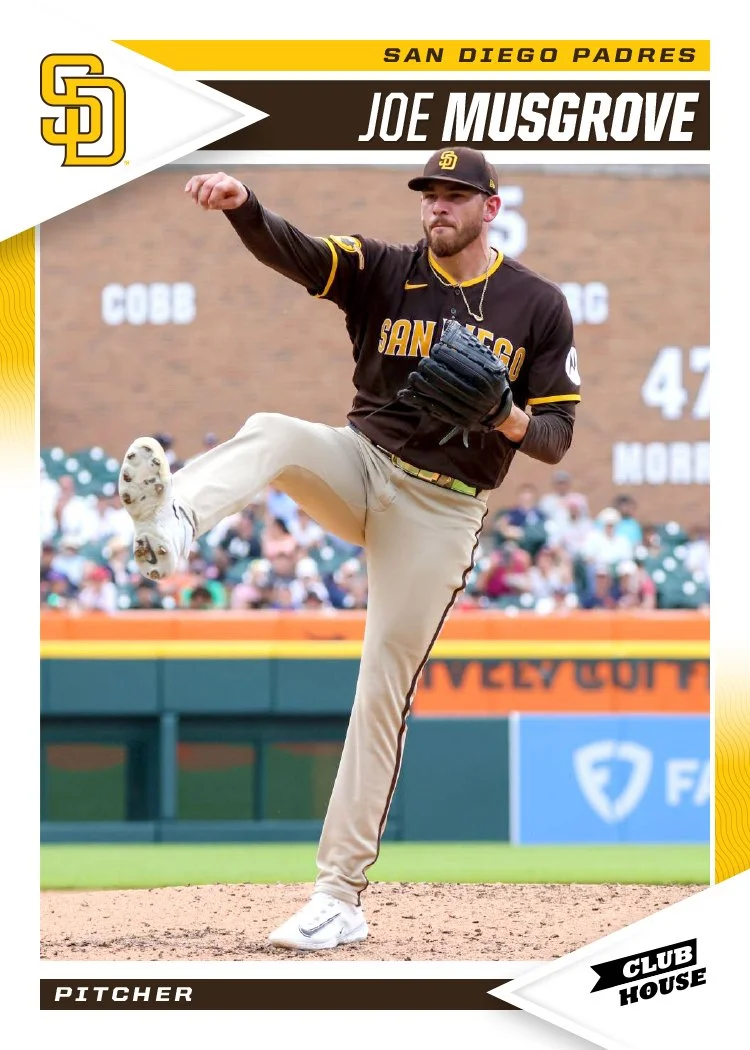
White border return with splashes of the team primary and secondary colors. There's a little bit of a pennant motif that pairs really well with the Clubhouse logo. Each photo finds space to break out of the frame a bit and overlap the name bar a least a little, though there are places like the Harold Ramírez card where it interacts with the name a bit more.

The vibe here is very "early 90's Score" which I've always been personally partial to. If Topps were to shoot for this with the Big League product, I think the response would be a lot more positive than what they've been getting.

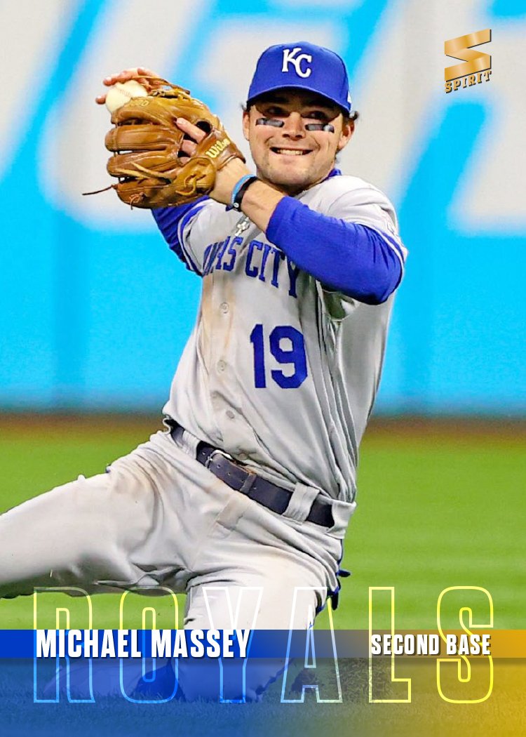
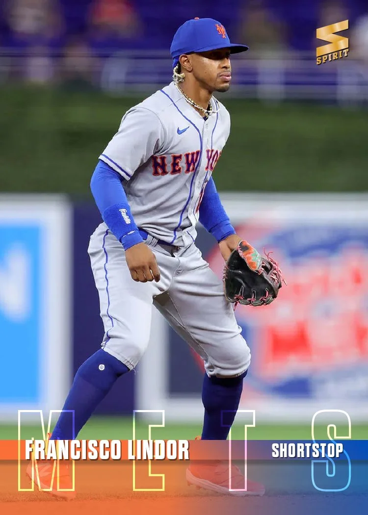
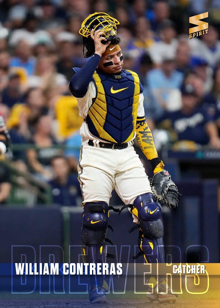
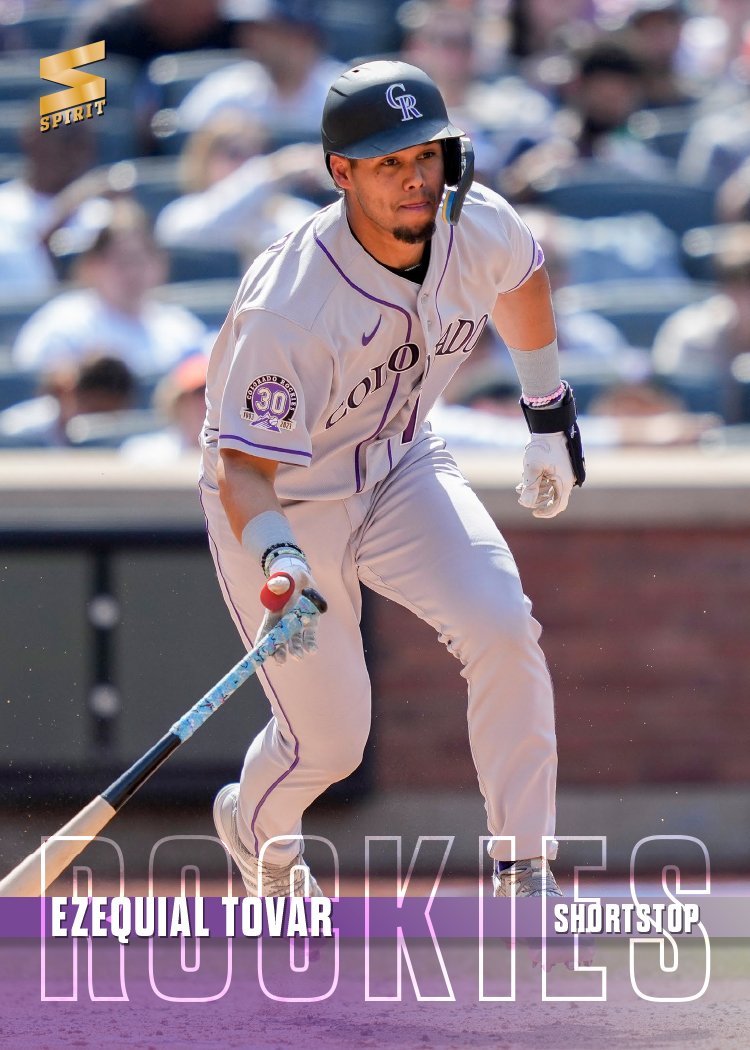
2024 Spirit Base

With Spring Training up and running, it’s time to share my 2024 Spirit base design.

I believe this is the first time I’ve shied away from using some element of the team logo on a Spirit base design. The team names are big and stretched across the bottom of the card, overlapping a spectrum of the team colors. Tucked inside an opaque strip are the player names and positions. That leaves plenty of room for the photograph to be the main focus of the card. While simple, I find the design to be rather bold with the vibrant colors and the large team names.

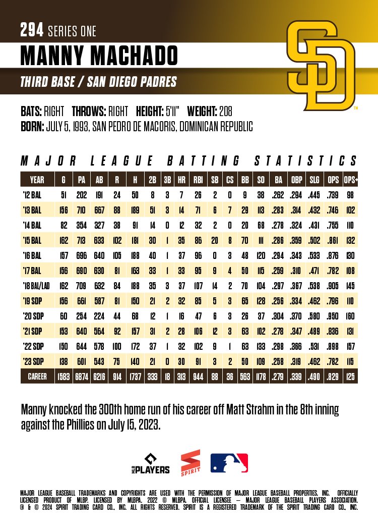
The backs are vertical as well with plenty room for full-career stats like Machado here. Team logos make an appearance on the back so they’re not completely absent from this year’s set. All in all, this is a pretty clean design for me as I’ve been using a lot of textures and effects in stuff the past few years. Not sure if this is an outlier or not but it was nice to do something a little different. Stay tuned to see what’s next.