00s Topps Remix Project: 2006

Oddly enough, 2006 was the first remix I did for this project. I can’t remember specifically what spurred the idea of doing the whole decade or what compelled me to remix 2006, but as soon as I was done with it, it seemed like a no-brainer to tackle all ten designs.

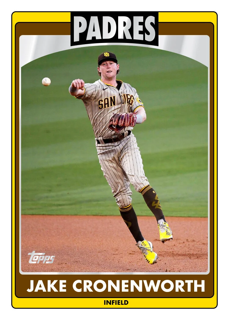
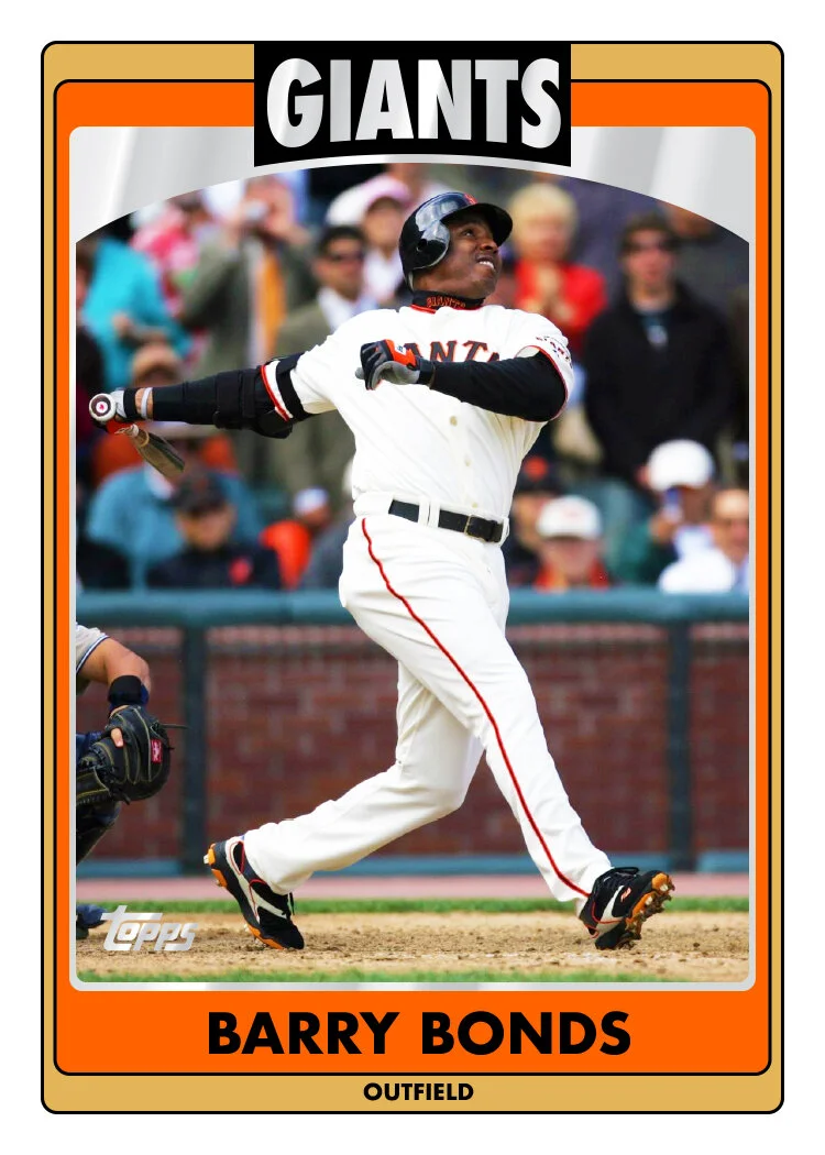
While I don’t “get” the black bar on the foil curve that’s at the top of the original, I decided to keep it pretty close to the same. I suppose this is back around the time banners and ribbons started showing up a lot in the broader design trends, so maybe it was an attempt at that? I did tighten it up a bit so it doesn’t extend as far left-to-right and also shortened it up so it doesn’t dip below the foil arch at the top of the photo. Even though I’m usually a sucker for photo elements breaking borders, I didn’t think it was a good look here since the first border around the photo is foil. I’m sure you’ve experienced some wacky foil-stamping misalignment over the years. In this instance, the nice, smooth border is a must.

For the color bars, I kept them pretty much the same at top, with both bars the same thickness but added a think black stroke to help keep them separated. Where they stretched down to the bottom, I decided to make the primary bigger and have it house the player name. I ditched the banner where it used to live for a couple reasons: a) I didn’t like the shape of the flag edges folding back along the edges; b) it was too small and made the player name tiny to fit the space. Ditching the banner gave me more space to make the name bigger and legible and got rid of that little sliver of photo peeking through. The bottom bar has just enough space for the player position and also got rid of some of the extraneous black that Topps was in love with for that period.

Again, I went back-and-forth with how much to keep and how much to ditch, but since getting rid of the banner at the bottom was DEFINITELY going to happen, I decided the team name foil treatment had to stick around. In the end, I’m pretty happy with this remix.
00s Topps Remix Project: 2005

Working through these remixes, 2005 was the one that gave me the most trouble. I didn’t do them in chronological order, so I had already tackled 2004 and 2008 when I got around to 2005. My biggest issue was that those 3 original designs have one very similar element: big text at the top of the card against a white background. True 2008 has the color dots, but there’s still a enough of a similarity that I always kinda clump them together. Given the opportunity to change these designs and differentiate them a bit, 2005 kinda forced my hand. But I’m satisfied with my solution.

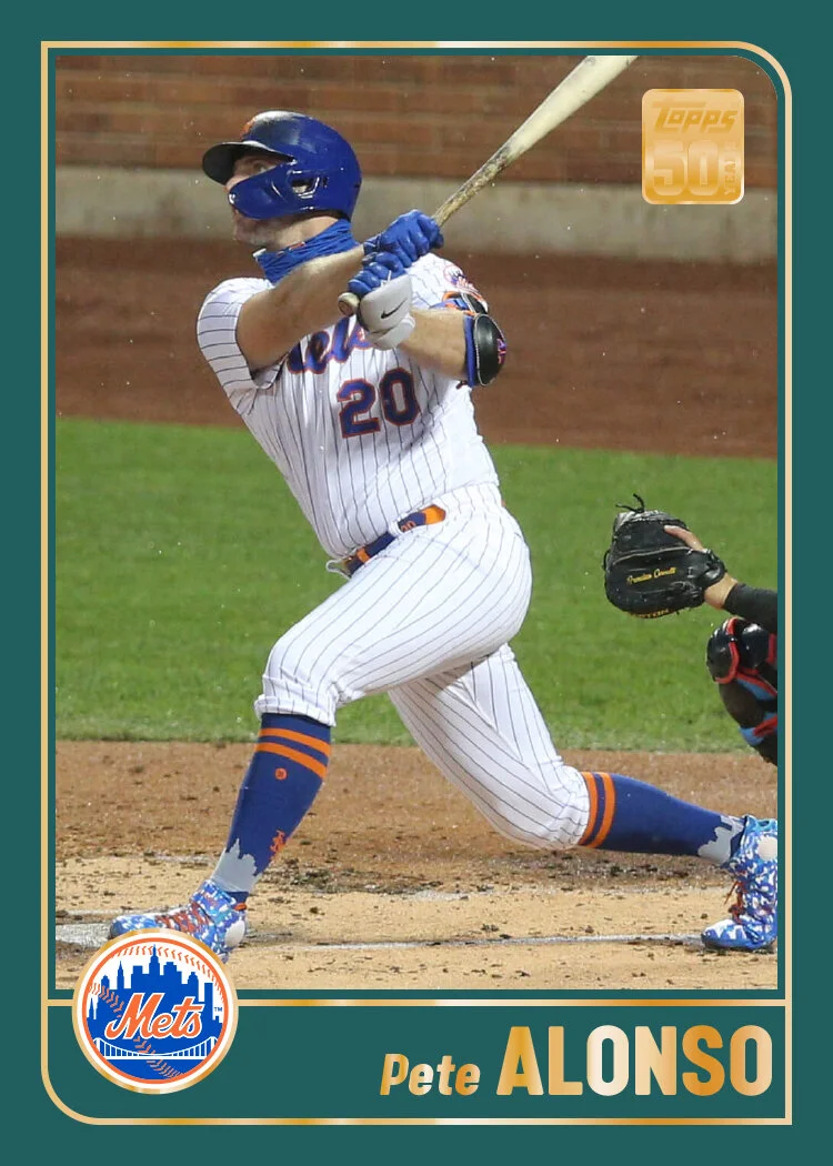
Since there’s symmetry with the design on a left/right basis, I did the same top/bottom. The black bar at the bottom of the original underwent meiosis and found home at the top as well. Now the big last name text is in white so it’s nice and legible. I kept the team color tabs on the left and right sides to house the team name and player name. On the original, the two colors do a criss-cross move in the middle that always bugged me. I decided to just have a sharp gradient instead to get rid of the double lines around the whole photo. Topps has a hard time figuring out that if you stack these team color lines so close to each other, they visually meld into a mess, making either color hard to discern. No such issue here.

On the bottom, I went with the primary team logo instead of the script logo on the original. This is mostly because a lot of the team scripts are meant to go over white, not black, making it really hard to read/make them out. The logos are more stand alone and have white keylines to easily offset them from any background. In the bottom left corner, I switched out the year with the player position for two reasons: a) Topps never has the year on the front of the card, so I’m just keeping that consistent; b) the player and team are both identified on here twice, so it seems like the player position should be on there to justify doubling up on those two.

This is strangely the most I’ve matched from an original but also the most drastic change thus far.

00s Topps Remix Project: 2004

After a run of 6-straight years with colored borders, Topps started off a new streak in 2004 with white borders on their flagship design. In other words, don’t expect any more border color changes from my remixes.

The biggest change here is probably the dismissal of the silver foil for the team and player name stuff. I really have no issue with foil on white but I decided it was an opportunity to inject some more team color into the mix. I simplified the color border around the photo so it’s now just a solid thick color instead of…. whatever Topps did. I also rounded said borders because having some hard and some soft just didn’t work for me. I tried them all as sharp angles at first but It was too harsh.

Though I had some initial internal resistance, I decided to soldier on and keep the little player figures in the bottom left corner. These are arguably the defining design characteristic of this set, so I felt compelled to keep them. Luckily it’s hard to tell how poorly they’re drawn at such a small size. Inside the little figure box, I switched out the uniform number on the original with the player position. That allowed me to make the name a bit bigger, which was definitely an issue with the original.

All in all, I think this is probably one the best examples of fixing something up without really changing the spirit of the design. More than anything, Topps needs an editor to chip away at some of the extra-ness they’re prone to deploy.

00s Topps Remix Project: 2003

I don’t think I have any actual 2003 Topps cards in my possession. That makes it hard for me to make a fair assessment of the blue borders. Digitally, they appear sometimes a vibrant, royal blue while also veering towards a lighter navy in some images I see. The results are thrown even more askew when factoring in the team colors of a particular card. For all the blue & red teams across the league, it looks pretty great. For any team that doesn’t have blue as part of its color scheme, it’s very jarring. So, once again, we’re turning the borders white.

There’s a good reason why more Topps flagship designs have had white borders than have not. (Okay, the real reason is probably because no-bleed borders are more cost-efficient when it comes to printing…) It makes the success of the design less conditional on the particular player or team. Just on these 3 cards here, the blue borders would look good but still different on the Colón and Bregman (royal vs. navy). And definitely bad on the Hudson. If you take that variable out of the equation, the results are going to be more consistent.

Moving past the borders, I decided that thickening up the line between the color box and the diamond photo would be a good way to introduce the secondary team color along with adding enough space for the team name to make an appearance. I kept the gold foil as a nice separator or elements and even let it stay for the player names. I think there’s probably enough contrast between those color boxes and the foil that it should be readable no matter what color (so long as it’s not black). The names have been right aligned so they line up with the new team name as well as to balance out the side of the card opposite the portrait and position. The last little tweak was adding a small color stroke around the photo to make the borders look more intentional and less like they’re just margins.

00s Topps Remix Project: 2002

My 2002 remix brings the first drastic change from the Topps original (though probably not too drastic if you follow me on Twitter….). BUT, even if you saw that preview back then, there’s still something new for you here.

The most obvious change is the mustard yellow borders are gone. I don’t think they’re as notorious as the 1991 Fleer yellow borders, but they seem to have a bad reputation. That’s probably going to be the biggest no-brainer in this whole project. Against the white borders here, the ribbon motif is actually kinda fun and old timey without being cheesy. I redrew them a bit so the white edges make their way to the card borders. I change the font and put the names in white so they pop off the color banners and match the overall cleanliness of the design now. The last move was to replace the redundant “2002 Topps” text at the top edge of the photo with the player position since that was absent. It’s a better use of the space left up there to accommodate the ribbon on the left side.

With those tweaks, this easily shoots up towards the top of the list of best Topps designs in my book. They’re bright and colorful without being obnoxious, touch on some standard baseball imagery without being cliché, and do a good job of straddling the modern and vintage eras. Feel free to chime in if you think I’m going a little overboard with that praise.

00s Topps Remix Project: 2000

The Aughts were a bit of a lost decade for me when it comes to collecting. I didn’t buy a single card from the turn of the century until sometime in 2010. Though I dropped out of the hobby in the mid 90s, the early half of that decade found me VERY involved. Upon my return in 2010, I found myself checking up on what I had missed and became very overwhelmed. It was like trying to process an ancient book written in Latin, Aramaic, Mandarin and Klingon all at once. As a kid, I wasn’t all that interested in cards from the past (mostly because they were inaccessible to a kid) and just dove into what was current and upcoming at the time. I followed mostly the same tack as an adult. Though with the monetary barrier no longer in place, I did sample a few things from the previous decade. A lot came from random stuff in those retail repacks or whatever happened to be leftover for clearance at Walmart or Target. Just enough to get a taste but nowhere near comprehensive.

Thanks to the internet, I’ve been able to fill in the gaps here and there in the subsequent years. Whether stuff popping up on my Twitter timeline, random sale/trade threads on forums or simply just on the Cardboard Connection chronicle, I’ve seen enough of the decade to know that I missed out on a LOT of ugly designs. Being one who rarely misses out on an opportunity to pick apart card design, I felt compelled to put my mouse where my mouth is and do some “remixes”. I’ve done this in the past on my old blog and randomly on Twitter when the mood struck me. Here, I’m doing an organized stroll through the decade of Topps flagship designs I missed out on their first time around.

There are no hard-fast rules as to what I’m changing/keeping with each design. Foil, colors, fonts, structure, etc., are all open for reinterpretation. I will say that the aim is to not do anything radically different but to keep with the spirit and point of the original design (so much as I can determine a point exists). This isn’t a Project 2020 or Project 70 thing. I’m not looking to futz up everything to the point it’s nearly beyond recognition.

With that introduction, here’s my first entry: Topps 2000.

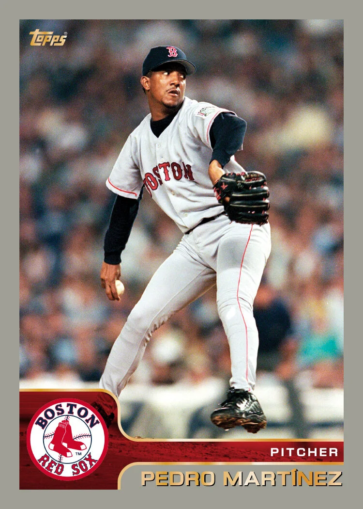
If you need a refresher on what the original 2000 design looks like, here you go. I kept this one pretty similar with the border color and basic construction the same. I decided to make the weird color shape a little more logical, leaving a uniform shape in the bottom left corner to better accommodate the team logo. One of my bigger beefs with the original was the tiny little tacked-on logo floating up above a color block that served no purpose other than to house “TOPPS 2000,” which is redundant since the logo already exists in foil in the upper corner. On the OG, the player name is in foil on top of a semi-transparent block, allowing a bit of the photo to show through. Unfortunately, that causes some legibility issues on some cards where that part of the photo is dark. To fix that, I extended the solid border so it’s behind the name, providing plenty of contrast to be read. I did keep the overlay element but shifted it to the team color bar. The original has colorized brushed metal texture there which I didn’t think was compelling enough to keep around. The team colors leave enough contrast for the player position in white, no matter the background photo. I kept some of the foil flourishes but now the add emphasis to the other elements instead of having to do much on their own.

Overall, this one’s not too different. Just a little tidier and more “purposeful” if that’s the word. Honestly, the original 2000 design was probably one of the better ones of the 00s. Stay tuned for 2001.

Welcome to 2021

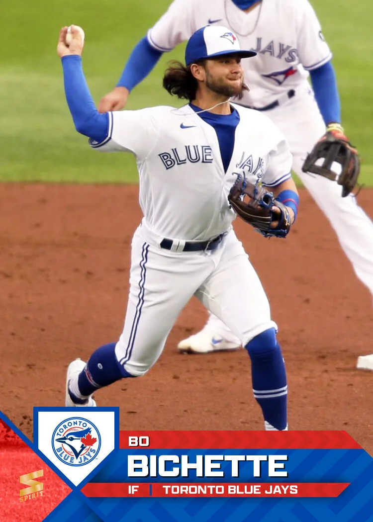
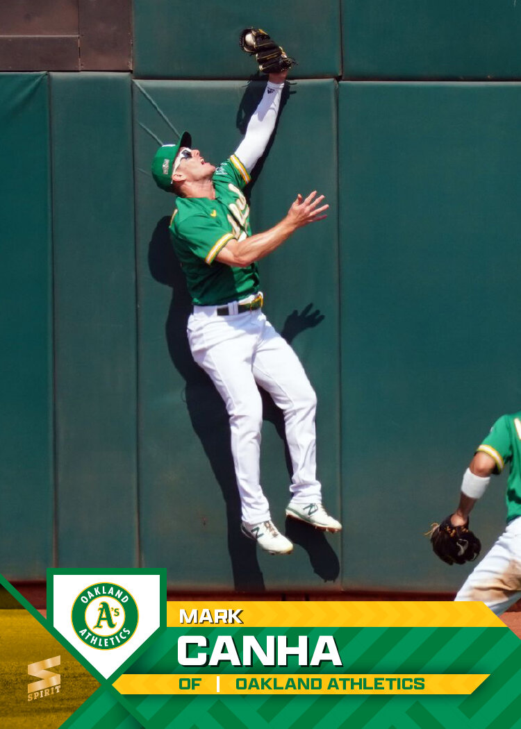
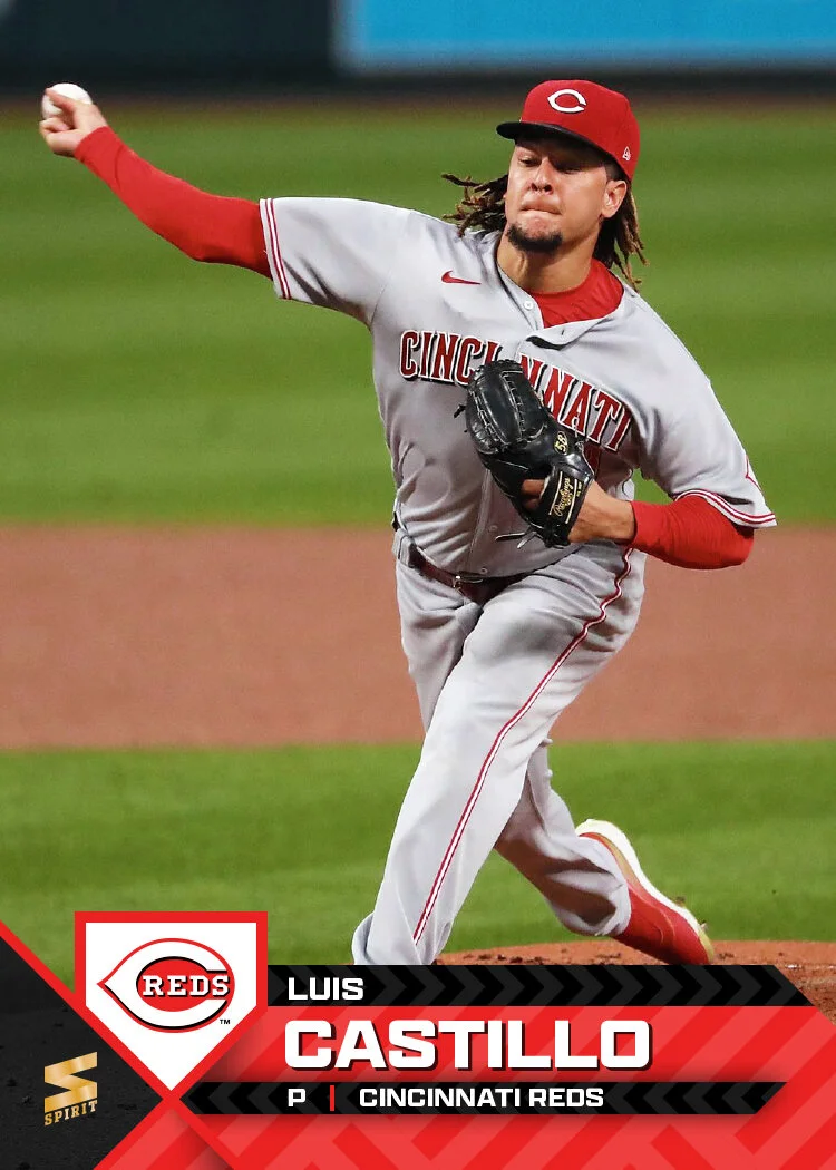
In honor of the first Spring Training games of the (pre)season, I figured today would be a good day to share the Spirit 2021 designs. I’ve decided to scale back from last year and just make a card for each team here instead of making one for every single card on the checklist. This means I’ll have more time to tackle other designs like inserts for this set as well as some of the other releases I’ve done in the past (Clubhouse, Pennant, Deluxe). I also tackled just a couple of the backs — one pitcher, one batter — since those may get a little boring looking at 30 in a row.

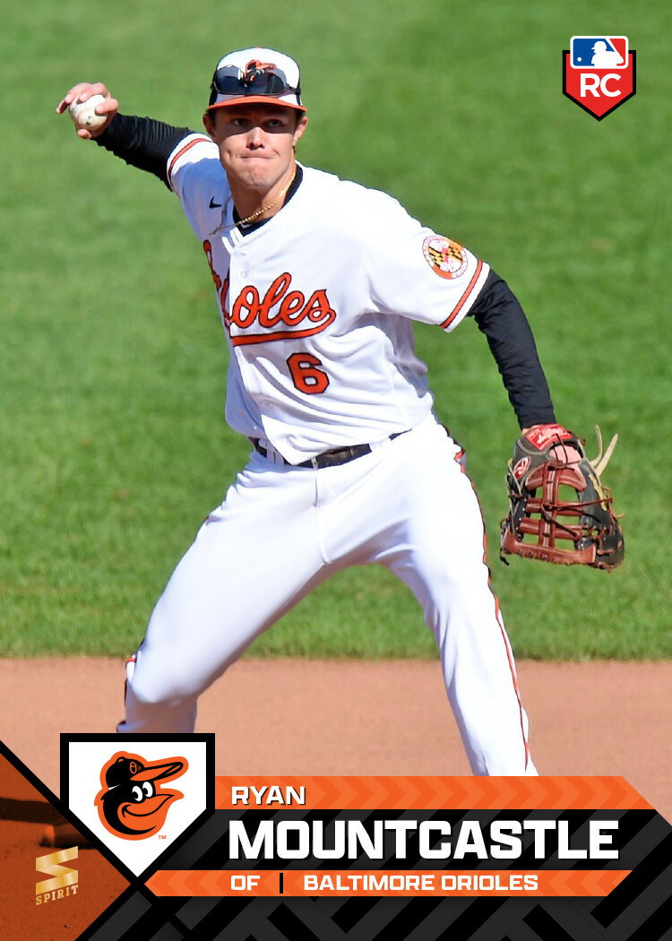
As I try to do with the Spirit line, the base design features full-bleed photos with team colors and team logos as well as the player name prominently featured (and easy to read). The home plate shape for the logo took me in the direction of these diagonal elements for the team colors and name plates. The idea is for the design to add some visually interest and give the info room to live without getting in the way or overpowering the photo. Ryan Mountcastle and Dylan Carlson have the standard RC logo I’ve been using on Spirit cards for years, tucked into the top corners to balance the design as a whole and not crowding the bottoms.

The backs are full-color with the same colorful diagonals from the front. I pared down the bio information so it could fit in the secondary bar and leave room for a fuller career stat record. I also reintroduced a feature from previous years where a player’s accomplishment from the previous season can be easily highlighted (Maeda’s All-MLB 2nd Team honor, Solano’s Silver Slugger award). Obviously every player won’t have such a notation but the space will still work if empty.

As 2020 taught us, plans are futile and we’re all living in a nonsensical simulation, but my intention is to have a good number of card design posts in this space throughout the upcoming season. Even as the hobby and world have made some huge shifts in the very recent past, making and sharing these cards is something that brings me joy, so hopefully there’s plenty more to come.

The Adults Are Batting

One of the very first things I learned about my wife when we started dating was her undying love for The Strokes. They are her all-time favorite band. She knows the lyrics to every song, the tracklist of every album, and a nearly-alarming amount about the band members themselves. I gained some major brownie points by singing along with “Reptilia” when it came up on shuffle on an early date. That combined with her obvious nerdiness for the band gave me clearance to open up to her about my nerdiness for baseball and baseball cards. Though she accepts them both, she still likes to tease me about it.

The Strokes put out a new album this spring, The New Abnormal. Before the release, they had played a few songs live, recordings of which had made their way to YouTube. One that I liked in particular was called “Ode to the Mets,” to which my wife says “of course you like the baseball song.” I used this as an opportunity to point out that, like her husband, her lifetime crush (Julian Casablancas) is a baseball fan. I was able to help her get her eyes back in place after they completely rolled out of her skull.

While my fandom will never rival hers, I was excited when the album was officially released in April and really cherished the chance to digest and experience a new album together with her. We learned the songs together, hummed melodies around the apartment, listened in the car and just kind of soaked the whole thing up during our quarantine. Through this weird and weary year, The Strokes shifted from being “her” thing to being “our” thing, with The New Abnormal being the artifact of that transition.

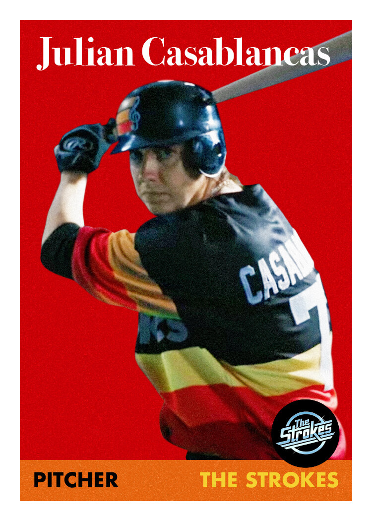
Fast-forward to yesterday when The Strokes posted an official video for “The Adults Are Talking” to their YouTube page. Suddenly, the “tequila sunrise”-inspired Strokes jersey we saw Julian wearing on Saturday Night Live made sense. The video shows the band squaring up against a team of Terminator-style robots on a baseball diamond. Though the whole thing is obviously green-screened, it’s impressively accomplished, including the guys’ athletic maneuvers. Julian, being the frontman, gets the most screentime as both the pitcher and the baserunner sliding into home for the climax. I suspect it’s also because he’s probably the most comfortable on a baseball field.

Now that Bivi and I have fully bonded over The Strokes, I took this as an opportunity to merge our nerd-realms and make some cards using stills from the video. As mentioned above, Julian gets most of the screentime and also the only frames good enough to take stills from. Luckily there’s one of him on the mound and also at the plate, so there’s a little bit of variety. I mimicked 58 Topps and 78 Topps pretty faithfully and then did a pair that evoke 84 Topps and 87 Topps without total replication. With those jerseys (and the image quality), I figured throwbacks were better than trying to do something modern.

I showed these to my wife and she loved them. She told me Julian would love them and I need to tag him on Twitter and this and that. I love her enthusiasm and optimism that he would see/like these. But more than that, I love how I was able to make something that so perfectly encapsulates the two of us and how dorky we are together.

Now I just need for the band to put those jerseys up on their merch site and I’ll have Christmas covered.

Every Day Is a Holiday

Today is National Baseball Card Day, according to Topps anyway. As I’m sure you’re aware if you’ve made your way to this blog, I’m a big fan of baseball cards — even as an adult. The main call for NBCD is to get collectors into hobby shops and buy cards. Topps facilitates this by providing shop owners “free” packs to distribute to customers for coming in and/or buy cards. Well, since there’s a pandemic going on, the idea of going to a card shop today seems particularly dubious. Still, I try to not be a scrooge for any holiday, let alone one that caters to my interest in particular. So here’s how I celebrated today.

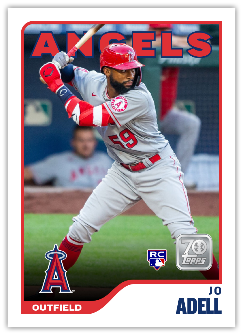
Earlier this week, Topps unveiled the design for their 2021 flagship release. In addition to disappointing many “collectors” by revealing Jo Adell rookie cards won’t be in any 2020 product, the reception was overwhelmingly sour. I found a lot of issues with the design and tried my hand at rectifying them a bit to meet in the middle of what Topps decided on and what I consider to be “good”. The finished product still has a few flaws but I’d call it a definite upgrade.

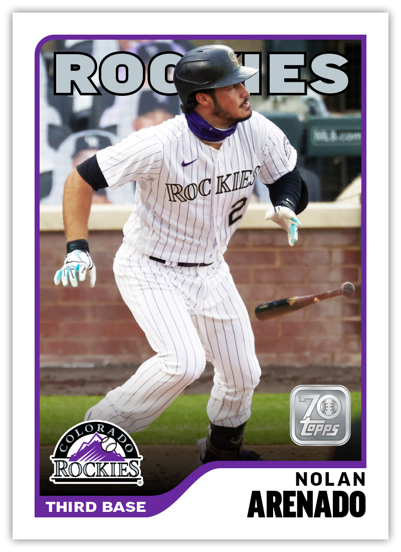
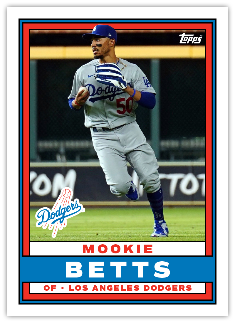
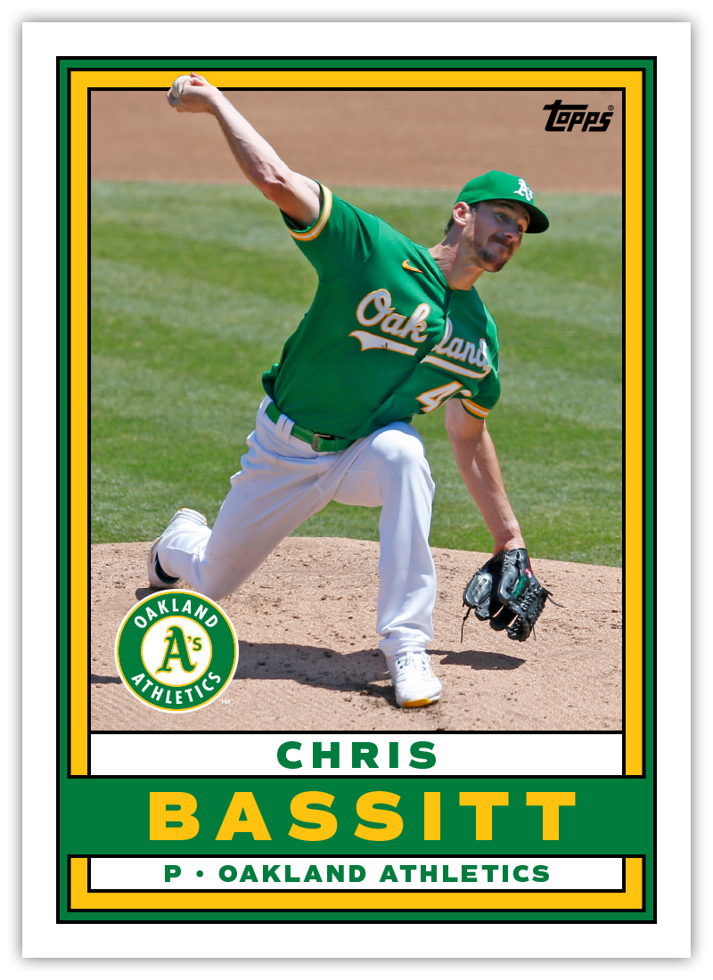
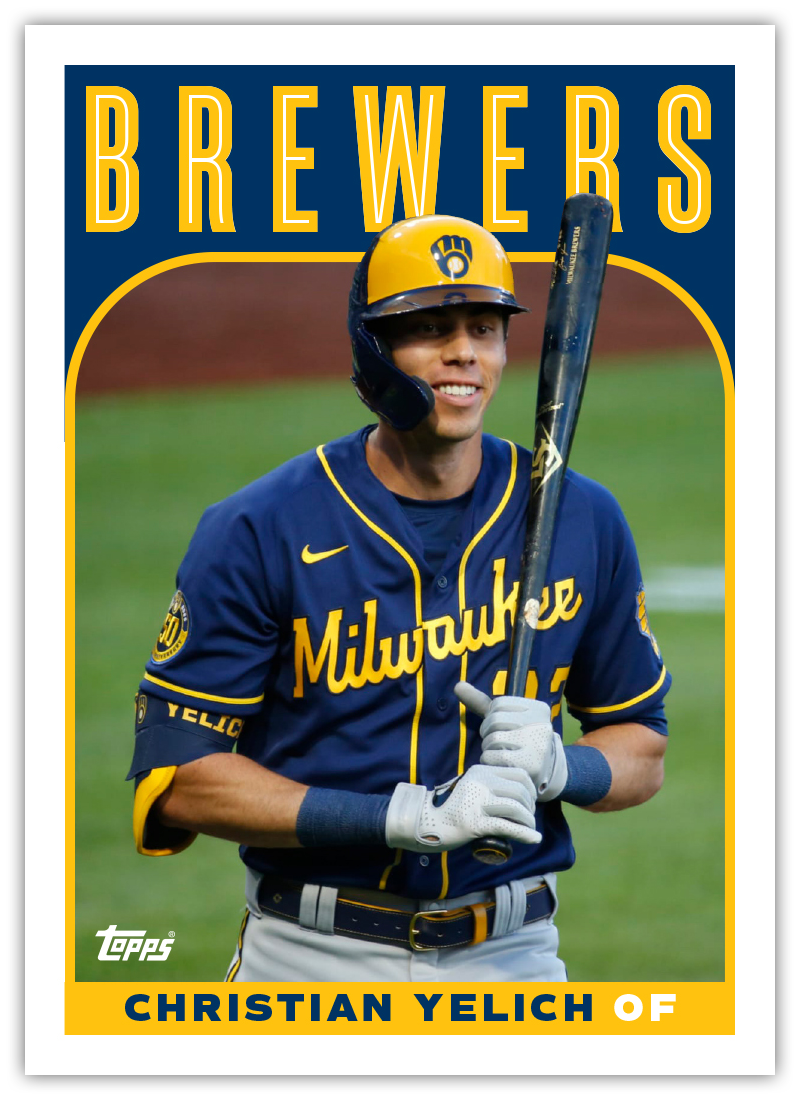
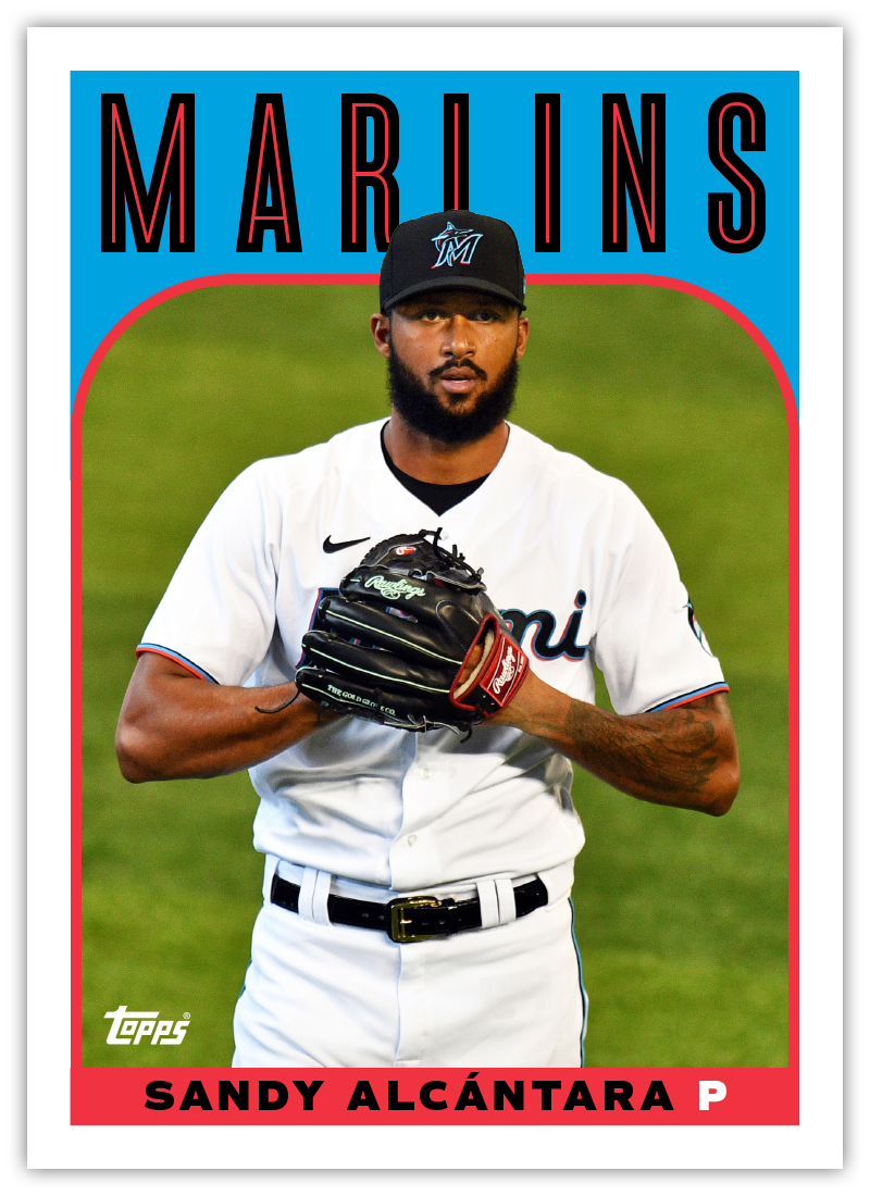
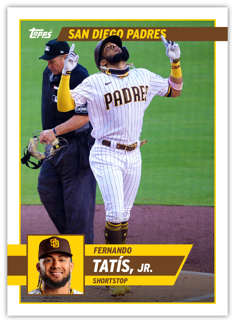
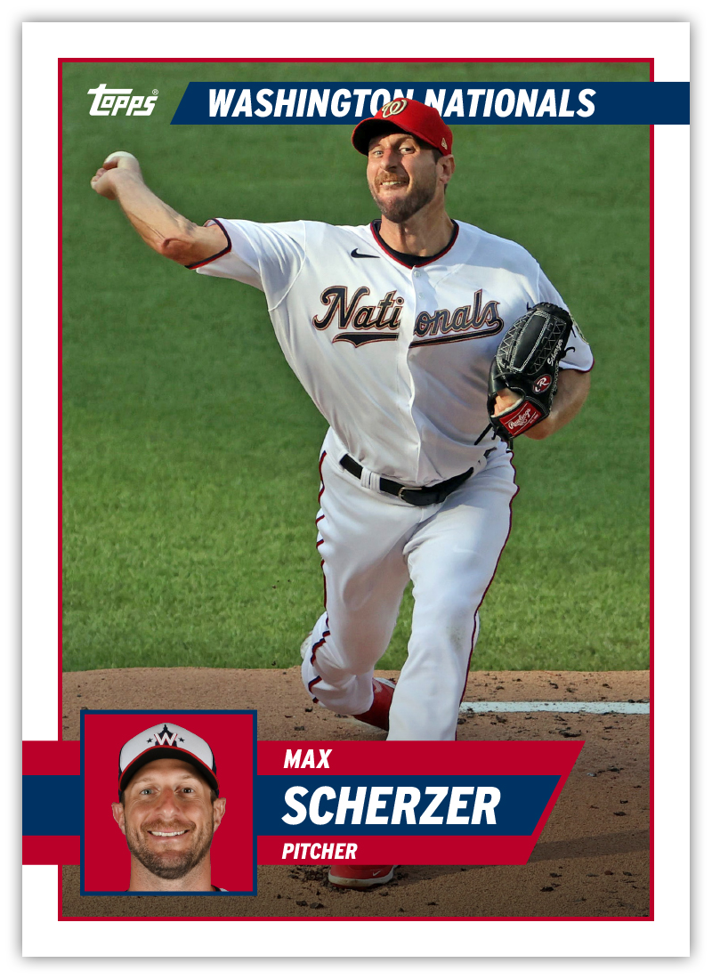
Well, since that day, I’ve been in a card designing mood, leading me to spend my Saturday putting together a few more design ideas for what some might consider a more traditional baseball card look. So here are 4 new designs (2 cards of each) that I think bring to mind some of the rich history of baseball card design without ripping anything off entirely. Hopefully these bridge the gap between traditional and modern.

Unnecessary Evil

I love living in Northwest Arkansas. The land here is so scenic and beautiful. The population is just about the right size (not too big, not too small). It’s more culturally enriched than you might think. I’ve been here for about 6 years now and I would be more than happy to call it home for the rest of my life.

One of the things I don’t love about being an Arkansan is having to call Tom Cotton “my” senator. Earlier this summer, he penned an op-ed in The New York Times calling for the deployment of troops in response to the Black Lives Matter protests all across the country. In other words, “stop complaining about brutality or face more brutality.” Not content to embarrass his constituents on a national scale just once this summer, he poked his head back into the spotlight this weekend thanks to an interview with the Arkansas Democrat-Gazette where he calls slavery a “necessary evil” for the founding of our country.

The most shocking aspect of these views/words is how unsurprising they are coming from Mr. Cotton. In Conservative circles, he’s seen as a potential player on the national stage, with a 2024 presidential campaign a real possibility. That tells you all you need to know about the GOP. Given the opportunity to display compassion, empathy or any regard for the common good, they choose cruelty. Their entire ethos can be summed up in two words: Unnecessary Evil.

Though the odds are long (thanks to so many issues currently plaguing our country), there is a chance Mr. Cotton could be unseated this fall. Though he won’t be disappearing anytime soon, at least he wouldn’t be espousing his hateful ideas with a seal of approval from the citizens of Arkansas.

Future Blog Posts

Hi there. Keep your eyes peeled for any future posts that may or may not arrive. In the meantime, wear a mask.