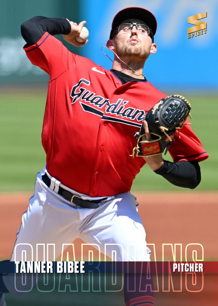
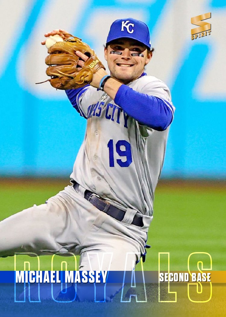
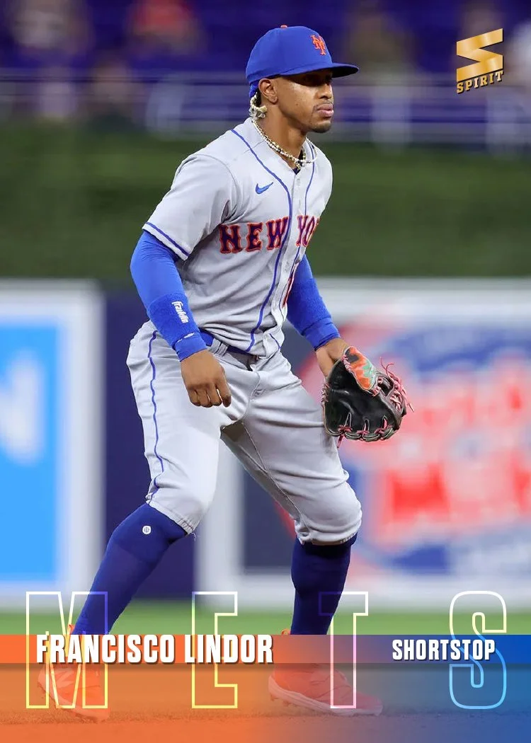
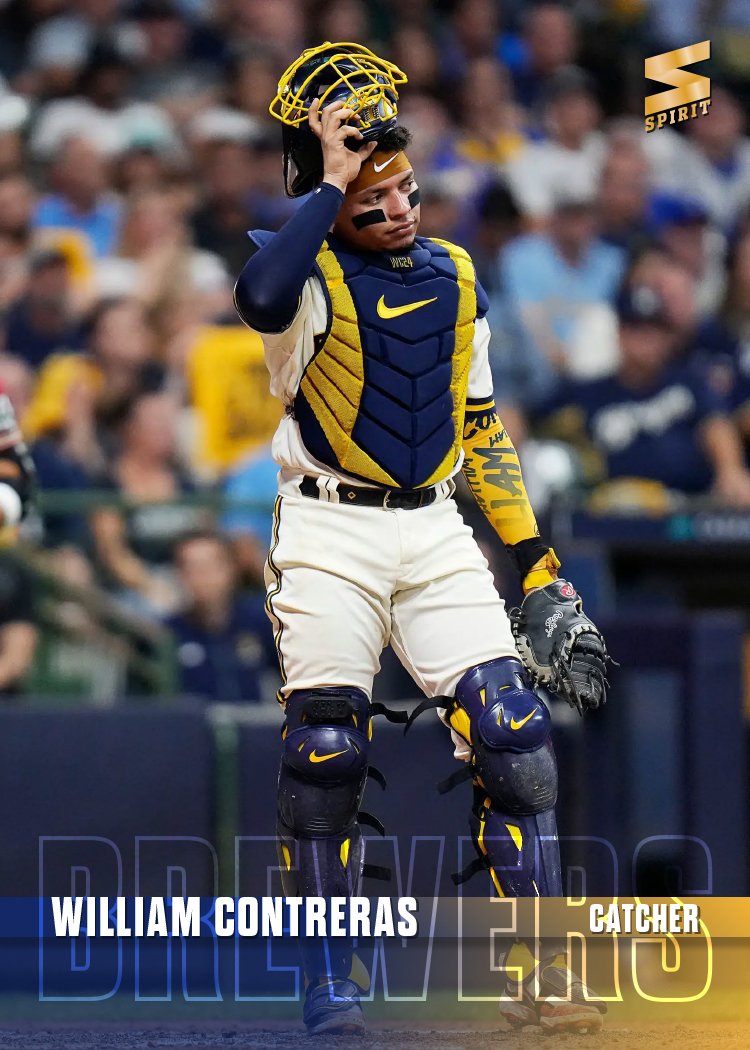
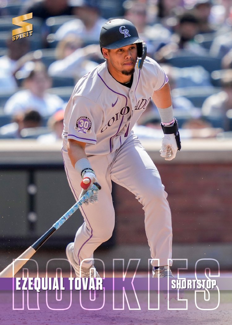
With Spring Training up and running, it’s time to share my 2024 Spirit base design.
I believe this is the first time I’ve shied away from using some element of the team logo on a Spirit base design. The team names are big and stretched across the bottom of the card, overlapping a spectrum of the team colors. Tucked inside an opaque strip are the player names and positions. That leaves plenty of room for the photograph to be the main focus of the card. While simple, I find the design to be rather bold with the vibrant colors and the large team names.
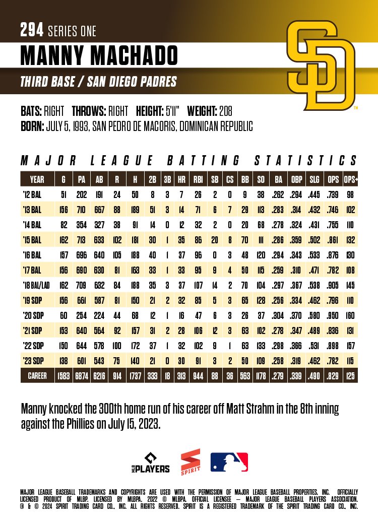
The backs are vertical as well with plenty room for full-career stats like Machado here. Team logos make an appearance on the back so they’re not completely absent from this year’s set. All in all, this is a pretty clean design for me as I’ve been using a lot of textures and effects in stuff the past few years. Not sure if this is an outlier or not but it was nice to do something a little different. Stay tuned to see what’s next.


