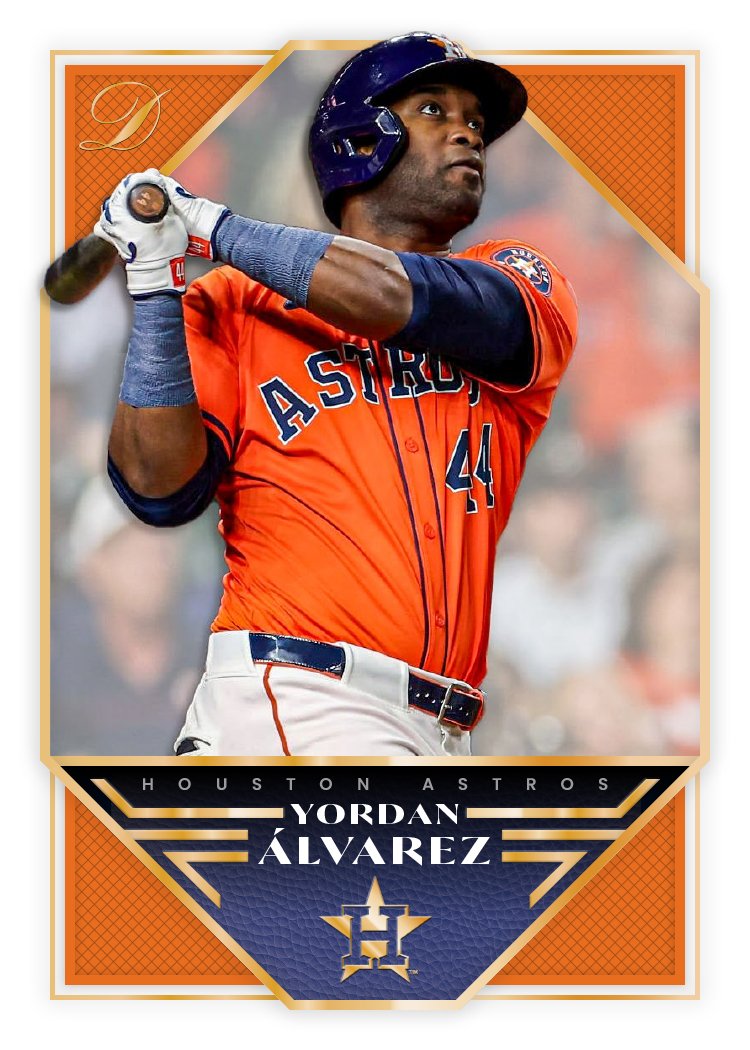
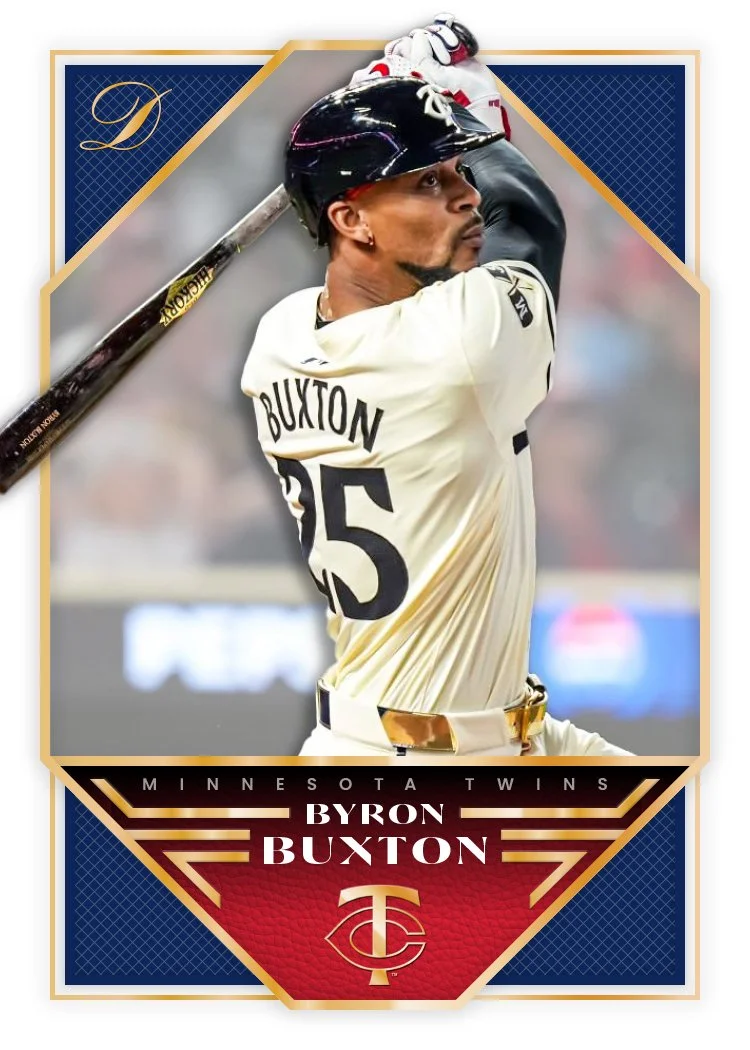
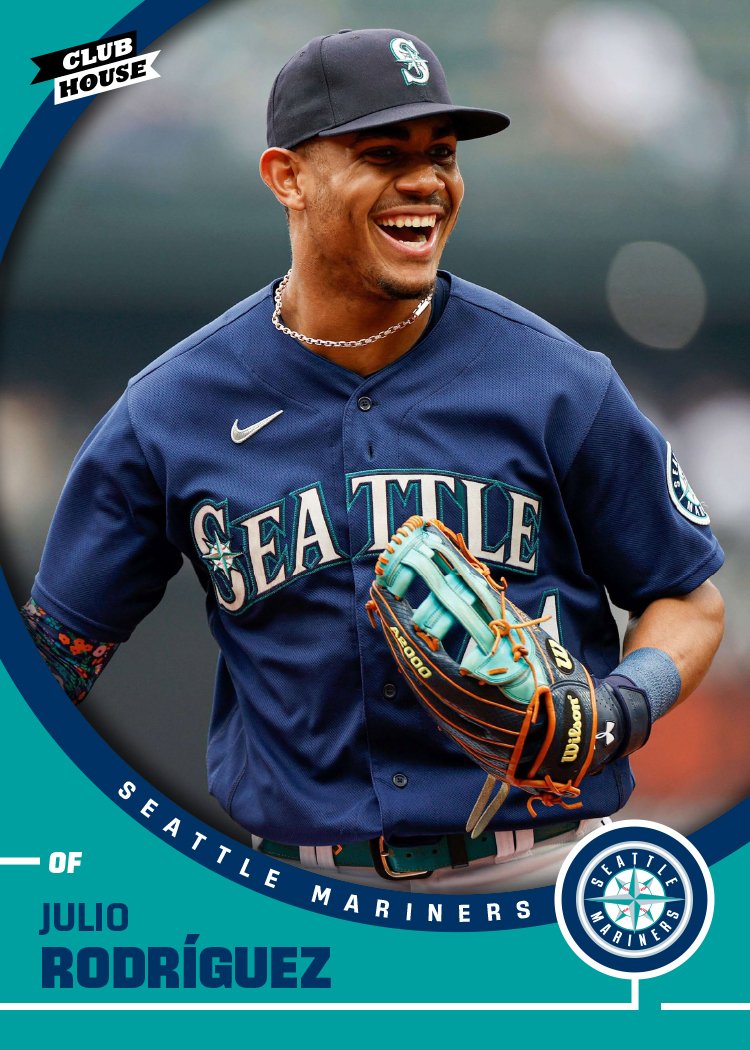
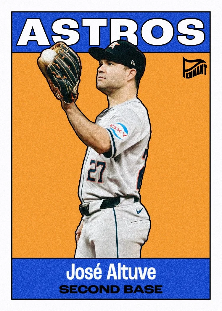
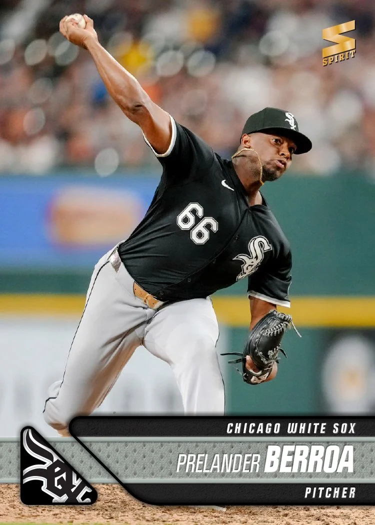
Now that Topps Series 1 has hit the shelves and Spring Training is up and running, it’s time to take a look at what 2025 has in store for my fake Spirit brand.
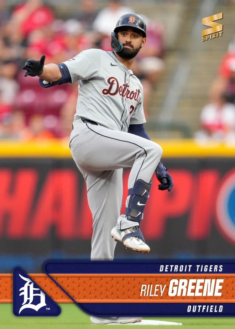
I went borderless once again like I’ve done for the past 14 years now (omg). Photographically, I tried to get a good variety of photos here, sprinkling in some actions shots along with stuff from the sidelines or dugout. Even with the action shots, I tried to pick some with interesting angles or a unique element. The Toglia one in particular is good example of a run-of-the-mill action that’s a little different than what you might typically see on cardboard. Of course the stuff like the Gatorade bath, tv interview, etc., might stand out a bit more.
As for the design, there are basically three elements all reflecting each team’s identity — the ribbon running from edge-to-edge with the player name, the secondary bar below holding the team name and player position, and then the wedge with the team logo in the bottom left corner. The 45-degree angle adds a little drama along with the stroke of the underneath bar overlapping the ribbon. There’s a little texture and depth in there but overall it’s a rather clean design.
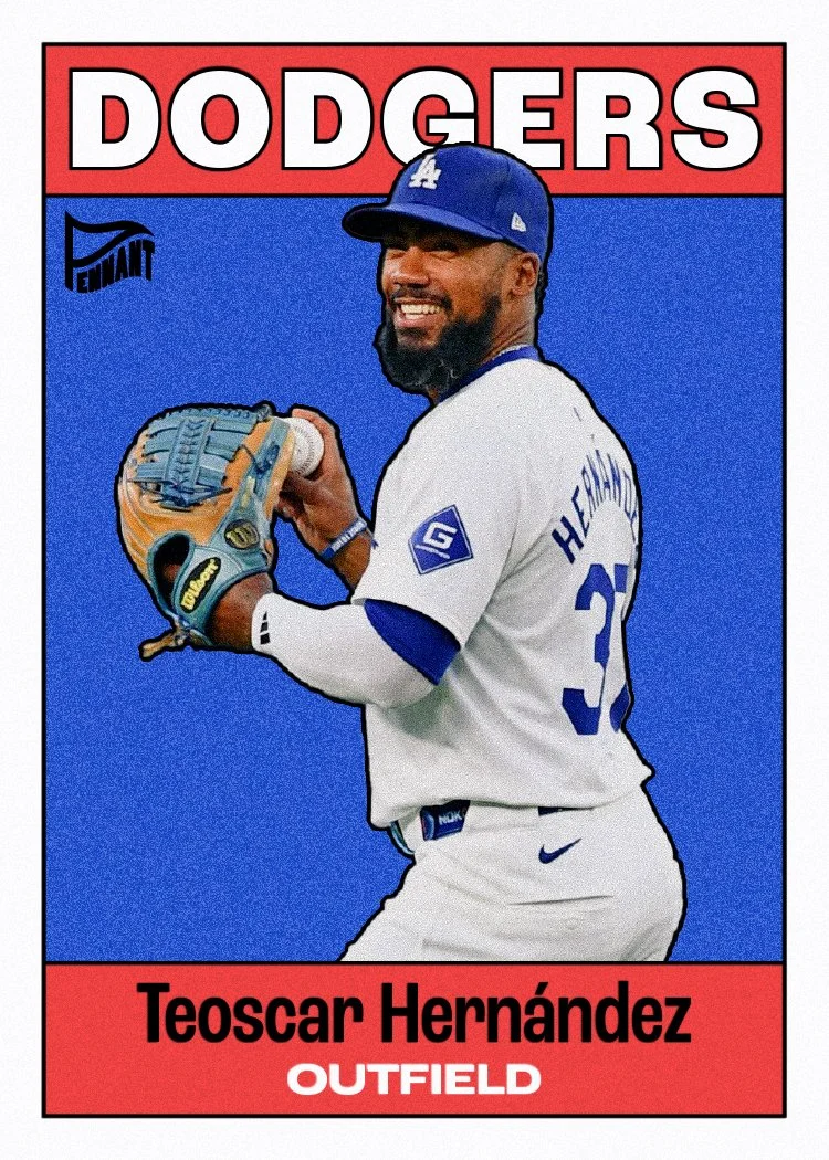
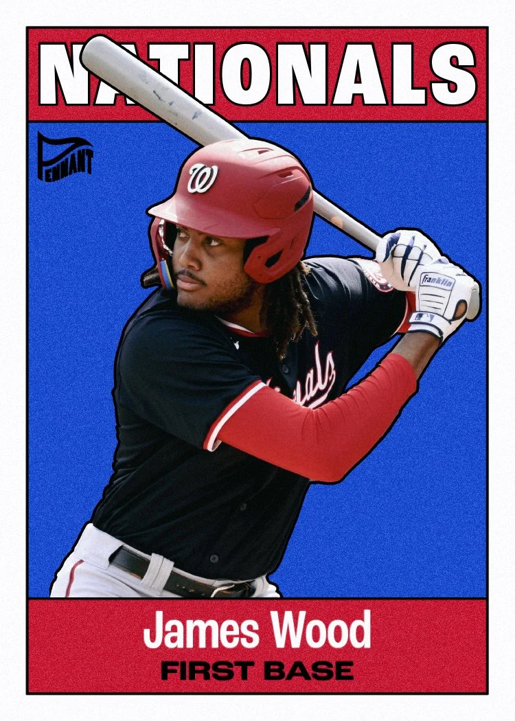
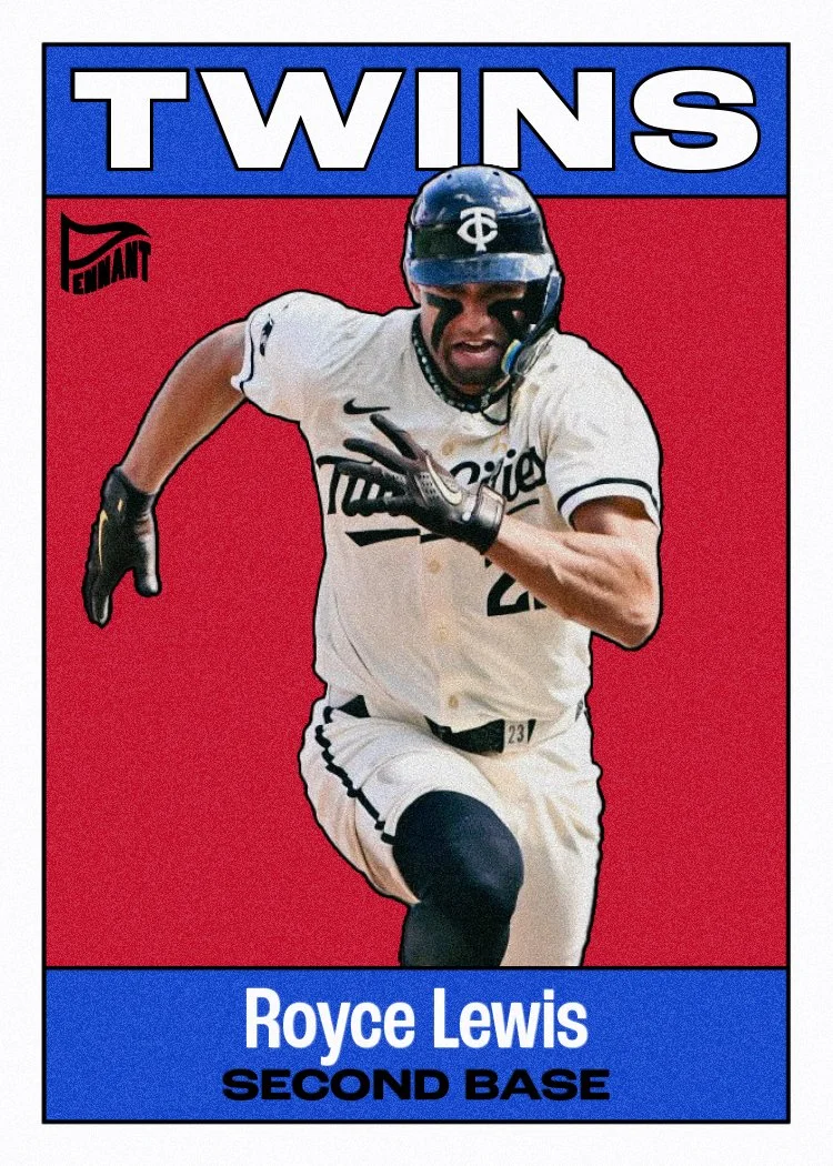
I already have my designs for the Clubhouse, Pennant and Deluxe sets squared away. Just need to finish putting together all the cards and I’ll be posting those in the near-ish future. Maybe even before Opening Day!