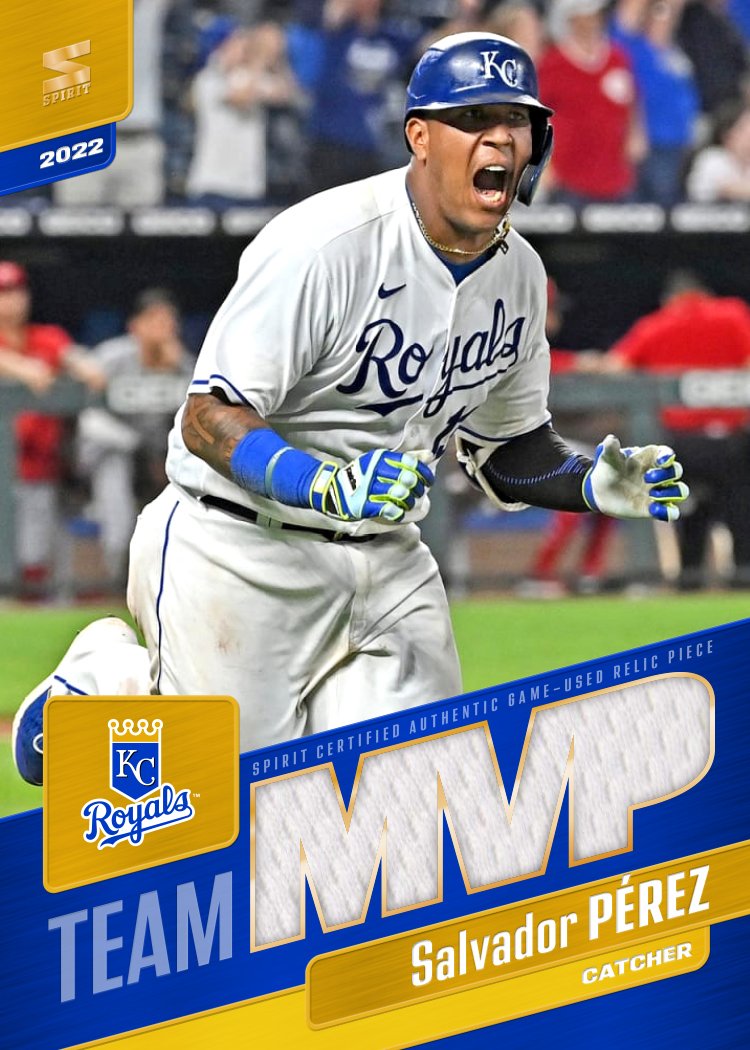
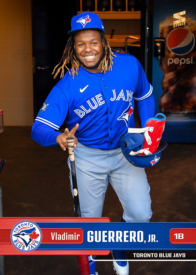
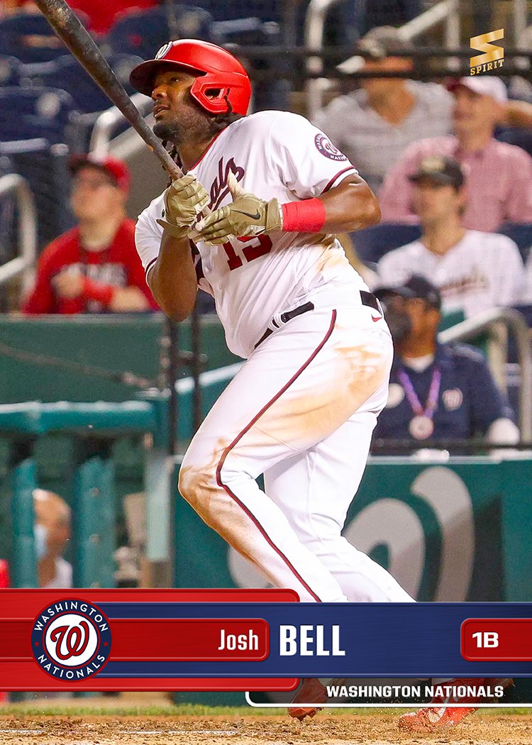
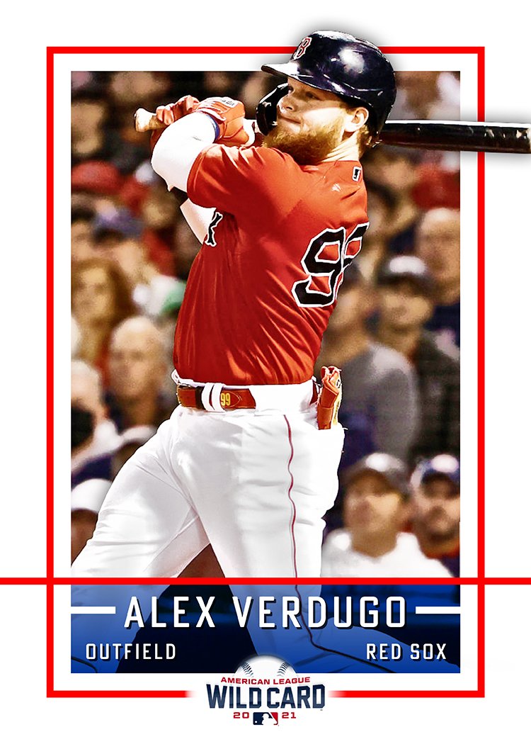
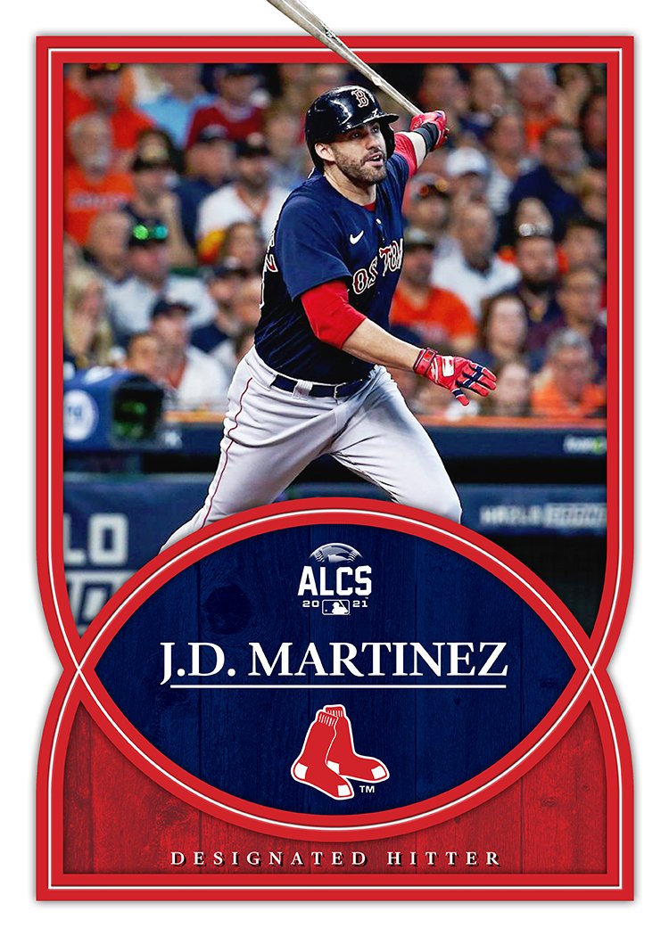
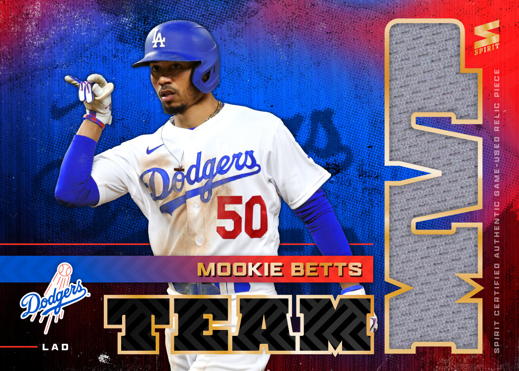
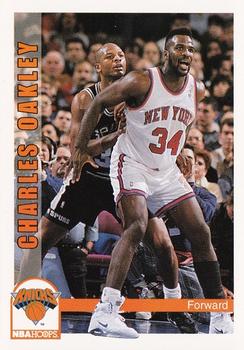
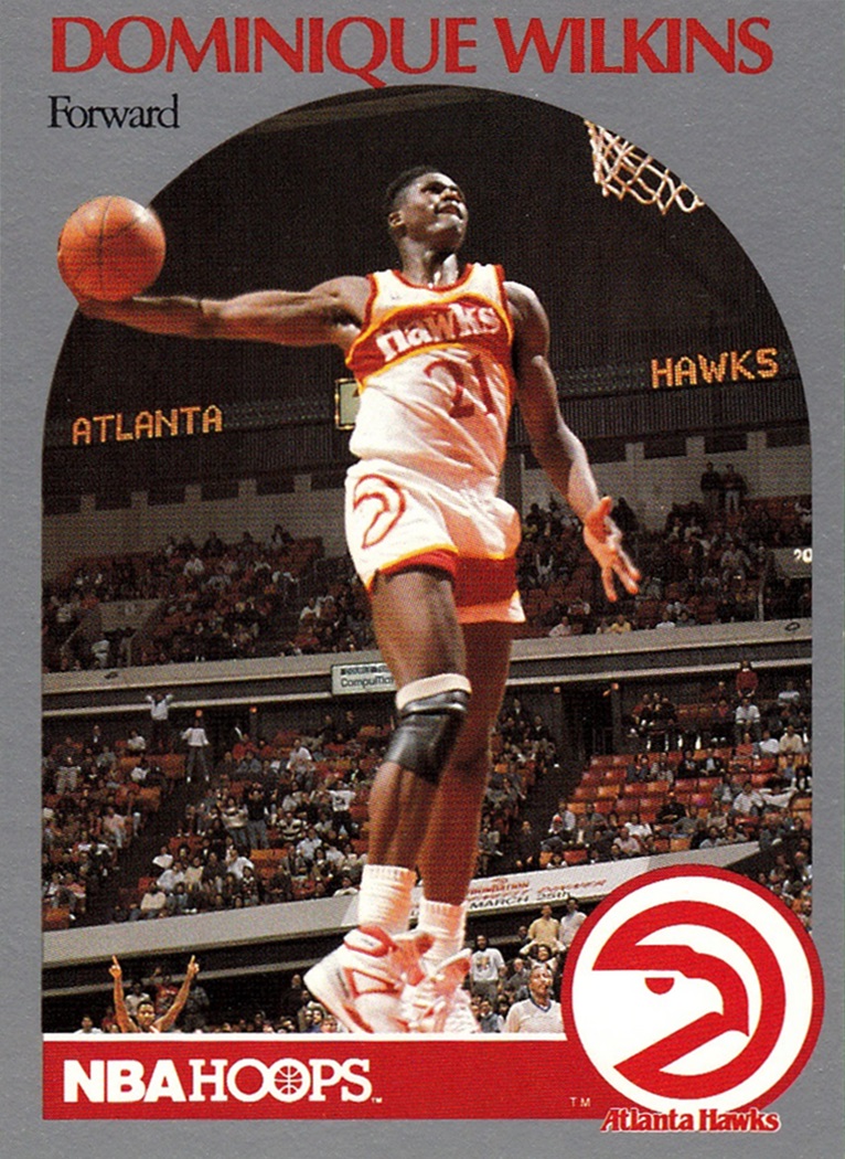
After tackling the Hoops suite, that 1991-92 Fleer design came calling and I could not resist that siren song. Reconstructing the design was a fun little exercise — one I thought may soften my criticism and warm my opinion of the set. Alas, my assessment remains hard and cold. I still enjoyed the hell out of it. So much that I took care of the less-offensive 1990-91 Fleer design. At the time, I had considered the Hoops and Fleer sets that year to be equals. Looking back now, I can see how the 90-91 Fleer was a quasi-knockoff of the 89-90 Hoops look. I wonder if they heard that feedback at the time and the 90-91 move was a drastic one to establish a difference between the two sets. Or maybe they were just rollin’ differently at Fleer back then. As you can see, the following year’s set is a solid argument that was the case.
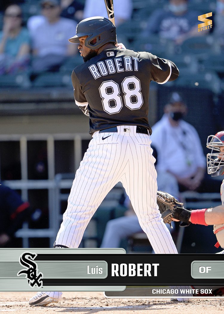
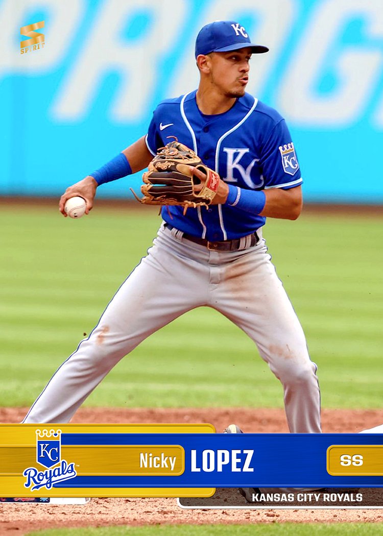
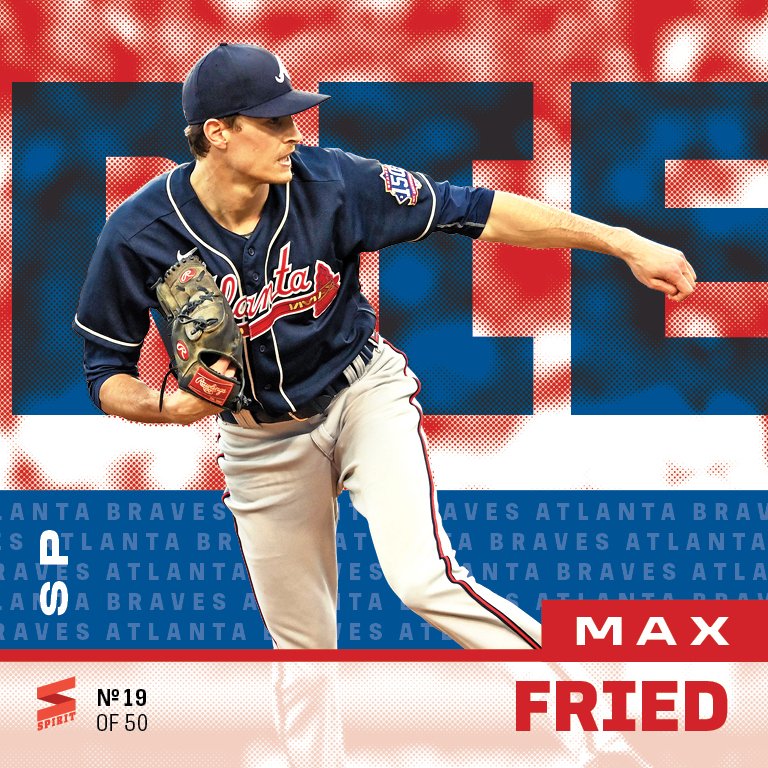
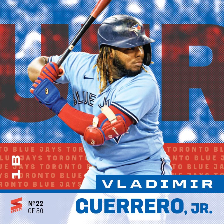
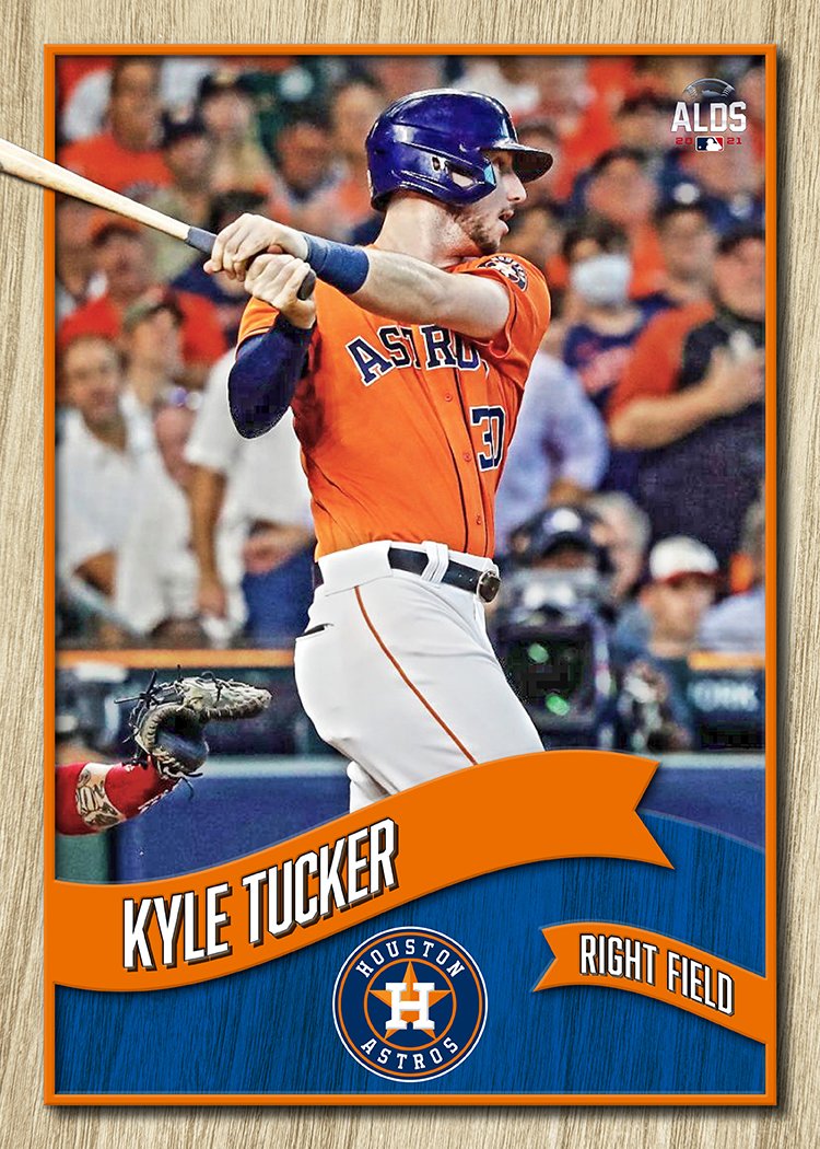
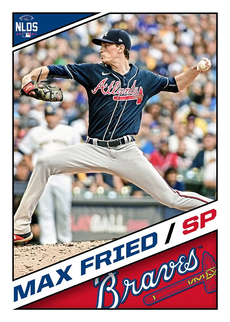
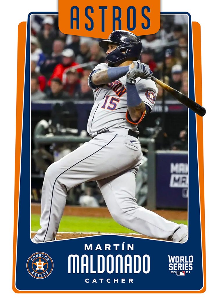
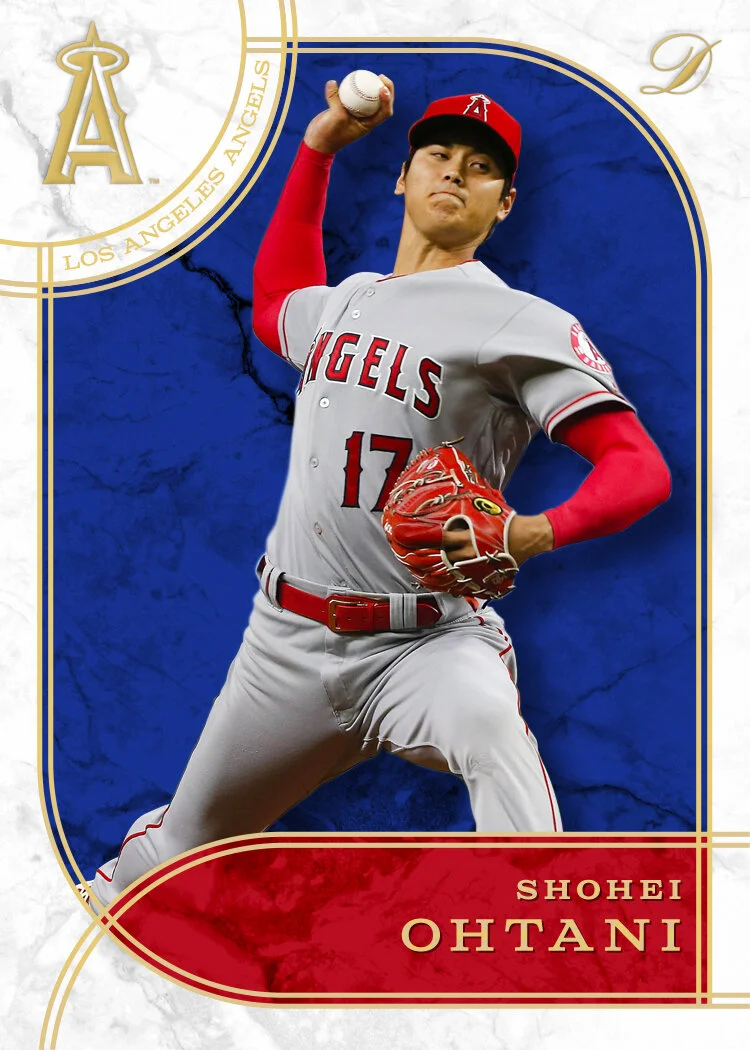
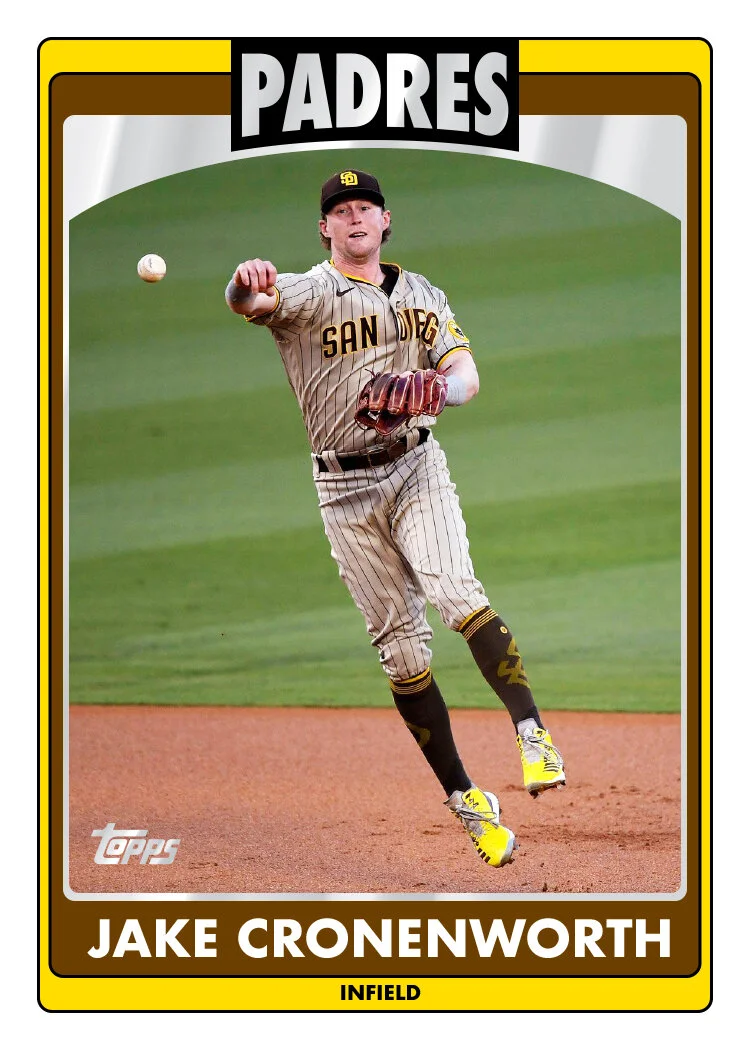
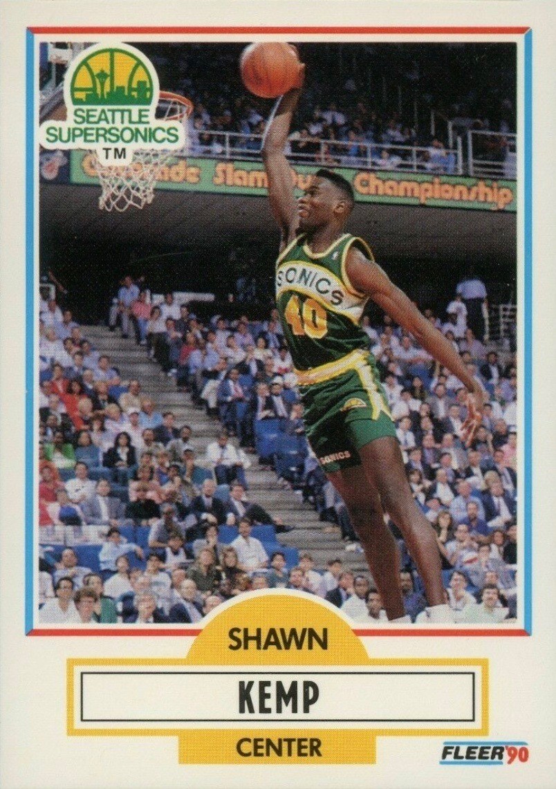
I did have to make a change to the 1992-93 Fleer design since one of the prominent elements they used was the pimpled basketball surface. The closest I could come for baseball was a really leathered baseball texture. I think it fulfills its purpose here. Seeing the chronology of all for designs side-by-side up there, it really accentuates how abruptly Fleer turned the page for the 1993-94 design. After going ALL OUT the previous two years, they came with a “less is more” approach in 1993-94. Even as a kid, I could perceive the shift from loud and almost childish to something more cool and confident in its restraint. As a designer now, I could call it lazy as it almost exclusively leans on Photoshop’s “outer glow” effect. But I’ll instead give them credit for knowing when to say when. And honestly, there’s something to be said for another designer doing something I would shoot down in the brainstorming processes and having it actually turn out pretty successful.
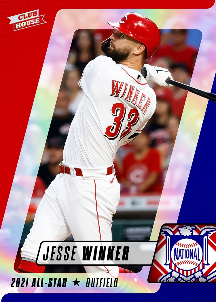
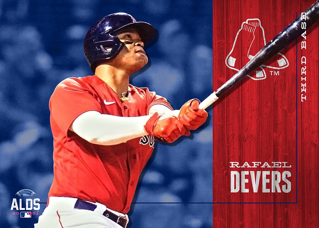
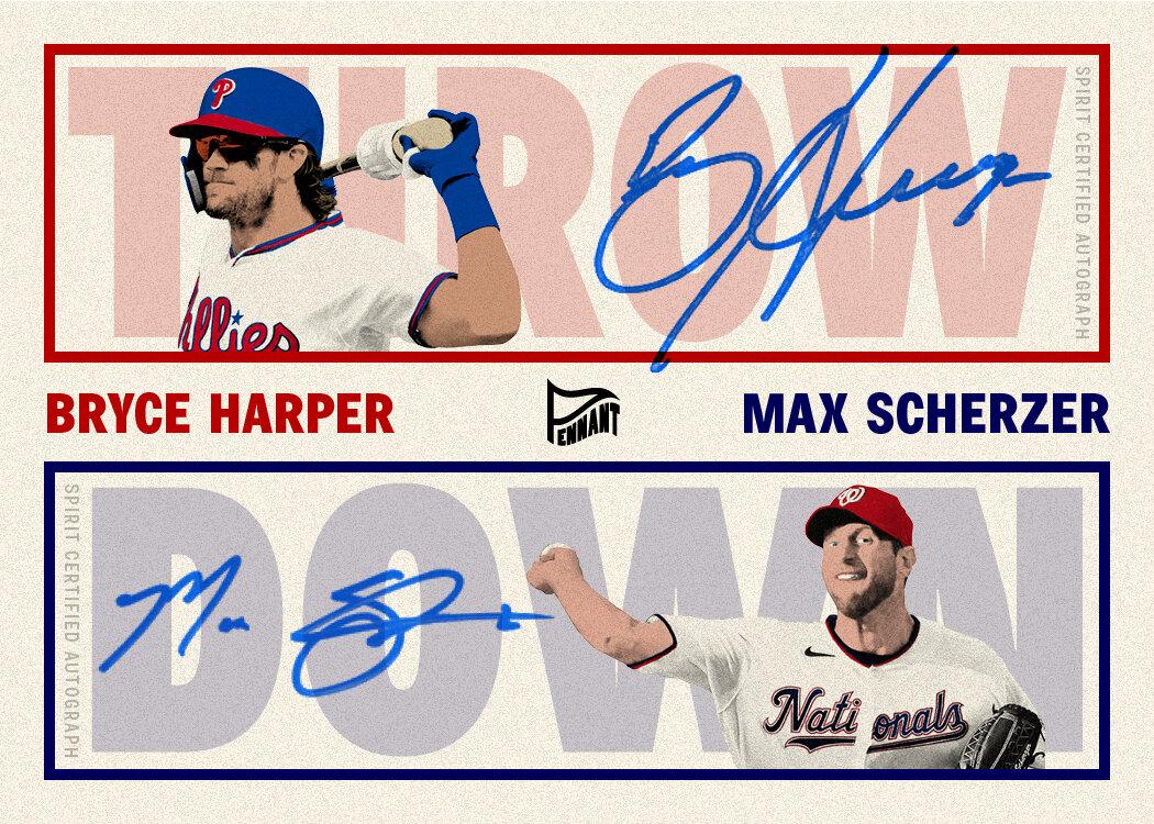
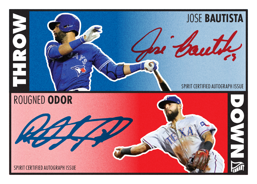
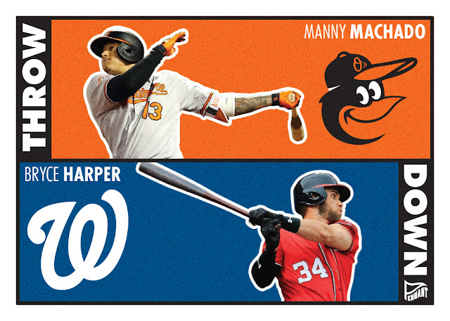
I should probably make a note about the Flipz name I went with to replace Fleer on these. Trying to stick with an f-word that wasn’t much longer presented a bit of a challenge. Between bat flips and glove flips, there’s enough baseball parlance to sell me on it. Plus we’re flipping sports here. Hate me for the Z if you want, but it was better than “Flips” to my eyes.
So after doing four cards for two different product lines, I feel satisfied enough to not delve any further into this exercise. For now. (I mean, Skybox….)


